Showing posts with label design. Show all posts

Thursday, April 27, 2017

Guest Room Styling with Serena & Lily


It's been busy in such a good way!! I just got back from an unbelievable trip to High Point Market, which is the world's largest to-the-trade furniture/ home decor show. The scope and magnitude are impossible to describe, but let's just say my brain exploded. Multiple times. (See the highlights here). I am also on Week 4 of 6 with the One Room Challenge over at Laura Design Co., and as if all that wasn't wonderful enough, my mom came to sneak in a quick visit from California!

Our guest room has been quite neglected, and I've been wanting to spruce it up for a while now. Mom's visit happened to coincide with Serena & Lily reaching out to see if they could send me a product to review. (Apparently somehow they were tipped off to the fact that I stalk their website on a near daily basis). One of the options was the Lanai Mirror- which seriously- I have been eyeing for MONTHS, and maybe even years, so I knew it would be a great fit for the guest room dresser immediately. In case you're curious, I went with the larger of the two sizes.

If you're not familiar with Serena & Lily, they are one of my top 3 favorite retailers. Their style is classic, preppy and a little bit coastal. Seriously, the last time I saw one of their ads in a magazine, I tore it out and carried it around with me for a week. This is what a nerd I am.

The mirror was here in no time and was just as gorgeous in real life as it was in their catalog (and my dreams). The fates even converged so that our magnolia tree popped, giving me fresh branches to style with! Ready to see it?


This room was long ago a nursery, but I painted it this deep navy (Naval by Sherwin Williams, one of our favorite go-to Navy blues), knowing that it would transition seamlessly into a guest room. I have a floral duvet cover (from RH over a decade ago) that I've always loved and am designing the room around. Now that this dresser is styled, of course, it makes me want to finish the room!


The rest of the room is pretty close...we just need a headboard (tough choices anyone?), a little more art, and some styling and we'll be there. But a huge thanks goes to Serena & Lily for the lovely mirror and a good start on finally finishing this room!


This post was sponsored by Serena & Lily, for which I am very grateful, in the form of product for review. As always, I would only recommend brands on this blog that I would share with my best friends at our weekly playdate. 


Wednesday, February 17, 2016

Schoolhouse Style


Elements of schoolhouse style have been popular for at least the last half decade, from the boys rooms of RH, to the best of minimalist farmhouses. Traditional trademarks include the iconic acorn shaped pendant, plenty of glossy shiplap, distressed wood furniture, and industrial metals. 

The trick to getting it right today is to pick and choose a few key pieces, and avoid going bananas so that your place doesn't end up looking like, er, a schoolhouse. Here's how to incorporate the style, and keep it fresh and updated for 2016. 


First up, for frame of reference, is an actual historic schoolhouse. Let's break down the elements and take a closer look at what to bring home (and what to leave in your locker).

Bring it Home:

1. PORTRAITS

Check out George- he's even dipped! Adding a portrait or two is a great way to bring character and personality to your space. Cool designers would probably choose an original vintage over a poster of GDub, since that's, like, obviously fake and ridiculous right? But I would totally do it. First of all, I have a weird obsession with presidential history, but more legitimately, it's cheeky. I actually came this close to buying a portrait of him riding a dinosaur at Renegade. Ah, craft fair regrets. Expert tip we can all agree on though: It's a good idea to test the waters on an inexpensive piece at first, to make sure you're cool with the eyes following you to your bathroom in the middle of the night.


2. PLANKS

As the #shiplap trend continues to mow down any opposition in its path, the more planks right now the better. Floors, walls, ceiling, skinny, fat or short, it's all fair game. And it's my opinion that architecture is king. If you have ugly baseboards and drywall-meeting-drywall, no amount of mid-century foraging is going to make up the difference. Likewise, a room with outstanding architectural features hardly needs anything in it to be stunning. If you're torn about where to spend the money, start with the bones of the house.


Via deVOL

3. STACKS OF BOOKS

Somehow the design world has us convinced that minimalists are also book hoarders. While this can't possibly be true, the stylists have SO perfected the art of the sloppy stack that even the most staunch spartan is clamoring to pile unread 'zines against those white walls.

Via Kinfolk Home


4. THE POT-BELLY STOVE

Believe it or not, this hallmark of early Americana is making a comeback in a huge way. I see them all. the. time. lately in the most hipster of homes. And why not? Nothing says cozy like a giant oven in the middle of your room.


Via TrendLand (header image as well)

5. KEEP IT MINIMAL

For a myriad of reasons, minimalism is more than a current trend; It's a surging movement. The roots and spirit of utilitarian style are clearly seen in these early 20th century buildings. More often than not, they're all white. They boast simple shapes, time-worn materials, hand crafted furniture, and zero excess. Keep these tenets in mind, and make sure white space is a part of your design plan.

Via Design*Sponge

Via Dust-Jacket Attic

A few more tips? Think black, white & tan. Grab a schoolhouse clock. Upgrade to fantastic door hardware. And remember, cognac leather + tufting is always a good thing.


Doorknob  |  George  |  Pendant  |  Sink  |  Leather Chair  |  Fireplace  |  
Stool  |  Clock  |  Book  |  Watering Can  |  Buffalo Check Chair 


Now there are a few more obvious nods to the ol' schoolhouse that I would caution you to use sparingly. Since this trend has been around a while, the goal is to keep it fresh. So, while any one of these things can still be perfectly fine and wonderful, putting two or more in the same room can put you in that "bananas" zone we discussed earlier. And obviously, bananas have no business in the American educational system. So leave these in your locker:

Maps
American Flags
Chalkboards
Lanterns
Globes
Um, Lockers

What do you think? Can this trend stick around for a bit longer and still feel fresh? Or is it time for us to graduate?

Thursday, October 16, 2014

industrial office project


{this post contains spoilers; mission staff stop reading now!}

so i know i'm not supposed to be doing any professional interior design work. i'm supposed to be staying home with the babes, homeschooling, keeping on top of my laundry, making gourmet meals every night...you know, priorities. but sometimes it's just too tempting to resist. i've decided just this one time it's ok, and that it doesn't count because technically i'm simply volunteering my time for a good cause. (but in case you're wondering, yes, this has given my laundry the upper hand. whatever, it'll keep).

my friend laura peacock (remember her, of house crush fame?) was recently asked to design her church's new offices and asked if i'd like to do it with her. the space is this awesome industrial building...and i just couldn't say no. who wouldn't want to work on a project that started with these ceilings??


here's the floor plan:


here are a few pictures of the space when i first saw it. the steel see-through walls are getting drywall and turning into two small offices. the main bulk of the rest will be a meeting/ lounge area up by the front windows.


we are right in the thick of it, and i'm so excited to be able to show you the results after we do the installation. construction is underway right now...the counter above and carpet have been ripped out. drywall is up, enclosing the offices, and a lovely distressed wood floor should be going in as we speak!


there have been a few unique things about this project, the most interesting of which was the budget. it's a church, so no one should be surprised they'd rather spend their money serving their community than on fancy furniture. i support that, of course, but when i found out we'd only have less than $100 per piece to spend, i had more than a couple moments of panic about our ability to pull that off. and i'm not talking about pieces of silverware or accessories; i'm talking about pieces of furniture. (if that sounds like a lot to you, go to the cheapest store you know of and see if you can find a sofa for less than $100 and get back to me).

secondly, it was a massively short turnaround time. i first saw the space two fridays ago and if all goes to plan, we'll be installing this wednesday...meaning 20 days total and meaning that stuff i ordered on ebay better hurry already!

and thirdly, the head pastor had the most specific wish list i've ever seen. his initial email was so adorable...i don't even know how to describe the smile i had when i read it. i'm just going to paste it for you so you can enjoy this:

I really want the feel to be Northwoodsy...like I'm in Quetico. One of my fav companies is Duluth Trading Co. Check out their site for feel and look. So cool! 

Wants:
-Old rugged desk, smaller the better. Nothing too huge... 
-Old rugged table to sit around...for 4 people if possible. 
-Keurig Coffee Maker w/ some cool mugs hanging up
-Northwoods art work. A canoe painting would be cool! 
-White board that is enclosed. 
-Fireside candle
-Stack of Boundary Waters Journal magazines. I'll bring those :)
-Some cool book shelves that fit the look/feel
-Dog bed for Remi :)

how cute is he?! his northwoods vibe is definitely going to be a departure from the modern space requested by the rest of the staff, but i'm already sure it's my favorite part of the project.


laura and i decided to start with a deep navy wall color for his office. (you know my first inclination is always to paint everything white, but since we need to work with the burnt red steel beams in this space, an all black-and-white scheme wasn't going to fly. that, and when i showed them inspiration spaces, they said, "we definitely don't like the all-white ones. hahahaha).


here's a peek at some of the things we have going in here:


back in the main space, we'll be sticking to the requested modern/ industrial feel with some charcoal grey on the walls (that'll go up tomorrow, hopefully), but more reds & blues will tie the two spaces together. 


i am so excited to tell you that we have completed our entire purchase list and, as of now, are well under budget! we have been scouring craigslist and thrift stores, doing a few DIY's, and working really hard to round up personalized accessories that won't break the bank.

stay tuned and i'll let you know how it all comes together!


{update // the installation is complete! visit the lounge & meeting area here, and the see how we checked off the pastor's quetico-inspired wish list here}


Monday, October 13, 2014

design for the world


i never win anything. seriously. if it's a matter of chance, it's not landing on me. chance doesn't know laura irion's name. i would never gamble. i really shouldn't even be in the room when ryan plays fantasy football.

so imagine my absolute surprise when i actually did win an instagram giveaway, hosted by sarah lin of ellie funday. i would have been thrilled to receive a piece of gum just so i could say i'd won it. but what i actually got was so amazing, i just have to share.


the first thing i opened was this organic baby blanket called the "goddess swaddle." i previously thought that aden + anais made the best baby blankets...i was wrong. this is it. soooo good. it's generously sized, buttery soft, and perfectly weighty without being heavy. i loved it, and immediately regretted the promised i'd made to give it to my new mama friend. (kidding!)


after being floored by this product, i did some more looking at ellie funday's shop, and am so touched by their heart for marginalized women. these blankets are hand-stitched by women in india whose families are under-resourced and in danger of crisis.

"We work with partner organizations that employ marginalized women in India specifically helping them become self-sustaining. Our hope is to provide a fair wage, relevant job training and a dignified living for many who are susceptible to human trafficking.
More often than not, our partners go above and beyond just a fair-wage. They provide crisis-counseling, education, and housing for their women. Poverty alleviation is a holistic effort."
{see more here, here & here...}

i wish i could say i shopped more with companies who have the kind of commitment and passion they do for fair trade, fair wages, and helping empower those who are powerless. i often feel helpless toward the plight of suffering women across the world, and i'm convicted that if i'd just be a little more careful with my purchases, i could buy products that really matter and really make a difference. which brings me to the second item in my lovely package...


inside this clutch by raven + lily was a card, personalized with the story of the woman who made it. it was so humbling to read about ferdoz, whose husband left her because she had five daughters for him, and no sons. with no money and no education (she could not read or write), she did not know how she would provide for herself and her children. crafting these goods has restored her livelihood.


raven + lily, like ellie funday, has a passion for empowering women, and the things they sell are beautiful, quality, unique items that i would be proud to own, to gift, and to support. read more about their mission here and see the incredibly gorgeous goods these artisans are making here.

thank you sarah & ellie funday for this wonderful gift and for all that you and your partners are doing to change the world...one blankie at a time.

Monday, September 29, 2014

a little bit of black & white // and free printables

good monday morning! today is my friend stephanie's (who i've mentioned before, before, and before) birthday. she's a great friend, a huge cheerleader for this blog, and the inspiration (and voice of reason) behind more posts than i can possibly acknowledge. as such, i'm turning the spotlight on her a little and giving you guys some free printables to celebrate. also, if i end up maimed by the side of the road somewhere you'll know it's because i showed you unedited pictures of her house without any permission to do this post whatsoever. (guess this is what birthday pranks look like when you're friends with a blogger. holla!)

steph has this gorgeous historic house, and has done so much to update it. i absolutely love her home and everything she's done, so when she asked me recently for some help "finishing" her family room, i about fell over. are you kidding- i should be asking her for advice! (hey, actually, that's a great idea...steph, i'll do your family room...you do mine...)

but i totally get it. i think family rooms are really hard. they're where you hang out all the time, and therefore you look at what's in them all the time. they can feel tired really fast. they also get a ton of use, ie. wear and tear. in our phase of life, there are little ones crawling everywhere and drooling on everything, so overly styled/ breakable objects are out of the question. the room needs to be comfortable and attractive, calm yet lively, organized yet accessible. and did i mention you have to look at it all day?

sometimes you just need a fresh set of eyes on a room to get your creative juices flowing again. so i'm here to throw out some ideas and help steph get back on her game and finish this room.


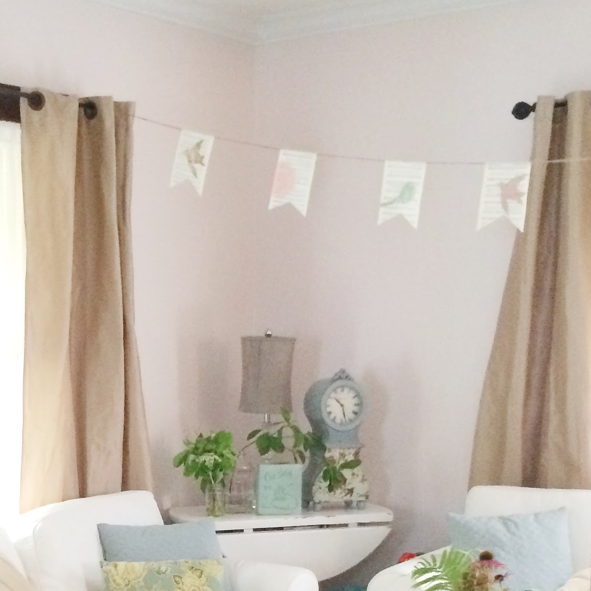
i'm sorry i don't have a good overall shot of the room- i was so busy shooting all the corners, i forgot to get one! the one above is from the recent baby shower we hosted there, so ignore the bunting and overabundance of flowers.


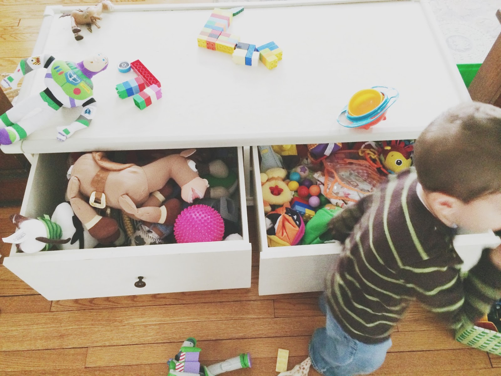
as you can see, things escalate quickly around these parts. steph's coffee table is a brilliant choice, with deep drawers to stash toys.


the above corner of the room has a target chair which steph scored brand new at the good will for $25. i am telling you...check there often. so many businesses donate new items!


as proof positive of steph's awesomeness, she just painted this room the pale perfect pink that you're seeing in these photos. yep, pink. (she's a mom of three boys, three and under no less, so she totally deserves a pink room, right?!) it is a great color and turned out beautifully.

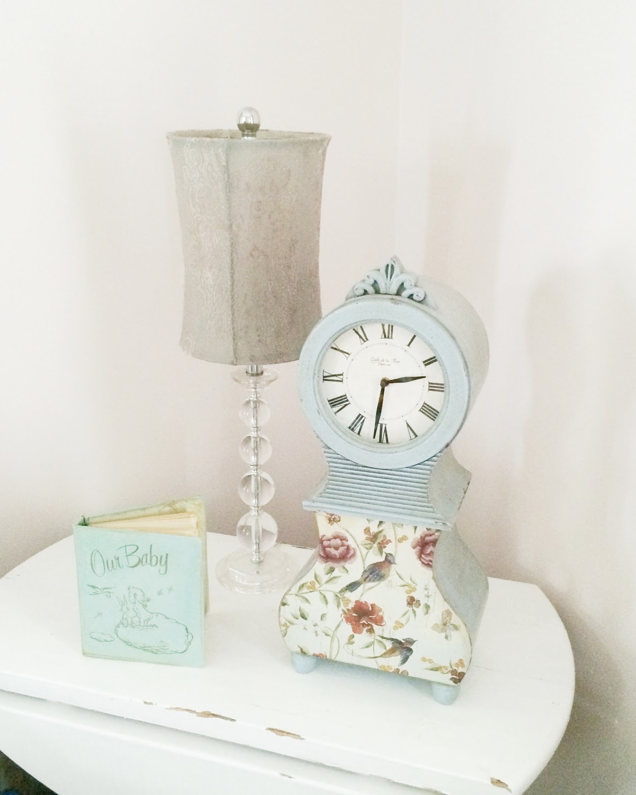
it used to be a lovely shade of robin's egg blue so all her current accessories are in that vein. that needs to change pronto as the baby shower look is not what she's going for here. steph is thinking that adding a little black to the accessories will help glam up and modernize the space. i'm thinking that is a fantastic idea because it also keeps her historic house from feeling too serious, and is a classic color combo that she isn't as likely to tire of.


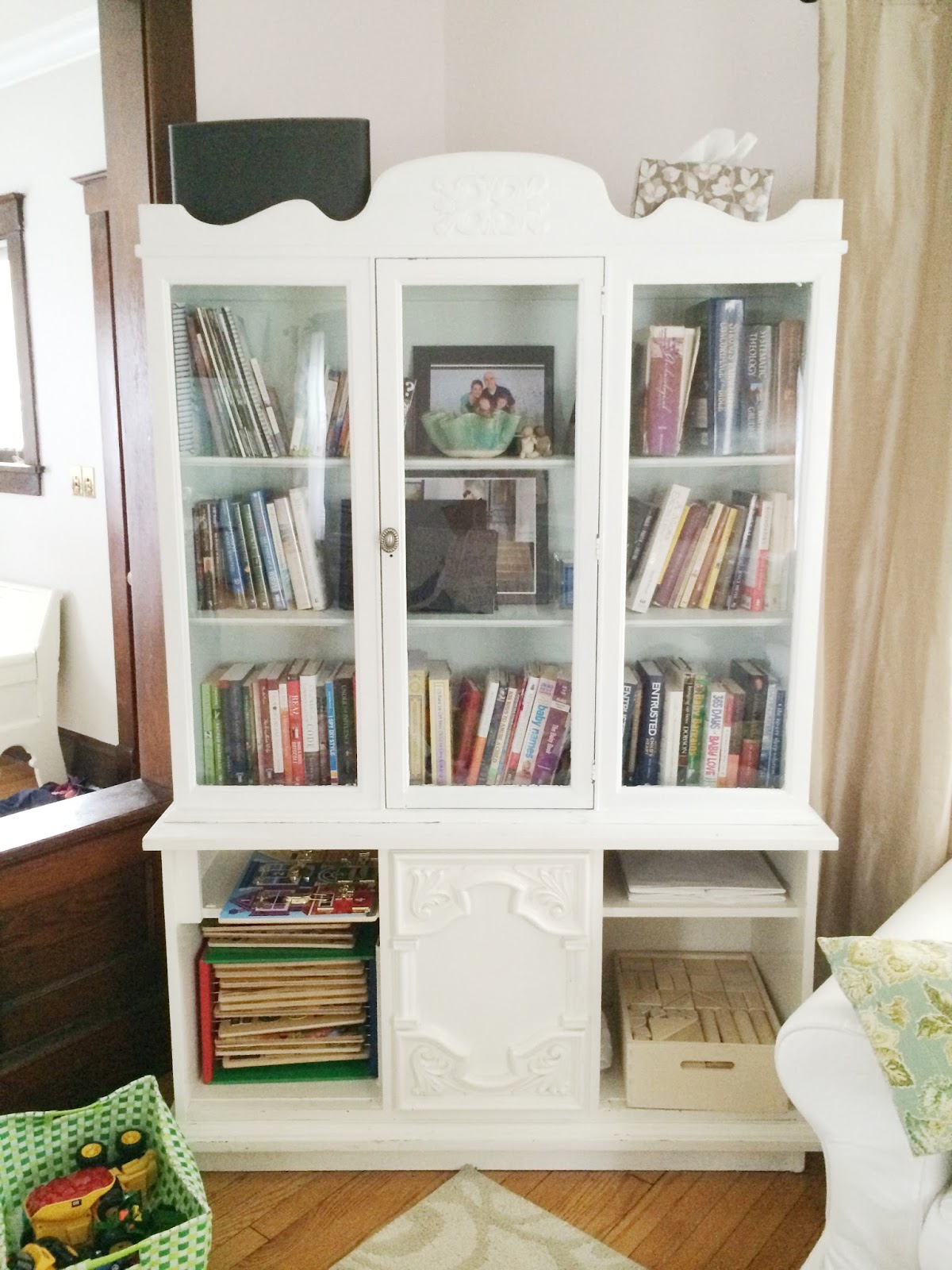
the other side of the room has a great bookcase that steph salvaged and painted:


hahaha, i am so laughing at those kleenex perched up top. it's the beginning of cold season in chicago (which just ended three months ago, by the way) and we have kleenex decorating every room in our house too. :)

i should also mention that no one wants to devote a ton of money to this update, as there are always more pressing needs, so steph's budget is going to be her little stash of birthday money. (p.s. i am always happy to help any of you spend your birthday money...just call me up).

so happy birthday stephanie; i got you a family room design this year. :)

as was my mantra for 
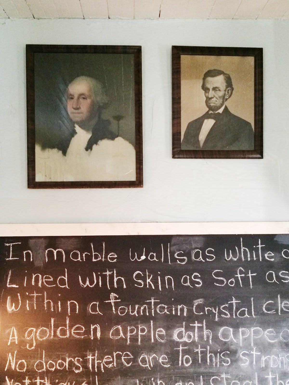
this recent console restyle, let's start with what we have. stephanie has this print from lindsay letters as well as a chalkboard she recently made:
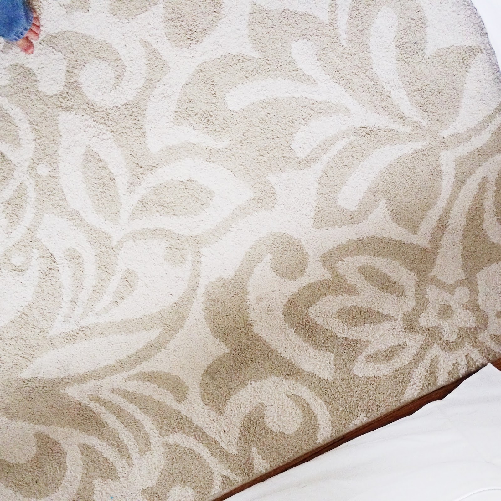
her existing rug will be perfect, as she'd like the overall color scheme of the room to end up being pale pink / gold / white / black & taupe:


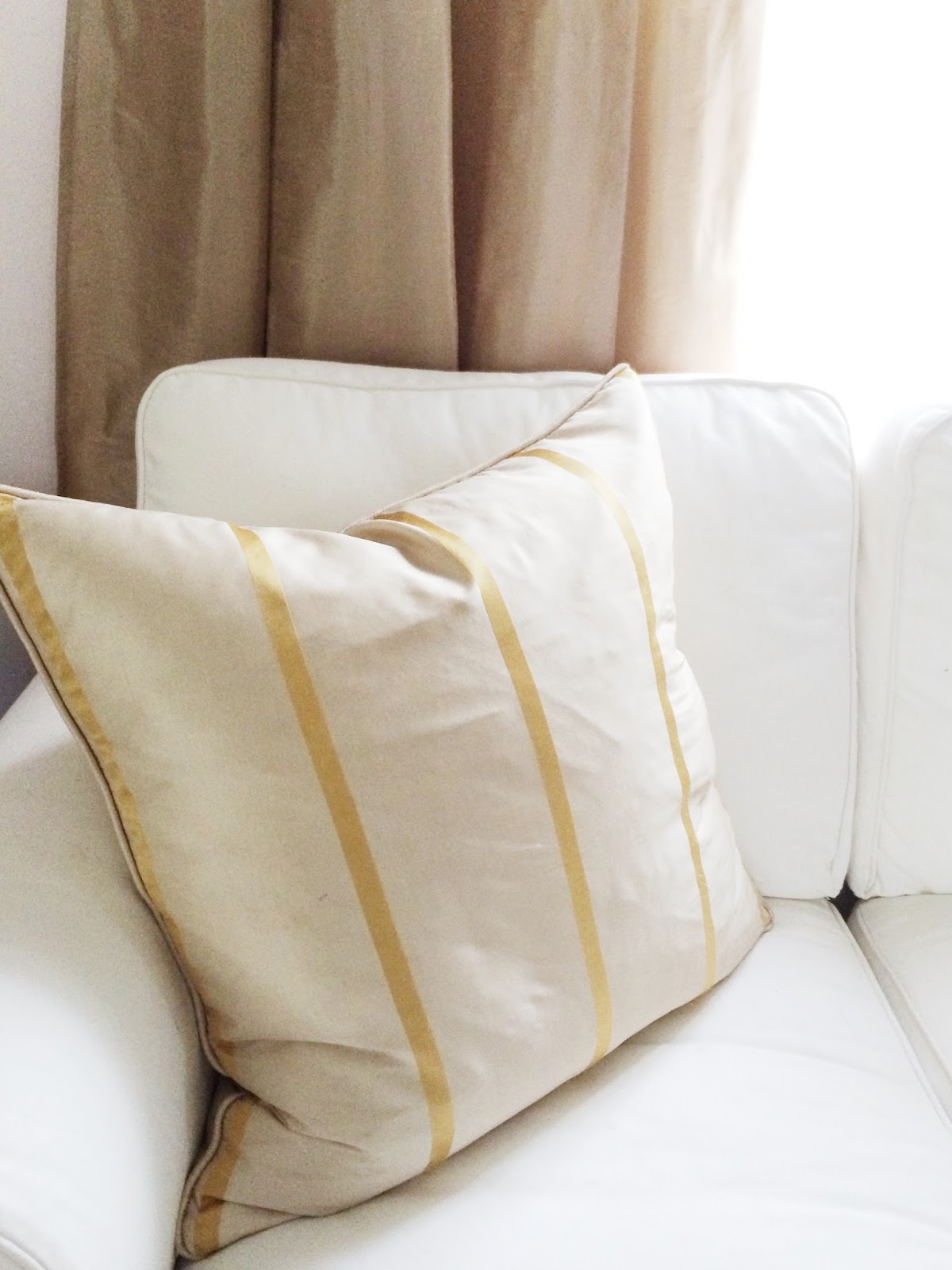
her drapes are a beautiful silk taupe so they will certainly stay. these pillows with gold striping could stay as well:


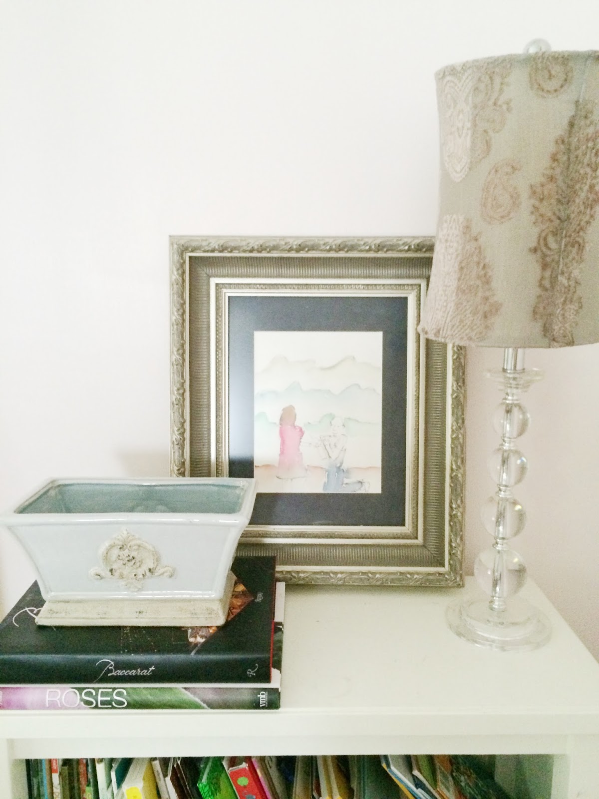
this print was commissioned by steph's husband and is an artist's rendering of their engagement. (um, hello, hubby bonus points). it has sentimental value and pulls in pink and gold, so it gets to stay too:


the lamp you see above is perfect for the "glam" factor with its crystal base, but the silver sage shade needs an update. since steph told me the shades aren't sacred, i'm suggesting she keep the whole lamp but go at the shades with some black fabric spray paint. she'd have two whole new lamps for around $3.


my next suggestion would be to add two graphic black & white striped pillows. i could not believe it when i found the perfect covers at ikea for $5 each!

here's the part you've been waiting for. i created the two prints above for steph because it would give her some high-contrast artwork at a zero dollar price tag. i certainly don't want her to feel obligated to use these, so i'm doubling the happiness and offering them to you too as free printables.

{the best resolution way to do it is right-click on the images below, save them to your computer or device, and either print them yourself on a printer like this one, or send them off to shutterfly. they are sized to print at 8 x 10. you can also print directly from this document. promise you'll be nice and only use it for yourself or a gift, ok?}


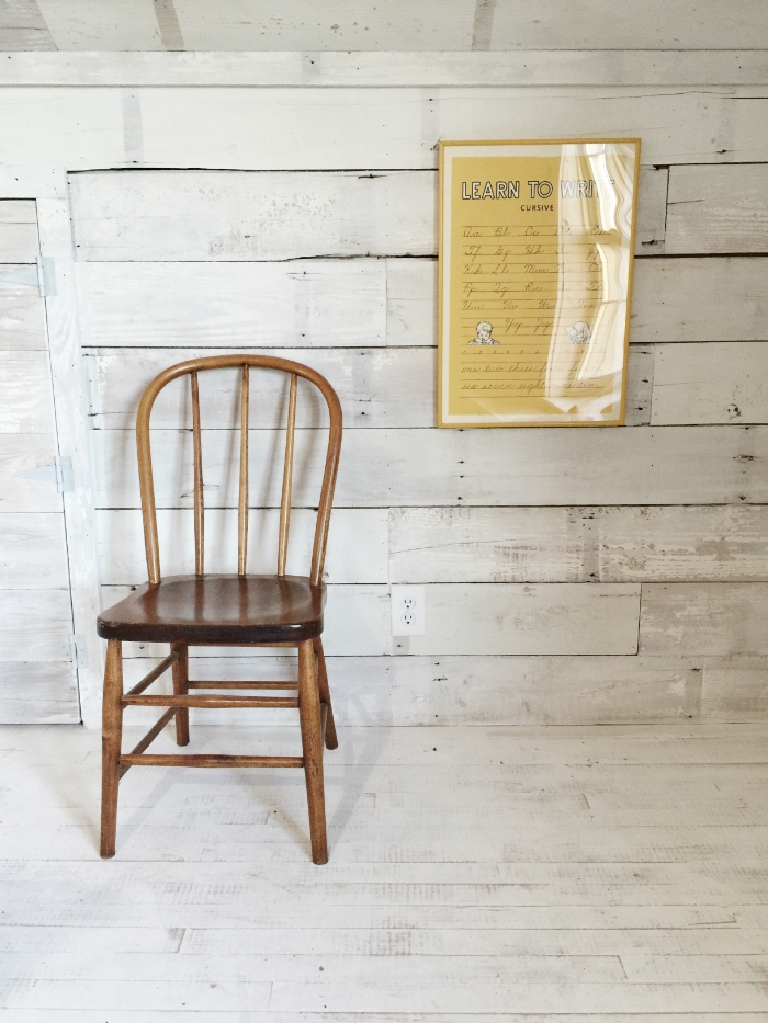
i'd suggest putting the bottom one on this wall, then put the engagement print above the back of the chair:


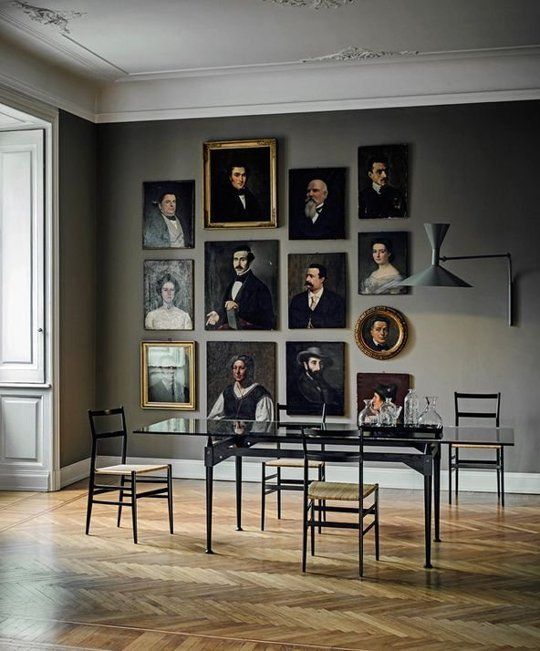
over on the couch wall, i'd create more of gallery like this:

just imagine there is a couch between those photos. oh, and you can see i was playing in poor man's photoshop with how black shades (and a black clock, not sure if that one will fly?!) would look. 


if we add the chalkboard print to this side, with those great pillows and some pops of black, i think it looks really sharp. i'd also love to see steph find some high quality faux blush roses for that table.

here's what we could do on the other side:


the space on the top left with the square print - that's a spot i saved for an adorable print steph showed me of her with her mom from when she was a baby. it would round out that gallery perfectly.

one of the things i love about steph is her love of reading and how she encourages that in her kids. she values keeping books at eye level and accessible. so i'm not styling a thing on those bookshelves. they are perfect as they are- filled to the brim with books her little guys can grab anytime they want.

i did spy this bowl at target this weekend, and it was beautiful and at a very good price of around $15, it would be pretty on top of her books and wouldn't be a big investment if the worst were to happen to it.
as for that white bookcase...


that's going to have to be an in-person project. i'm thinking we'll easily clean up those books and it can look good with basically the same contents, just rearranged a tad. we could even make white and/or kraft paper book covers and go with a monochromatic look. (some people just turn the books around so you only see the pages. while i like the look, that's something you'll only want to do if you literally never read the books, otherwise put that on the list of ways to annoy yourself every day). i'm also wondering if we could find some handy little company to make three matching doors for the bottom. rather than always trying to style it or find baskets, wouldn't it be nice to close it off? just a thought.

well guys, as always, i'd love to hear you weigh-in on this subject. if you have thoughts on what you'd do with this room, feel free to share. having friends to bounce ideas around with is such a great way to narrow your vision, so i know she'd enjoy hearing it!

and to you my darling stephanie- have an awesome birthday! (i know she will since we'll be braving the adler planetarium with our girl holly and 8 kids! bring on the crazy!)

 
Blogging tips