Showing posts with label interiors. Show all posts

Wednesday, July 13, 2016

Death by Legos


So, I'm pretty sure I'll be preaching to the choir if you're the mom of a grade-school aged boy (or Heaven help you, more than one grade-school aged boy), but I'm pretty sure that Legos are going to be the end of me fairly soon.

If I don't bleed out from the gaping foot wounds they inflict at night, I will definitely succumb from mental anguish over the sheer volume of the little beasts! The rate at which they are consuming our available remaining floor space is shocking. They're like block-shaped carpet-locusts.

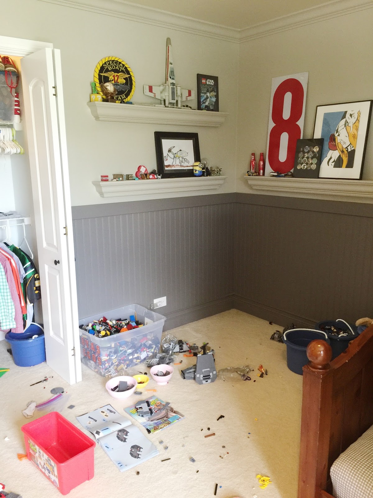
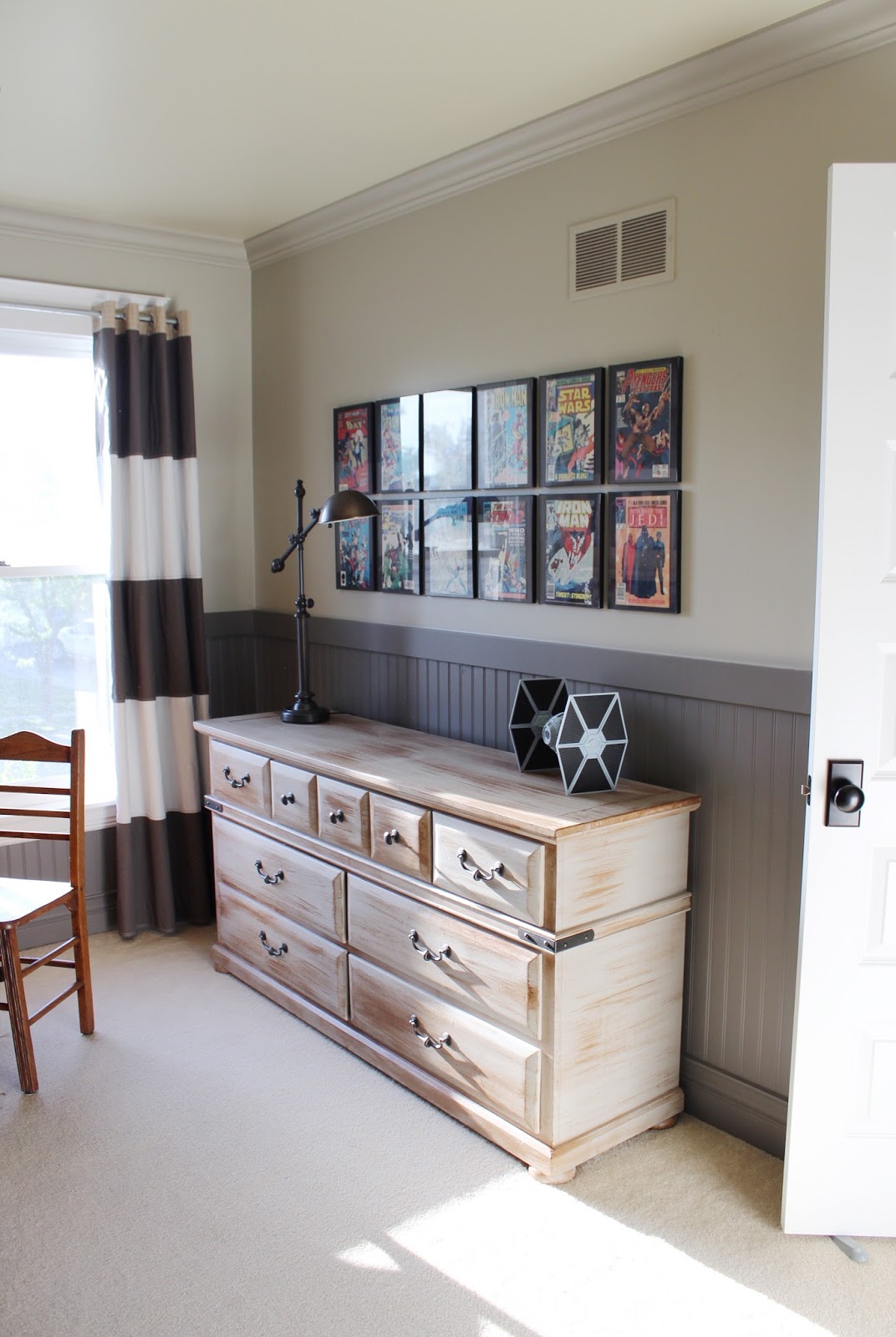
When we first remodeled our boys' room in 2013 PB (that's "pre-blog"), I thought that a few wall shelves and a dresser top would be plenty of storage and display space for a Lego collection. Ha. Silly Laura. 2016 laughs at you.

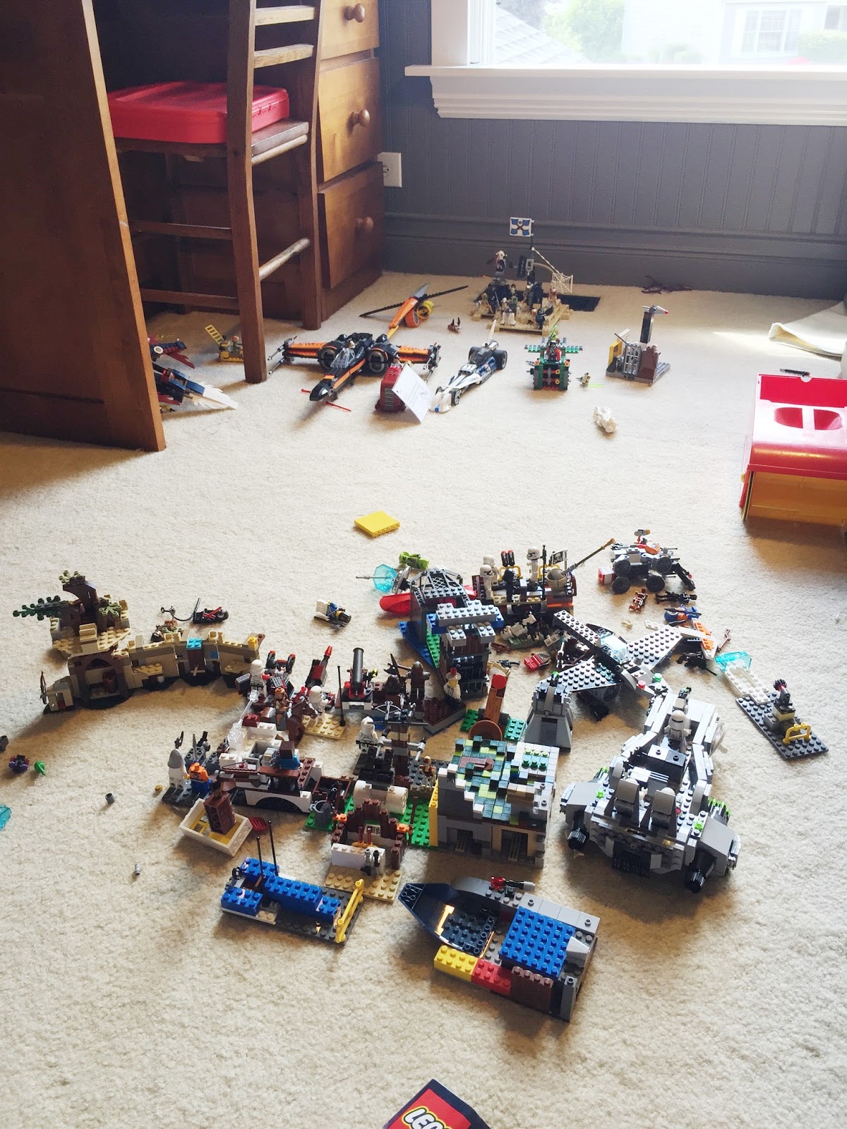
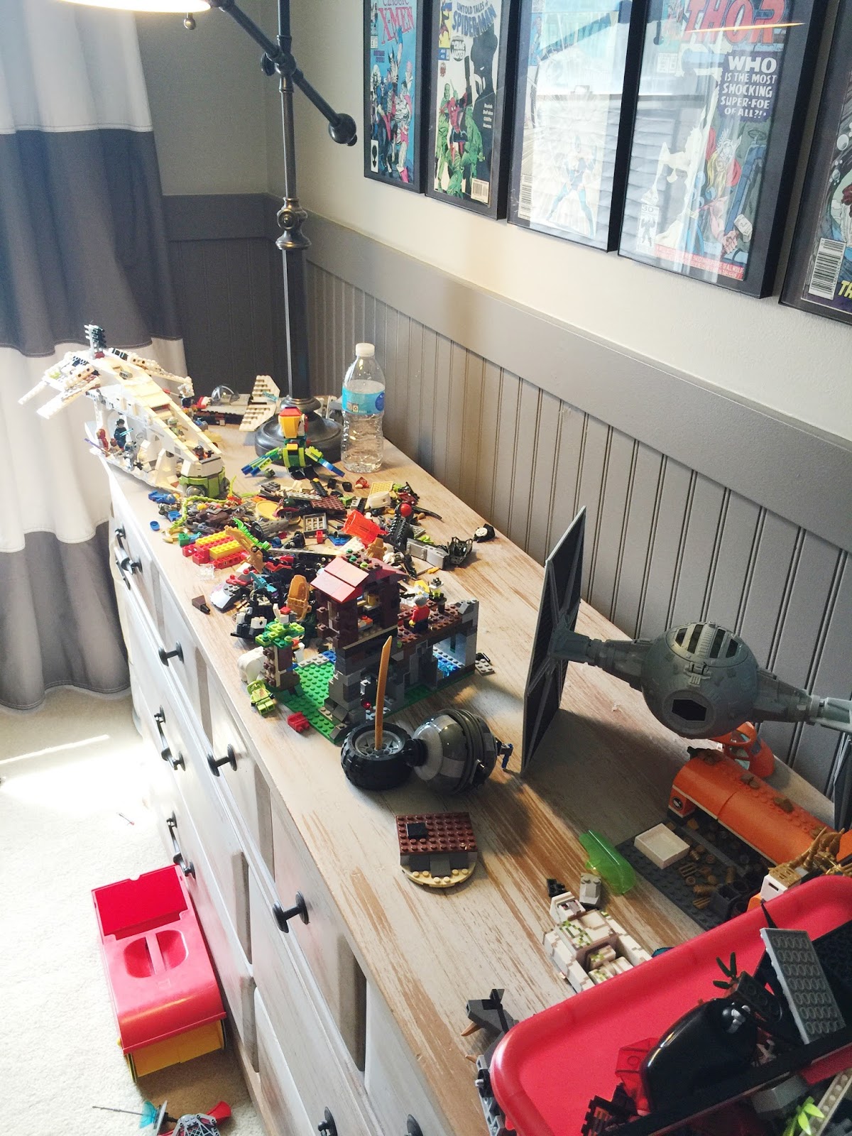
My breaking point came this weekend. As I stood in the doorway to the room and surveyed the landscape, there was no end in sight. Piles, stacks, battles, bases, lost Chi, dismembered Kai, X-wings with broken wings, Emmett missing his pants. And it's not fair, really, for the boys to have nowhere to put these creations they spend so much time on. Elaborate sets are left to the perils of the carpet, where they are stepped on and crushed, never to be resurrected (see previous note about my foot wounds). The Lego population had to be dealt with.

These photos only scratch the surface- they were snapped after we cleaned half of them up...


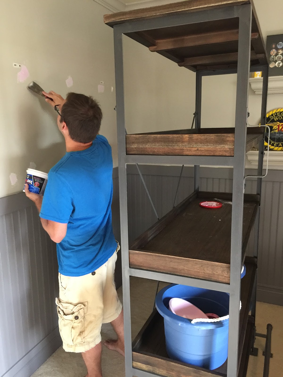
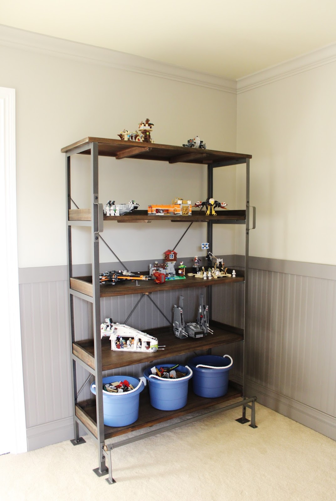
Shudder. In totally uncharacteristic fashion, I did a quick online search for a bookcase, barely measured, called the store and held it, drove over, didn't see it in person, bought it for a whopping $330 (which I NEVER spend, and especially not on a whim), and wrestled it back in the house all in the span of a couple hours.

World Market Emerson Shelving

Much to Ryan's delight, he got to spend the remainder of his weekend assembling it and rearranging wall shelves (with the ensuing patching & repainting of NINE holes in the wall) to accommodate it. I spent the remainder of my weekend organizing the entire boys' room, cleaning it top to bottom, and sorting my little locust-nemeses with glee.


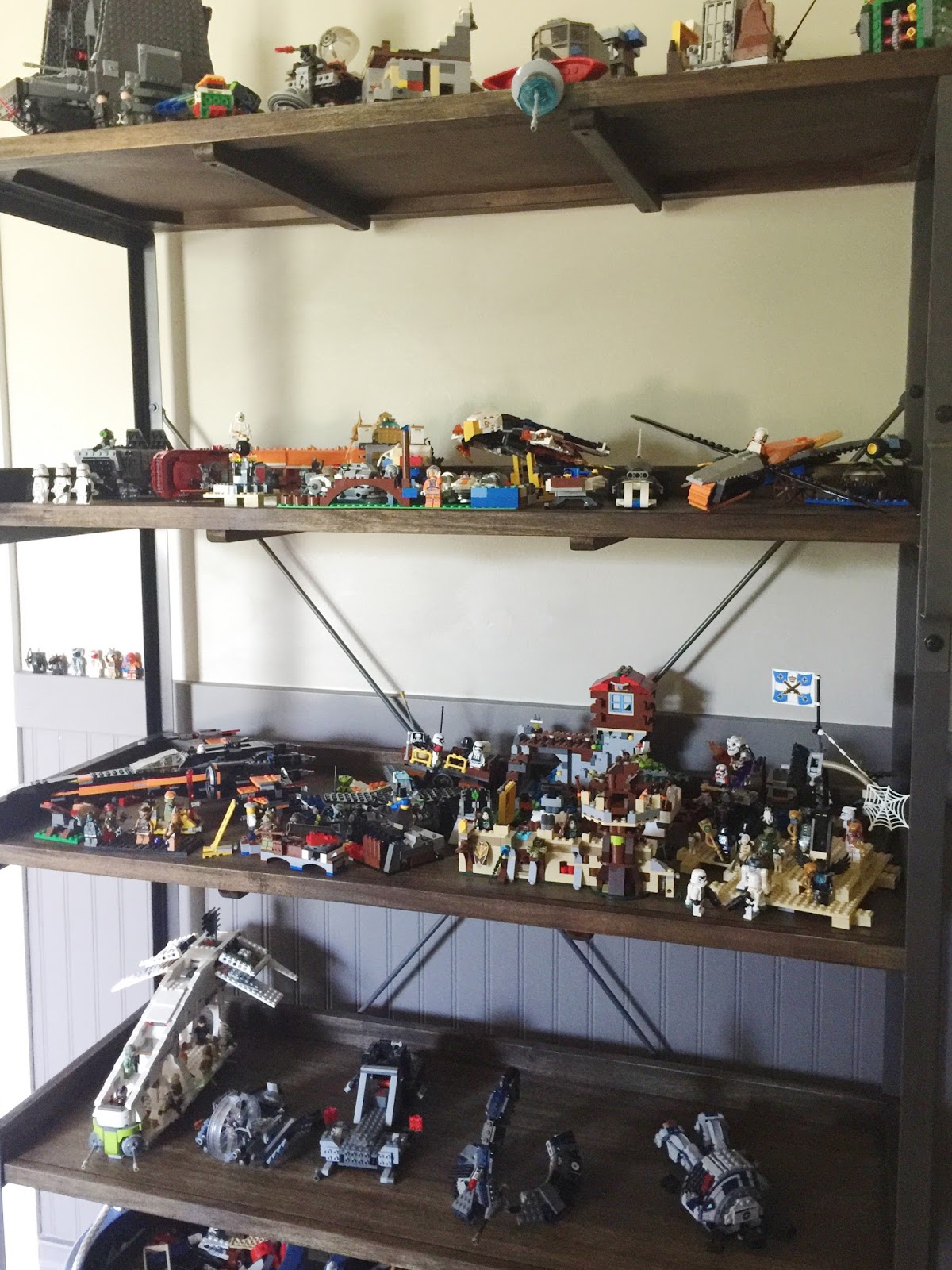
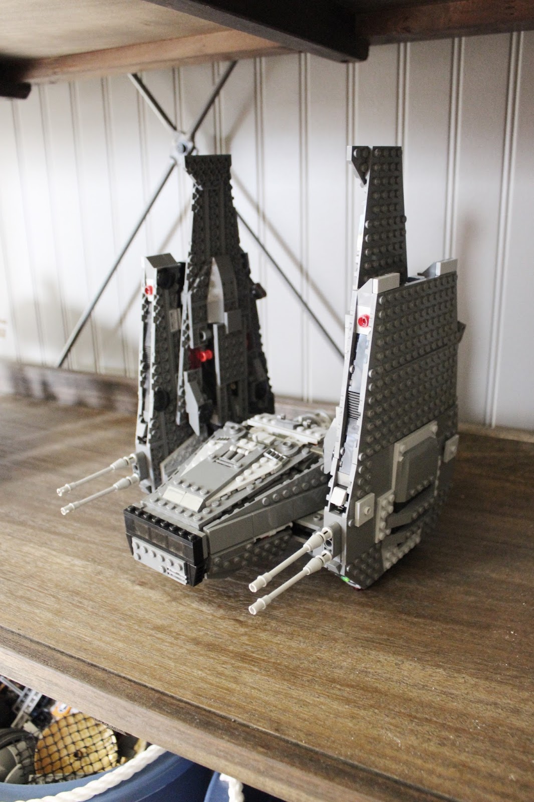
I could NOT be more pleased. This bookcase is a monster size, but it looks just right in the room. It has deep, wide shelves, perfect for showing off the Kylo Ren Command Shuttle and keeping it not-decimated. The wood is beautiful, the metal perfectly coordinates with the grey on the beadboard, and it is such a cool design for kids because-- get this-- foot rail and handles! They are actually allowed to climb the furniture to reach the top shelf (thank you, industrial-strength wall anchors). And it's manly enough to make the transition into the teen years.

For a brief moment I entertained fantasies that the bookcase would be styled just so...


...buuuut it basically just looks like the mess has migrated.


Still, I'm declaring victory because at least they're not on the floor. And I took the opportunity to photograph the room for posterity, since I've never done it, and since for this one brief moment it is free and clear of debris!


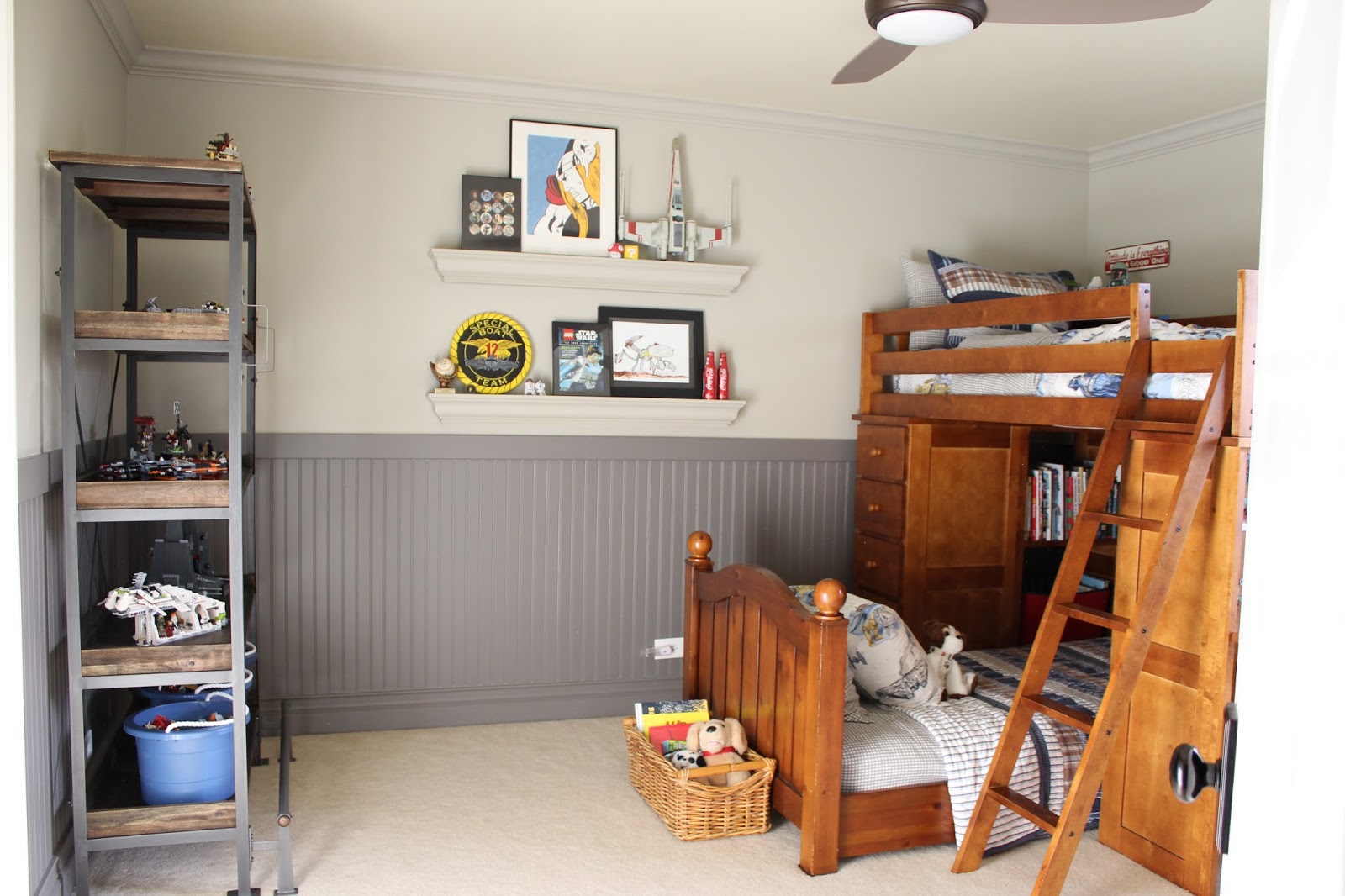
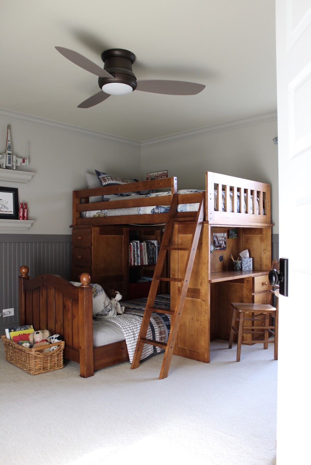
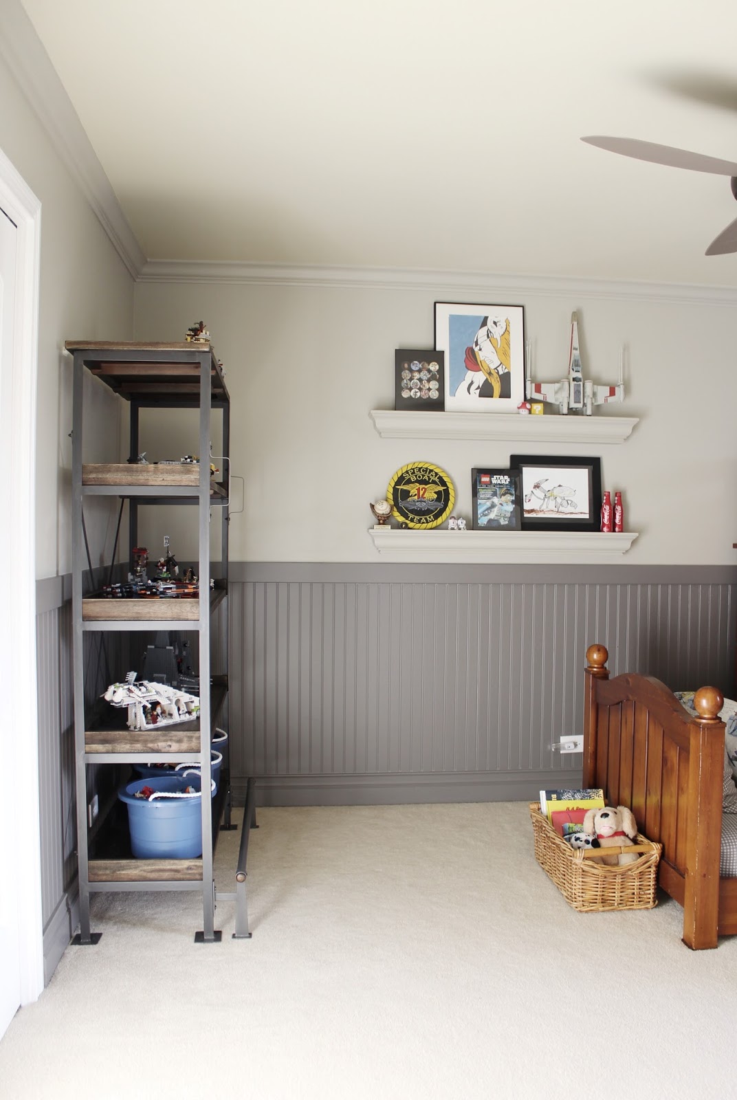
Ahhhh. Look at that glorious expanse of carpet. SANITY RESTORED. I WIN LEGOS!!!

Wednesday, February 17, 2016

Schoolhouse Style


Elements of schoolhouse style have been popular for at least the last half decade, from the boys rooms of RH, to the best of minimalist farmhouses. Traditional trademarks include the iconic acorn shaped pendant, plenty of glossy shiplap, distressed wood furniture, and industrial metals. 

The trick to getting it right today is to pick and choose a few key pieces, and avoid going bananas so that your place doesn't end up looking like, er, a schoolhouse. Here's how to incorporate the style, and keep it fresh and updated for 2016. 


First up, for frame of reference, is an actual historic schoolhouse. Let's break down the elements and take a closer look at what to bring home (and what to leave in your locker).

Bring it Home:

1. PORTRAITS

Check out George- he's even dipped! Adding a portrait or two is a great way to bring character and personality to your space. Cool designers would probably choose an original vintage over a poster of GDub, since that's, like, obviously fake and ridiculous right? But I would totally do it. First of all, I have a weird obsession with presidential history, but more legitimately, it's cheeky. I actually came this close to buying a portrait of him riding a dinosaur at Renegade. Ah, craft fair regrets. Expert tip we can all agree on though: It's a good idea to test the waters on an inexpensive piece at first, to make sure you're cool with the eyes following you to your bathroom in the middle of the night.


2. PLANKS

As the #shiplap trend continues to mow down any opposition in its path, the more planks right now the better. Floors, walls, ceiling, skinny, fat or short, it's all fair game. And it's my opinion that architecture is king. If you have ugly baseboards and drywall-meeting-drywall, no amount of mid-century foraging is going to make up the difference. Likewise, a room with outstanding architectural features hardly needs anything in it to be stunning. If you're torn about where to spend the money, start with the bones of the house.


Via deVOL

3. STACKS OF BOOKS

Somehow the design world has us convinced that minimalists are also book hoarders. While this can't possibly be true, the stylists have SO perfected the art of the sloppy stack that even the most staunch spartan is clamoring to pile unread 'zines against those white walls.

Via Kinfolk Home


4. THE POT-BELLY STOVE

Believe it or not, this hallmark of early Americana is making a comeback in a huge way. I see them all. the. time. lately in the most hipster of homes. And why not? Nothing says cozy like a giant oven in the middle of your room.


Via TrendLand (header image as well)

5. KEEP IT MINIMAL

For a myriad of reasons, minimalism is more than a current trend; It's a surging movement. The roots and spirit of utilitarian style are clearly seen in these early 20th century buildings. More often than not, they're all white. They boast simple shapes, time-worn materials, hand crafted furniture, and zero excess. Keep these tenets in mind, and make sure white space is a part of your design plan.

Via Design*Sponge

Via Dust-Jacket Attic

A few more tips? Think black, white & tan. Grab a schoolhouse clock. Upgrade to fantastic door hardware. And remember, cognac leather + tufting is always a good thing.


Doorknob  |  George  |  Pendant  |  Sink  |  Leather Chair  |  Fireplace  |  
Stool  |  Clock  |  Book  |  Watering Can  |  Buffalo Check Chair 


Now there are a few more obvious nods to the ol' schoolhouse that I would caution you to use sparingly. Since this trend has been around a while, the goal is to keep it fresh. So, while any one of these things can still be perfectly fine and wonderful, putting two or more in the same room can put you in that "bananas" zone we discussed earlier. And obviously, bananas have no business in the American educational system. So leave these in your locker:

Maps
American Flags
Chalkboards
Lanterns
Globes
Um, Lockers

What do you think? Can this trend stick around for a bit longer and still feel fresh? Or is it time for us to graduate?

Monday, July 27, 2015

Woods or Waves?


Heh, I just realized that post title probably implies we are going to discuss vacation destinations. No. Today we are discussing something far more interesting and frankly, critical, than vacations: Wallpaper.

I know that in my last post about the powder room, I sounded exceptionally decisive about my Cole & Sons Woods wallpaper choice. And I was. The problem is, a week has passed. So, naturally I'm all like "Ooh, but maybe this one would be better..." again.

When I ordered the sample of Woods, so that I could lovingly tack it up and stare at it over the next few months with joyful expectation as the room is under construction, I also ordered- totally on a whim and because it was pretty even though I figured I'd never actually use it but samples are free so who cares- the "Great Wave" pattern.


Two things happened when these samples arrived. One, I adored the Great Wave paper. And two, my daughter insisted that I was NOT to use the Woods wallpaper in the bathroom. (I know it's only because she wants to get her claws on it for her own room...she's like that, and she's going through a Narnia phase).

Once I assured her I would NOT be purchasing that paper for her room at $200 a roll, young lady, and she gave me the stink eye one more time before sauntering off, it was too late. The mere suggestion from someone that I shouldn't use that paper in my powder room reopened the flood gates of indecision.

Now don't get me wrong. I equally adored the Woods paper. It is every bit as glorious in real life as I hoped it would be.


Even as a 12" rectangle, taped to a 2 x 4 in a wall-less room next to a cardboard cutout of a mirror and an empty electrical box, it STILL looks uh-mazing.


But there's just something about those waves! The dusty blue colors, the graphic repeat, the whimsy of it. The unexpectedness! My house has no whimsy. Or color. Or unexpectedness.

Clearly, the only thing to do was revisit my Canva elevation, and then call on the blogosphere for a vote.

I adjusted the scale of the Woods wallpaper now that I have the sample and can see how it will lay out more accurately on the wall, and I did a second graphic with the paper switched to Great Wave.


I don't know you guys. Am I really going to miss the opportunity to use a wallpaper that is so iconic and massively appealing it inspires 50-deep round-up post "Extravaganzas?" Am I really going to do something as permanent as wallpaper and choose blue?

Obviously I need you! What's your vote? Are you Team Woods or Team Wave? (I will send you t-shirts and 40-oz. cups emblazoned with your team name if you comment and vote. Not really). Maybe you're Team Option C. I'm listening...the flood gates of indecision are open again, right? So I'm all ears.

(The curious may enjoy seeing poll results from Instagram...)

Monday, July 20, 2015

Powder Room Update


Hi guys!

Well, I hope I'm not jinxing anything by writing this post, but I'm too giddy not to share. Construction has resumed on our powder room! Long time readers will remember me moaning well over a year ago about how we would love a bathroom on our main floor (we don't have one; long story), and may even remember the panic room post from last summer about our failed stalled construction on that project.

It hasn't been touched since that post. And it still looked exactly the same, until we got home from our vacation last week (because, seriously, who can visit a house like that and not get the bug to renovate?) We had a long talk on our car ride home about how to pull this off, and shortly after our return, my kitchen was once again hosting door frame builds. Finally!


Happily, Ryan's had a year to recover from major construction, and got to hit a few softballs on our bedroom remake, so he's ready to dive back in and pick up the power tools on this long-forgotten powder room. In fact, I'm listening to the power saw as I write this post. Sweet sweet music.

Here's why I might be jinxing it right now. We have to hire a plumber. And my husband- admiringly so- has never agreed to do that before. He has demolished a bathroom, rerouted pipes, including the main sewage line of our house, fixed our broken water heater (more than once), fixed all the toilets, and installed new faucets, totally on his own. But we've finally broken him. Adding new plumbing from scratch and making a bathroom where there wasn't one is just too scary, even for my fearless handy man.

Imagine this: You just sawed a hole in the floor next to your kitchen. As you look down into it you can see through to your basement. You see the plastic storage bins stacked just so on wire shelves, the pool table that's covered in lamps your wife used to like, and way too many cobwebs.

Now, make it so someone can pee in the hole.

{100% naturally occurring wood marks; No 2 x 4's were harmed in the making of this post}

See? Too scary. So the options came down to this: 1) Leave the room a rubble pile forever, 2) Drywall it back up and pretend it never happened (probably Ryan's first choice), or 3), Hire someone for the scary parts. We agreed he would get a quote for option 3. Note that he did not agree to DO option 3.

So, this may go nowhere. But he does seem motivated, and has been working quite diligently on it since we got home. He even went so far as to let me get him a plumber recommendation. I, of course, went straight to work revising the design plan and dreaming about wall paper.


We are modifying our original plan slightly and trying for a metal console sink base instead of a porcelain one. I wanted something that was still classic but a little more modern and a little less cottage.

{via RH}

What's that? I can't afford that sink even in my wildest dreams? Oh, pshh, technicalities. We ordered some parts today and I have high hopes that it will be a DIY post in the near future. Cross your fingers for us!

My plan was always to do hex tile on the floor with some sort of pattern. But because of the switch to wallpaper (see below) I'm sticking with plain marble. In order to further keep it from being too busy (and thanks to this photo by Lucy Laught), I'm going with a larger 2" scale.


And get this- after hours of searching online for sconces, I remembered we had two unopened RH sconces in the basement! (Yeah, that's bad, I know).


{Wilshire by RH}

I had been searching for something a little more modern...maybe antique brass, maybe copper, possibly a little bit mid-century, but then I remembered I had these and thought hey, why complicate this? These are timeless and they're already in my house. Done.

I'm still loving the mirror we picked up at the Heritage Barn Sale for this project, and miraculously, in spite of a year-long stay on the panic room floor, it's still in one piece!


I'm not still loving the idea of blush pink paint (even though I of course still love the idea of blush pink paint). It's just that how can I not take this opportunity to put amazing wallpaper in my house? I have been uncontrollably pinning wallpaper.


I love the Woods wallpaper by Cole and Son. My single concern was that it is everywhere and I didn't really want to jump on any trend bandwagons. I'm hoping for a room that is purely classic and could go any which way- a little bit modern farmhouse, a little bit Parisian apartment, a little bit minimalist. But I couldn't find anything I liked better than those trees, and everything I pinned was basically me trying to find something that was those trees without being those trees. Know what I mean? So I decided to just go with them.

Then I read this by Grace Bonney:

"I went back and forth on including this wallpaper, but ultimately landed on including it for one reason: I still love it and remember it fondly. This paper got majorly overexposed during the early Domino Magazine years. It was the precursor to “Keep Calm” madness and seemed to pop up in everyone’s home. I had to stop looking at it for a while, but when I thought about wallpapers I love and still love seeing in people’s homes, this one was literally the first I thought of. Nature is timeless, so I think the strength of this design (which was actually created in 1959) is that it may go through bouts of overexposure, but the design itself is beautiful and classic."

~ Grace Bonney, "12 Wallpapers We Trust"

And I feel better. Yay!

I did seriously entertain this stunning large-scale floral print:


But in the end, it just kept coming back to the Woods. Ryan made his classic crack: "I've said this to you before, Laura, but I think you use too much color."


I like the way that the tiles and the wallpaper have a ton of pattern but still manage to feel like a serene backdrop because of the monochromatic palette. To me, it feels beautiful and classic. 

Of course today it looks like this....so....not...beautiful or classic....


We have a long way to go! But at least there is hope. 

 
Blogging tips