Showing posts with label styling. Show all posts

Thursday, April 27, 2017

Guest Room Styling with Serena & Lily


It's been busy in such a good way!! I just got back from an unbelievable trip to High Point Market, which is the world's largest to-the-trade furniture/ home decor show. The scope and magnitude are impossible to describe, but let's just say my brain exploded. Multiple times. (See the highlights here). I am also on Week 4 of 6 with the One Room Challenge over at Laura Design Co., and as if all that wasn't wonderful enough, my mom came to sneak in a quick visit from California!

Our guest room has been quite neglected, and I've been wanting to spruce it up for a while now. Mom's visit happened to coincide with Serena & Lily reaching out to see if they could send me a product to review. (Apparently somehow they were tipped off to the fact that I stalk their website on a near daily basis). One of the options was the Lanai Mirror- which seriously- I have been eyeing for MONTHS, and maybe even years, so I knew it would be a great fit for the guest room dresser immediately. In case you're curious, I went with the larger of the two sizes.

If you're not familiar with Serena & Lily, they are one of my top 3 favorite retailers. Their style is classic, preppy and a little bit coastal. Seriously, the last time I saw one of their ads in a magazine, I tore it out and carried it around with me for a week. This is what a nerd I am.

The mirror was here in no time and was just as gorgeous in real life as it was in their catalog (and my dreams). The fates even converged so that our magnolia tree popped, giving me fresh branches to style with! Ready to see it?


This room was long ago a nursery, but I painted it this deep navy (Naval by Sherwin Williams, one of our favorite go-to Navy blues), knowing that it would transition seamlessly into a guest room. I have a floral duvet cover (from RH over a decade ago) that I've always loved and am designing the room around. Now that this dresser is styled, of course, it makes me want to finish the room!


The rest of the room is pretty close...we just need a headboard (tough choices anyone?), a little more art, and some styling and we'll be there. But a huge thanks goes to Serena & Lily for the lovely mirror and a good start on finally finishing this room!


This post was sponsored by Serena & Lily, for which I am very grateful, in the form of product for review. As always, I would only recommend brands on this blog that I would share with my best friends at our weekly playdate. 


Monday, August 18, 2014

one bookcase, four ways (yes. four.)


since starting this blog, i am beyond excited (and quite surprised) to report that the amount of texts, emails, and face-to-face inquiries i've gotten that begin with "can you give me some design advice for..." has increased exponentially.

i am serious when i tell you that nothing thrills me more. i've gotten to pick out counters, consult on lighting, and help out with drapery, to name a few, and next up on my to-do list are accessorizing a living room and styling a bathroom. but the one i'm working on today has been the hardest so far, and i decided i need to blog about it in real-time. this little corner of the internet really has become a way for me to journal out all the creativity and ideas swirling in my head and sharpen them into focus. and i've been doing a lot of swirling on this one, so it's time to get those ideas onto paper, er, screen.


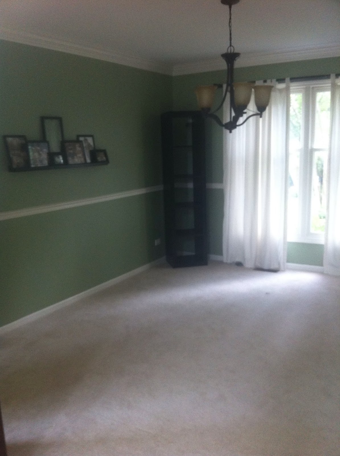
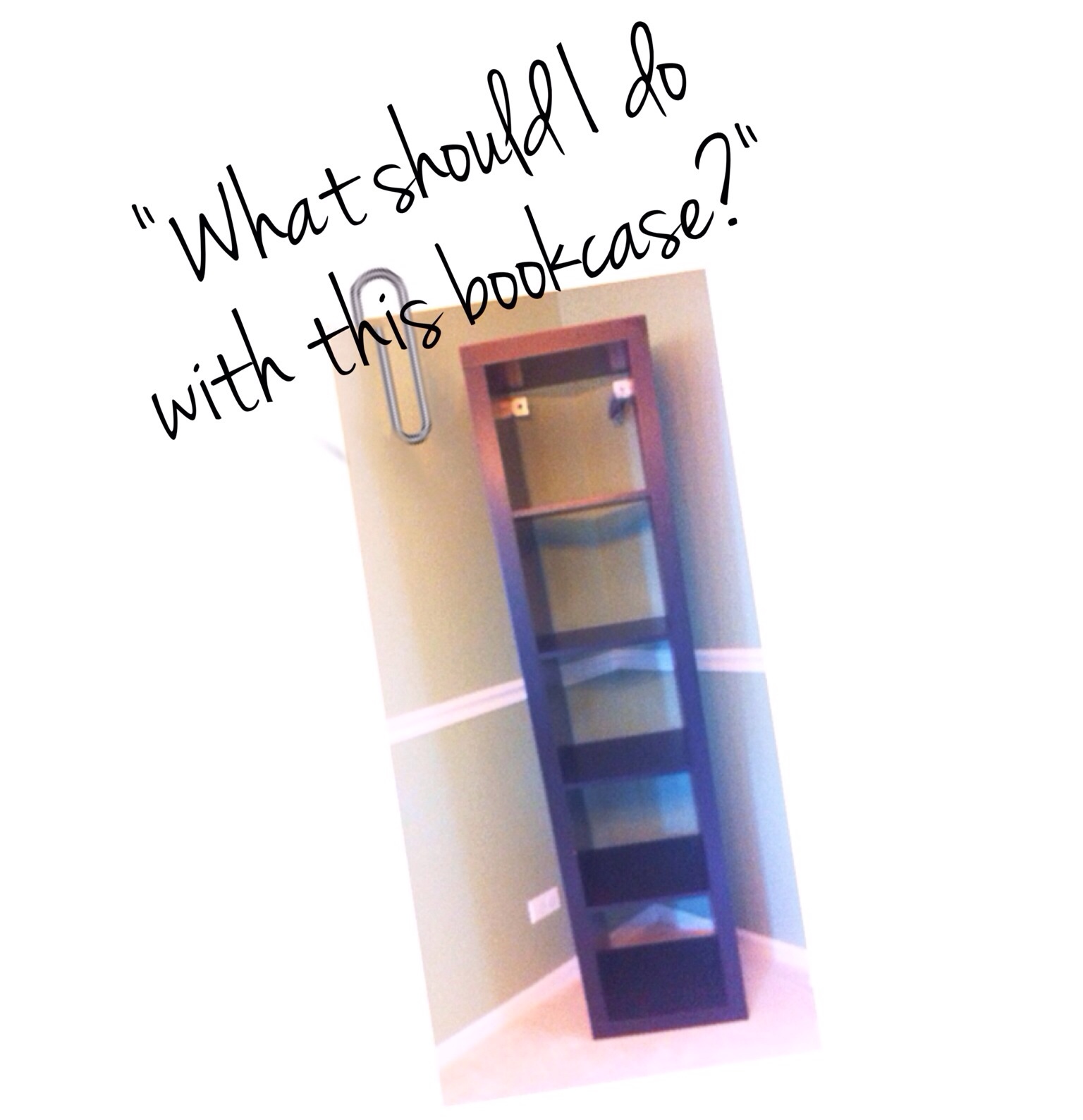
the inquiry was from a sweet friend of mine, christie, and was basically "what should i do with this bookcase?" it is one of those tall, skinny bookcases with five square openings. besides needing to clear my head, i'm sharing this because i don't know anyone who doesn't have one of these in their house. and they are tricky to style! they have a lot of openings, all of which are very small, and they don't provide any privacy for your less-than-lovely possessions. they almost never look right on their own, but purchasing a second one or finding something to balance the height in your room will (duh) double your budget. not cool.
now, speaking of budget, i didn't even ask about it. i remember one time how christie's husband looked at me with 
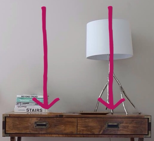
mortification when i said i hoped our garage door would break so i could have a new one. seriously, i horrified him. (what? that sounds like a perfectly reasonable hope to me! right?!) and they just bought a new house. so i know they don't want to spend a lot to style a little bookcase in the corner of the dining room. who does? i'm going to want to keep this as wallet-friendly as possible. here is the bookcase in the room:


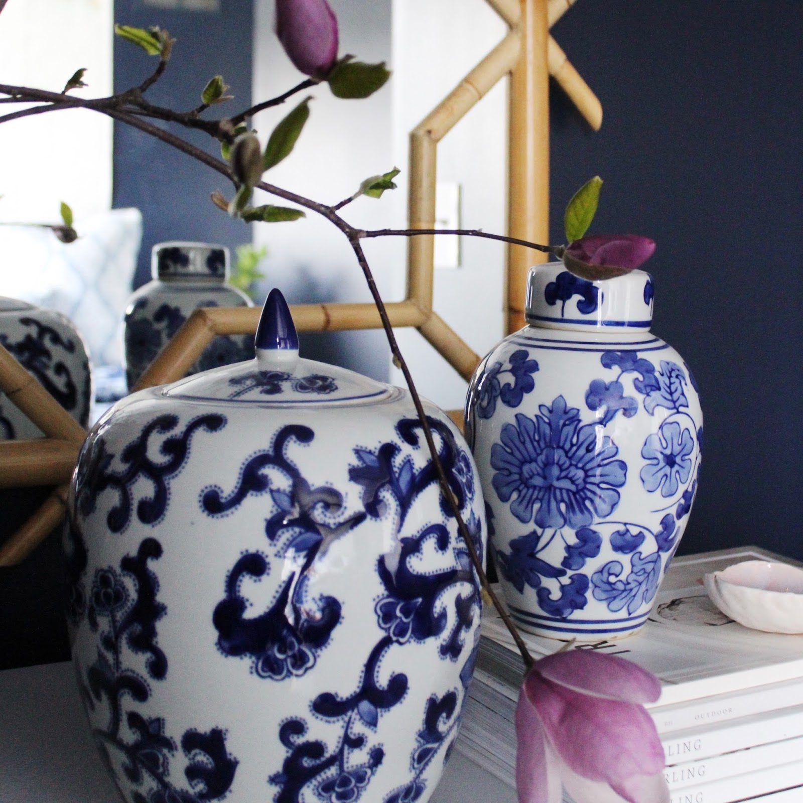
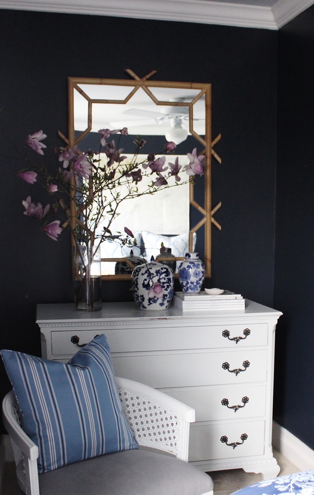
problem one: her style is "cottage...reclaimed barn wood, white and homey." his style is "the industrial look." hmm...ok. problem two: her colors are in the turquoise, navy and yellow realm; his favorite color scheme is restoration hardware (which, in case you don't know, is grey, grey, beige, and grey). problem three: "i currently have no existing accessories i want to use. i'm starting from scratch!" now, some might think this is a designer's dream statement. no no no. let me explain. not only does it mean there is no relief for your budget, but you have basically no direction or jumping off point. this can send even the most seasoned designer into option-overload.


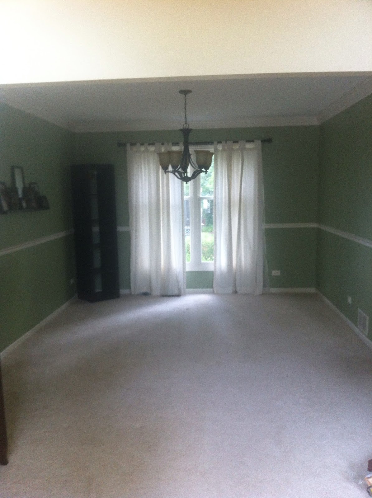
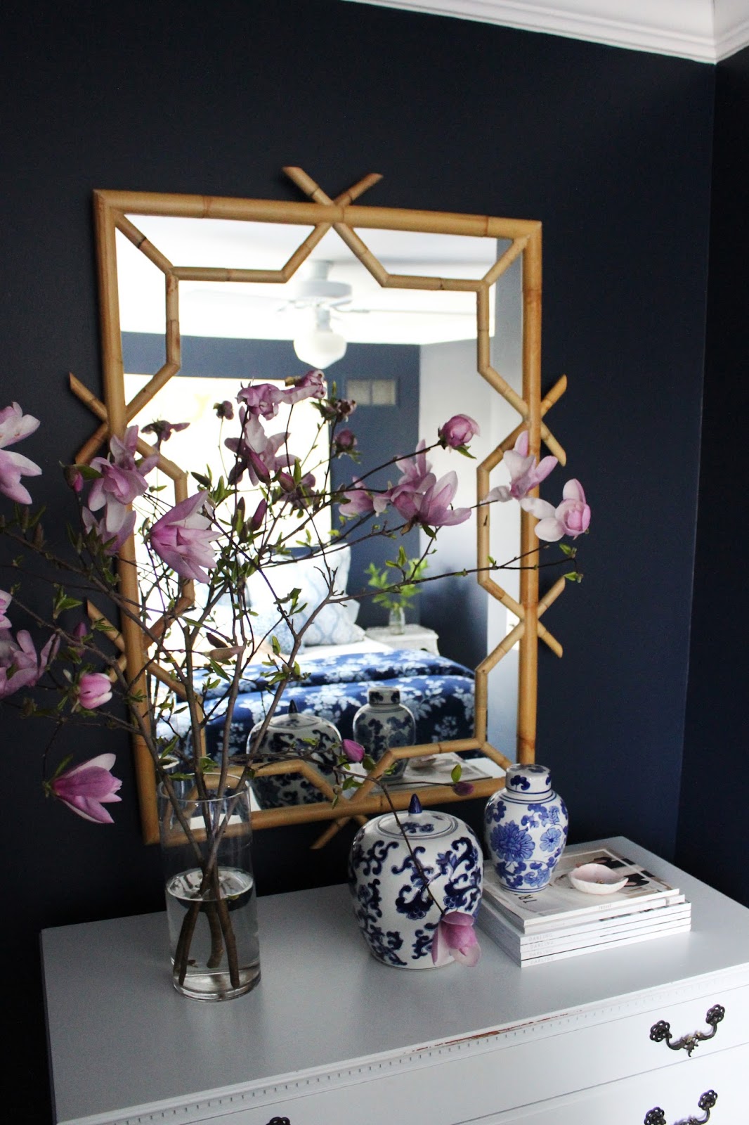
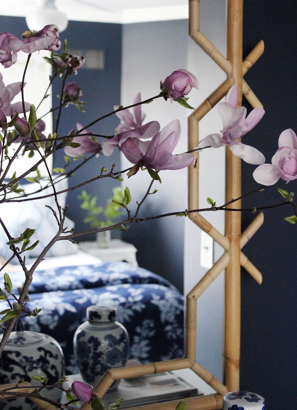
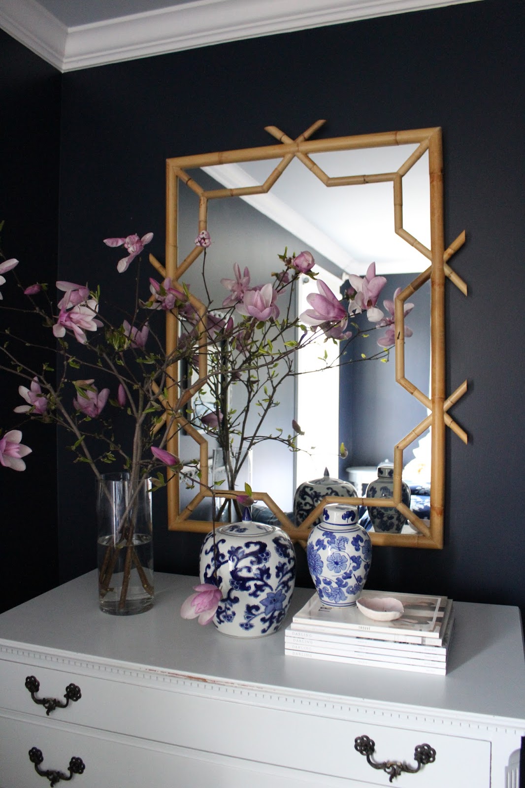
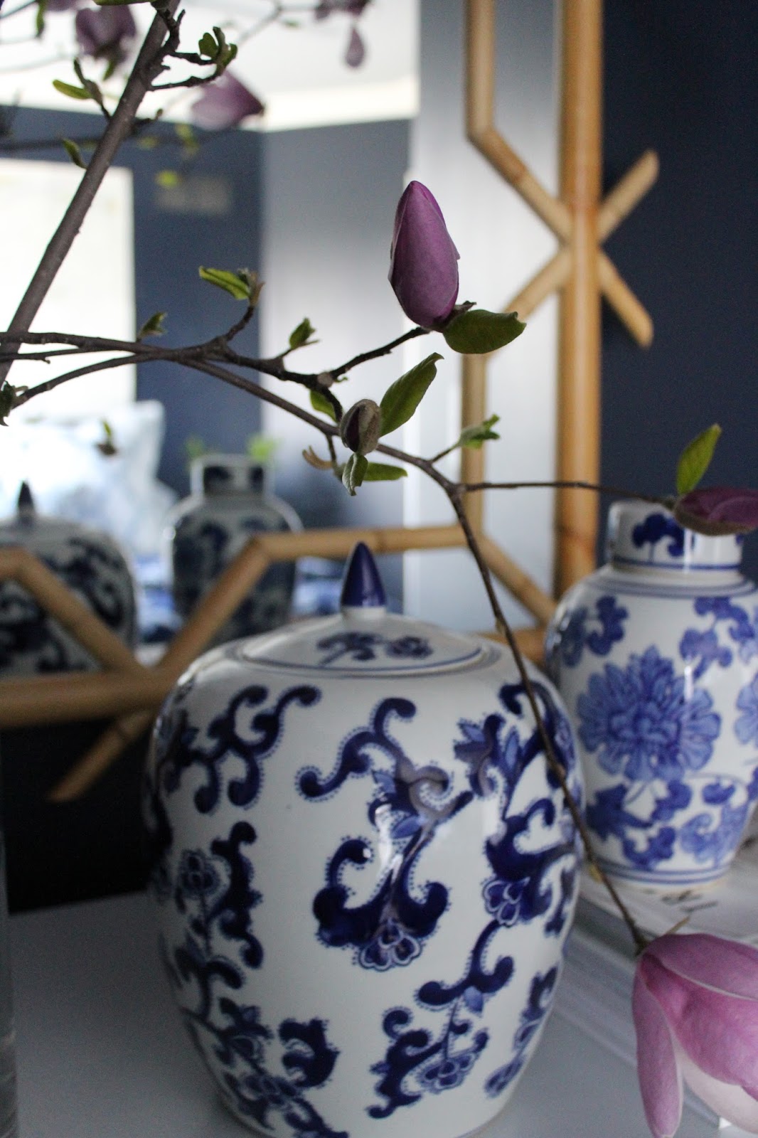
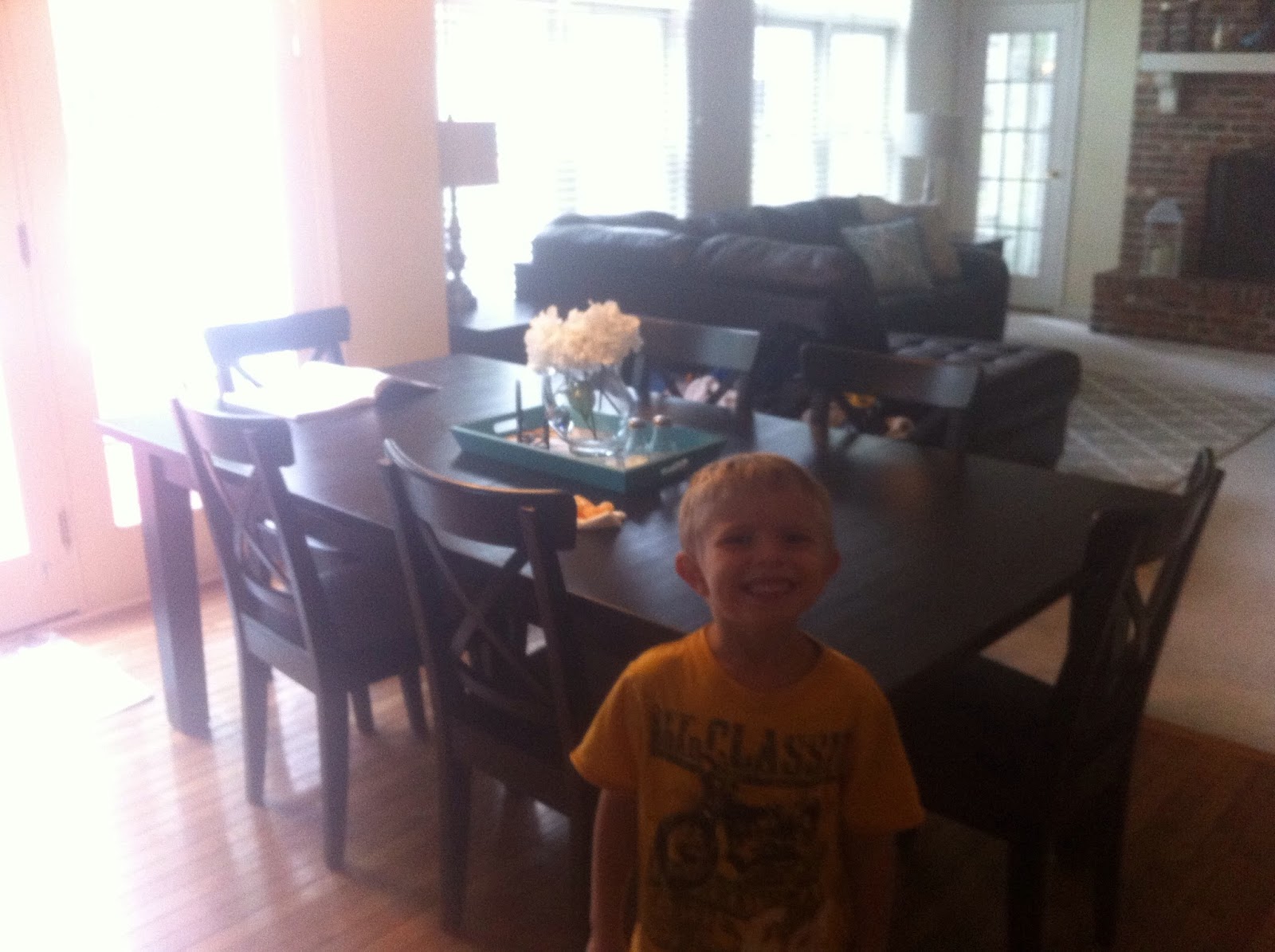
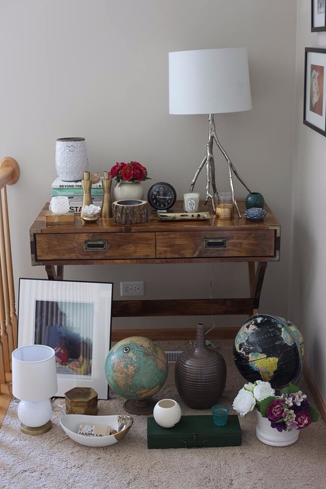
the surrounding environment isn't offering any inspiration either. the walls are being painted grey, the curtains are white, and the table is black. so the sky's the limit. darn darn darny darn! (i know, i know. #firstworldproblems.) here's a look at the table, and a peek into the rest of her gorgeous house for some style clues:


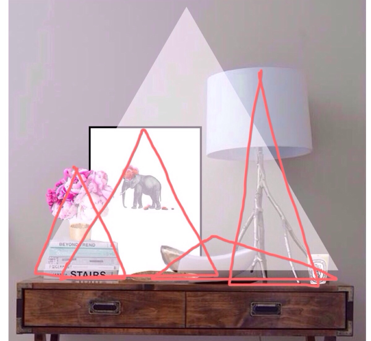
try not to be distracted by overly adorable photobombing kid. alright. now you know why i have 
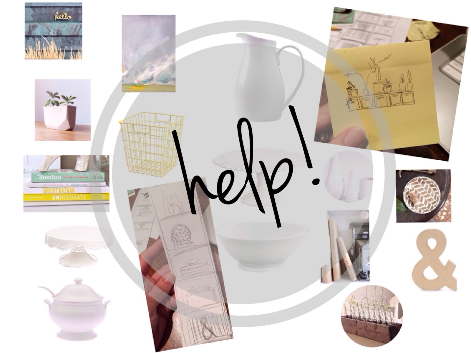
four (yes, four) answers to the question "what should i do with this bookcase." so here we go:

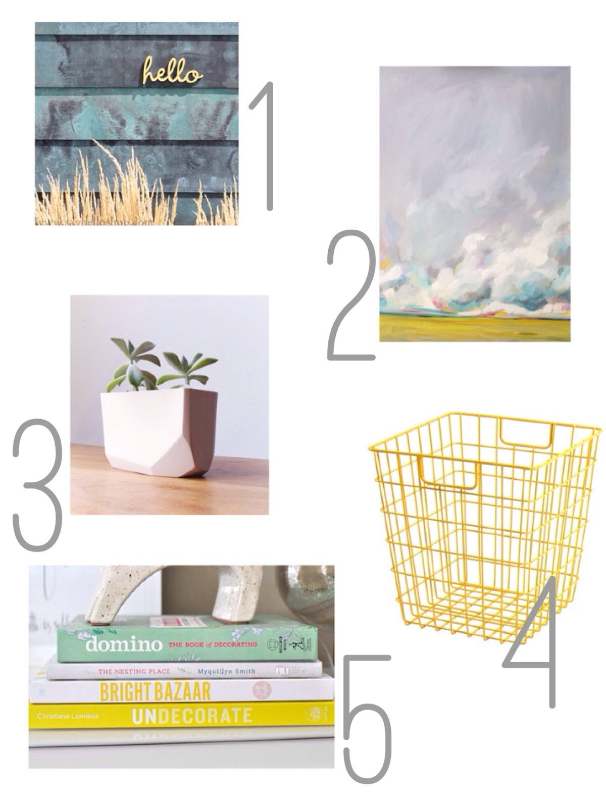
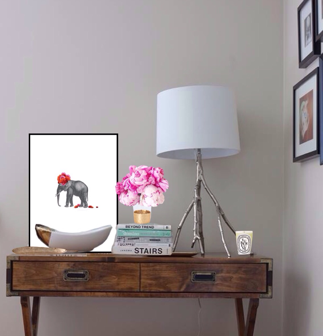
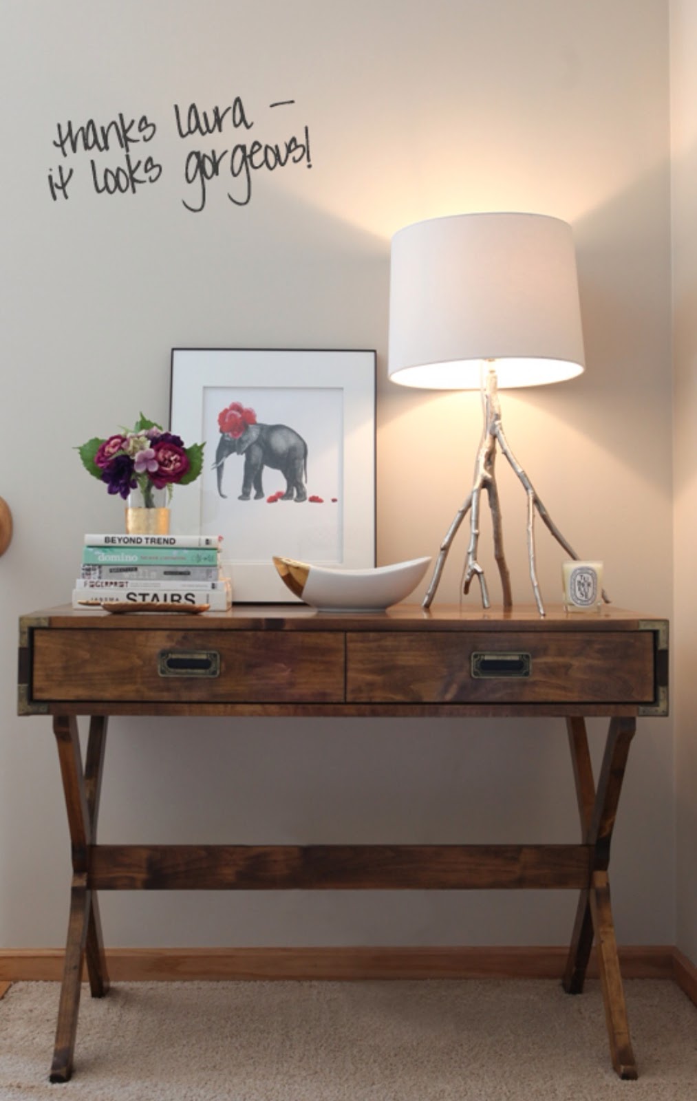
option one: stylishly styled

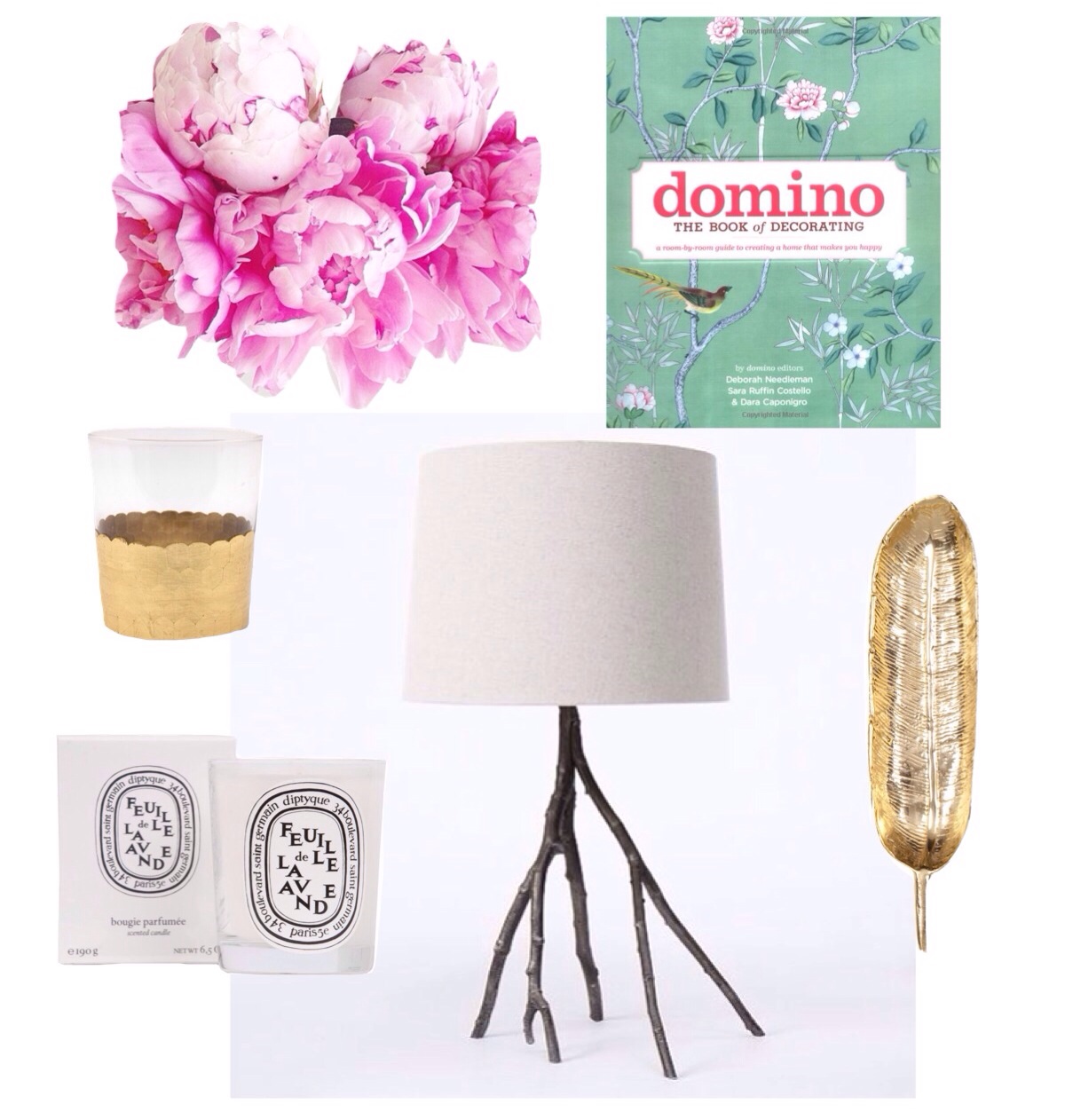
in option one, i'm going shopping with actual money, (ok, well, imaginary money, but you know what i mean). i'm trying to keep it reigned in and affordable though. admittedly, this look is a little more for the lady of the house, with these bright colors, but it's still got a nod to industrial-cool.

the ingredients:
1. hello sign (spray that baby bright white and add a tiny bit of antique glaze on top for a distressed feel)
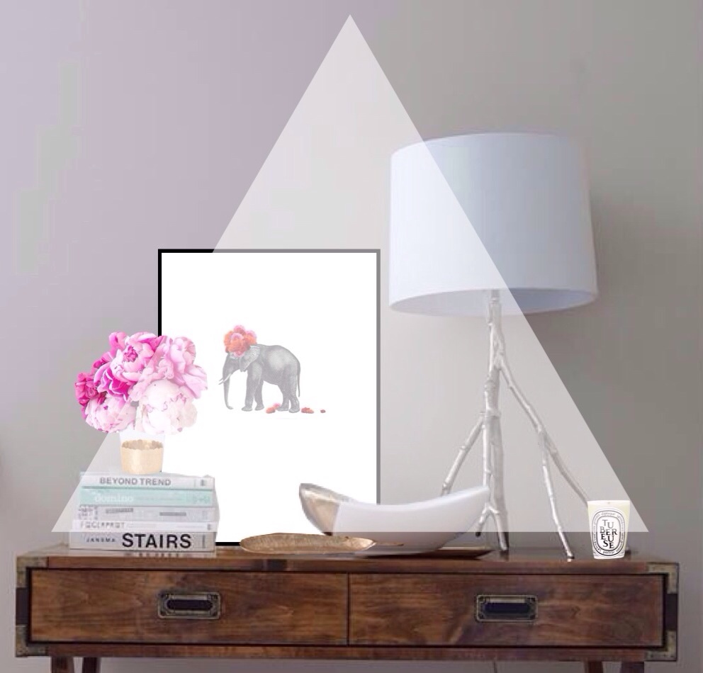
2. emily jeffords art print, mid-summertime  (8 x 10, no mat, in a white frame)
3. geometric planter (the shape of this planter will take you to the trend-edge, but you can bring it back to cottage comfort with faux ranunculus stems)
4. industrial baskets (set of two, filled with some pretty table linens)
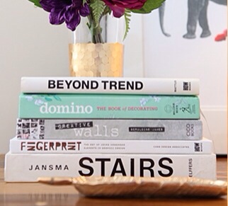
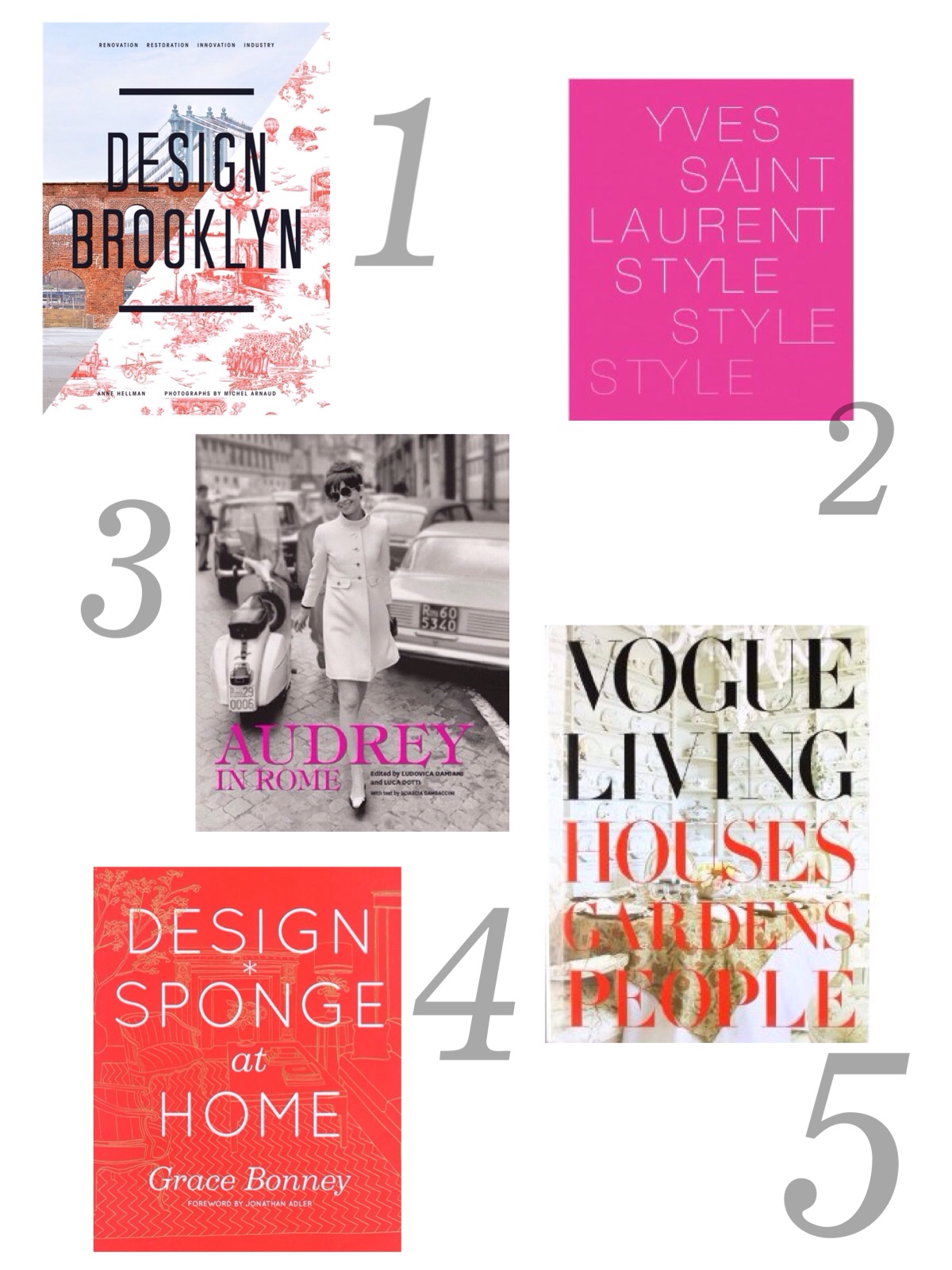
5. lovely-to-look-at books (grace at the big reveal has the. perfect. stack.)

the arrangement:

top shelf: hello sign sitting in front of the art print
2nd shelf: stack of horizontal books with geometric planter on top
3rd shelf: basket
4th shelf: vertical books and/or magazines with white spines, and maybe one turquoise sleeve if you can find it (check half price books!)
bottom shelf: second basket

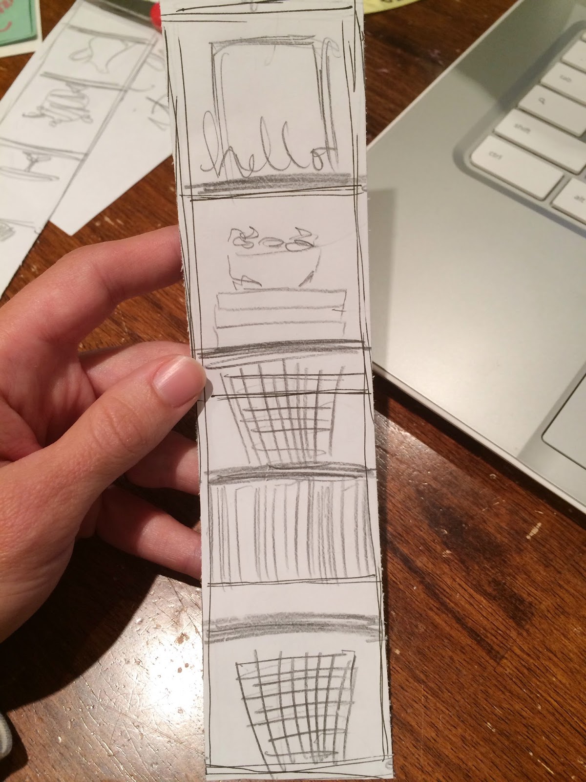
wow! i love it so much i don't really need to move on. but yes i do. i found sooo many great diy's...


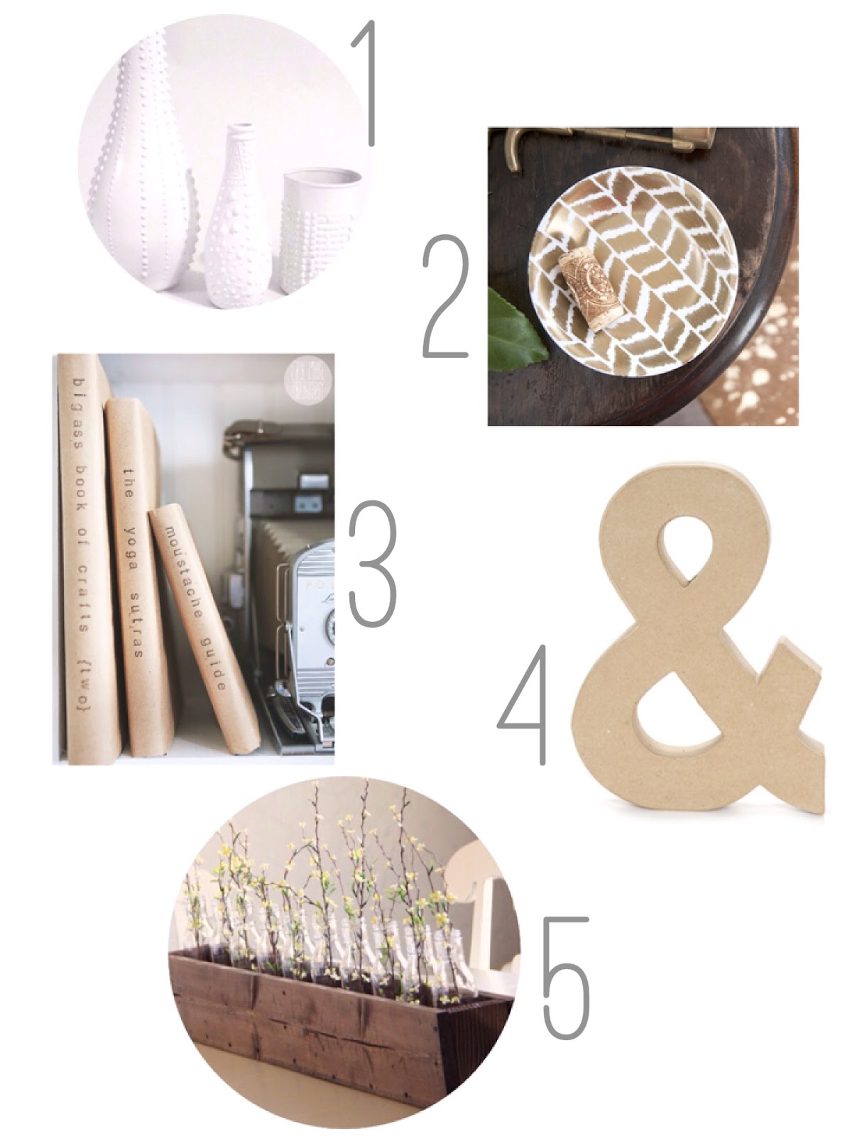
option two: showin' off your diy prowess

the basic idea here will be the same as number one, to have a 'stylishly styled' bookcase. but this will be the way-budget-friendlier option as every shelf will have something you lovingly (and cheaply) create for it. it will also suit the hubby a little better, with more muted colors and a mix of metals.

the ingredients:


1. the design*sponge classic faux porcelain vases
2. the genius herringbone platter by house of earnest (this plate will work nicely- no rims!)
3. stamped book covers from chloe moore photography
4. distressed wood box by shanty 2 chic (width shortened to fit your bookcase, obviously)
5. faux zinc ampersand (using this ampersand and this tutorial by stephanie hickox)

the arrangement:


top shelf: vases, a group of three (keep in mind the triangle rule and vary the heights!)
2nd shelf: plate (stand it up on a mini easel)
3rd shelf: 3 horizontal books with stamped covers, and go forage for a hefty and pretty rock to place on top
4th shelf: wood box (put those ranunculus in there- i love those things!)
bottom shelf: more covered and stamped books, this time standing vertically, with the ampersand in front

alright, now i like that one the best. sheesh, this is hard. moving on...


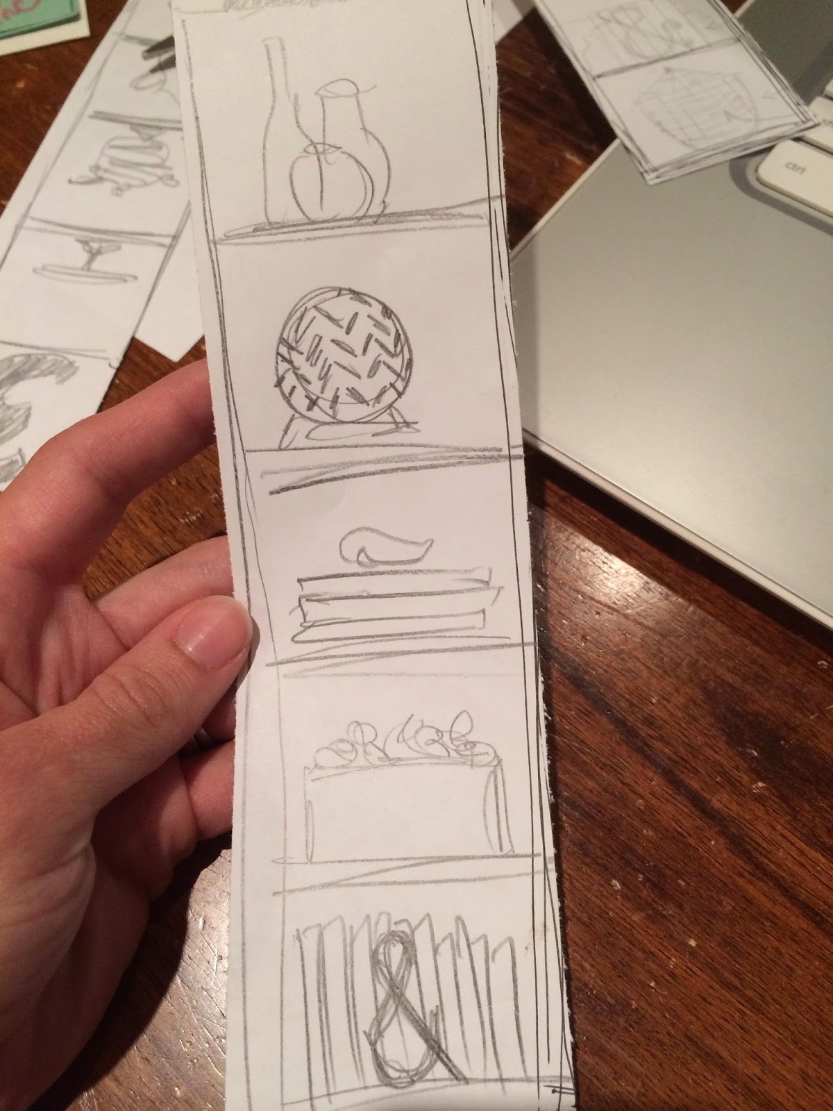
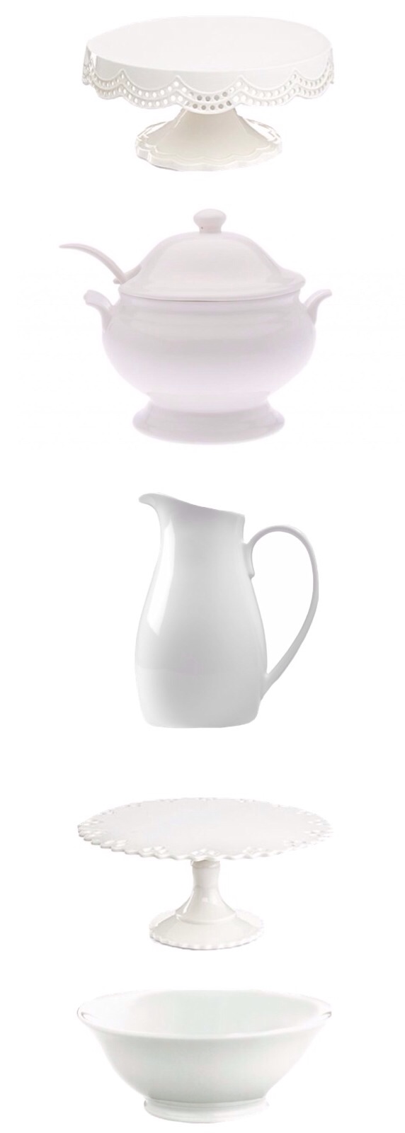
option three: shelve your serveware

you know, this is a dining room after all, so what better spot to house that less-often-used serveware than right here on shelves that need stuff on them? i don't know if you already have a serveware collection started, but you can. not. go. wrong. with. whiteware. it will always look classy and timeless, and this is by far the easiest way you could style dining room shelves.

the ingredients: 


1. scalloped cake stand
2. soup toureen
3. pitcher
4. pierced cake stand
5. footed bowl

the arrangement:

see above. place them in that order, one per shelf, and you are good to go. wow, that was easy!

i realize that even though these are by no means the highest-end pieces out there, this is a bit of an expensive option when you add it up. the good news is, if you can spare the patience, it's a collection that is easily thrifted or found at flea markets (or your grandma's cupboards) over time. if you know what to keep an eye out for, it's quite easy to pull together as you're out and about and see deals. and a collection like this would be well worth the extra effort.


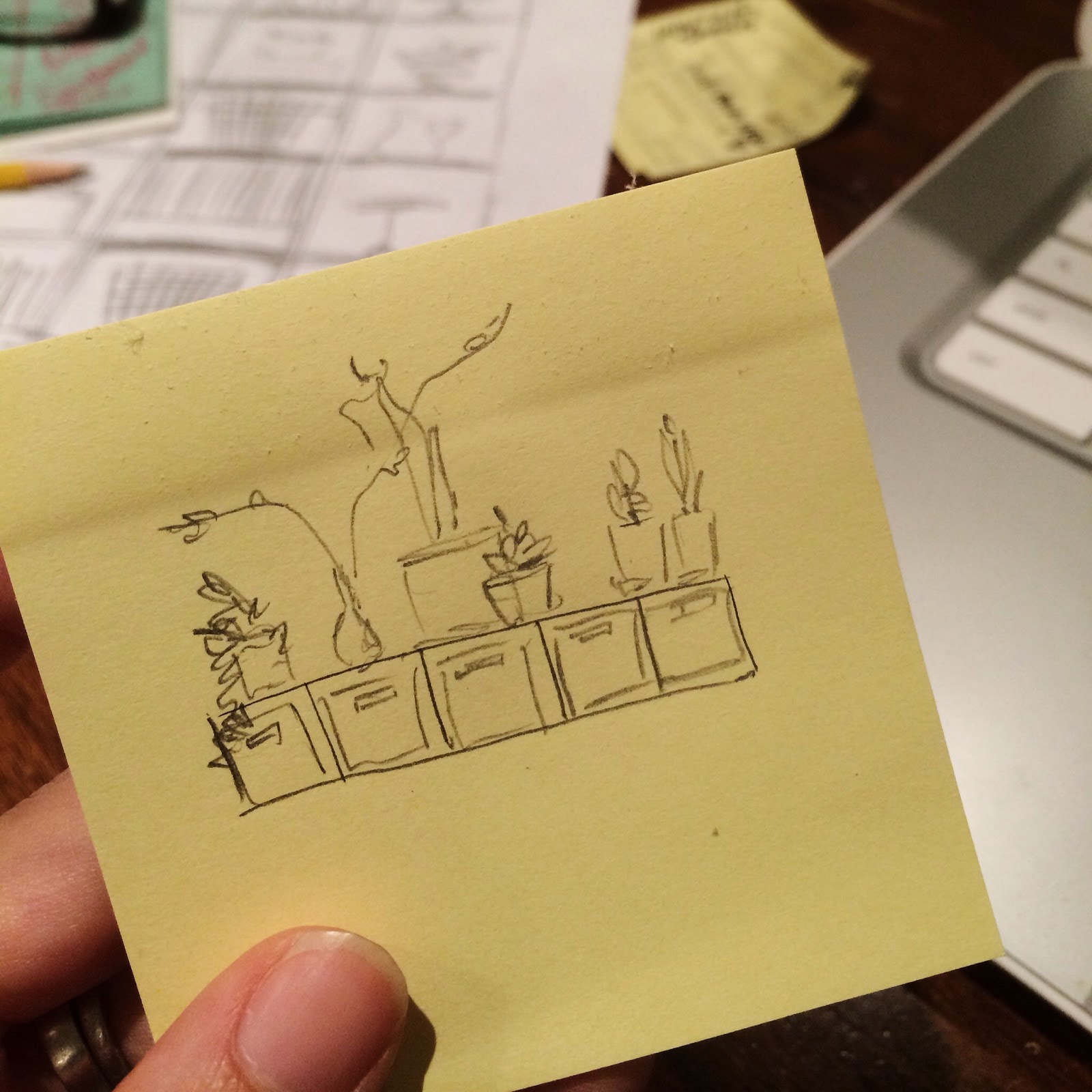
option four: think outside the bookcase

i have to mention this. i'm not sold on it, but i still have to mention it. i've seen a lot of pinterest-folk flipping these bookcases on their sides. you could give it a try and see what you think. you might end up having a lot of storage and a pretty perch for plants under that window. i'd put these grey flannel storage bins in there, and a whole bunch of house plants on top (so on-trend, you know). here's my doodle of the idea:


just sayin'. think about it.


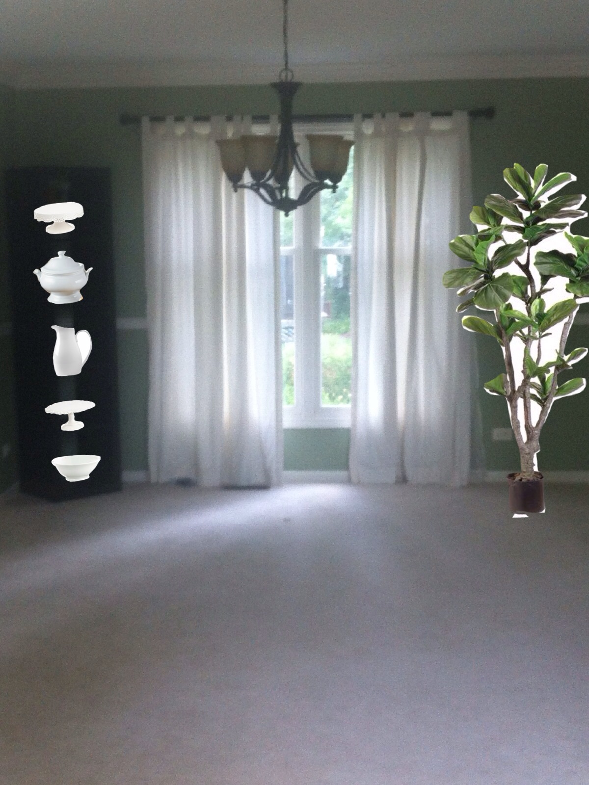
not an option: balance it out

here's the deal. you just can't have this bookcase on its own. it's too tall, dark and heavy (and now gorgeously styled!) to be without a friend. my suggestion, if you go with option one, two, or three, is to do a tall plant, or a chair with artwork, on the other side of the window. i also suggest placing the bookcase flush against the window wall instead of diagonally in the corner. everything will feel better that way.


please forgive the poor man's photoshop butchered graphic. seriously i can't believe i even put that on my blog. but i really want to be helpful, so hopefully this gives you the idea. balance is good.


unsolicited extra: let there be light!

i came across this just now and almost freaked out when i saw it, and then did freak out when i saw it came with a yellow cord option. i mean, does it get any more industrial-cottage-resto-happy-colors blended than this?? and at a very budget-friendly 99 dollars, this pendant (or two) over that black table would be like, so super awesome.

{west elm industrial glass pendant with yellow cord set}

well, christie my friend, hopefully this doesn't put you into option-overload! (anyone else want to vote on it for her??) let us know what you decide and send pics!! and thanks so much for inviting me to work on this one!!


Friday, June 13, 2014

how to style a desk


a couple weeks ago, i posted something random on facebook, and a former neighbor of mine commented on it. it occurred to me when her name popped up: she's artsy. and i bet she takes great photos. i'll look her up on instagram. well, i did, and turned out, she had a blog. i went to said blog, was blown away, and now she's my new obsession. if i can put in perspective for you how good she is, i only subscribe via email to two blogs. hers is one of them.

everyone, meet kyla from house of hipsters.

naturally i stalked her in every way possible, as one should properly behave with any blog crush. and when she suggested that i help her style a tricky desk, it took me about -2 seconds to say "yes please."

the problem was, i have these three darling children with me all the time, so it's kind of hard to find time for geek dates right now.

enter technology that solves all of life's problems. first, kyla emailed me pictures of her desk and all the things she could put on it. then, i used my ipad to mock up some options. i sent them to her, she picked her favorite, styled the desk using my photo like a map, and voila! there was a beautifully styled desk. man, if i didn't have to sleep i could do this for a living!

before this experience, i would have said "just move things around until it feels right." but that isn't really helpful advice, and it certainly wasn't working for kyla. so let me share some more specific instructions for the times you get "stuck" trying to arrange things at your house.


STEP 1 // GATHER

first of all, i believe every beautifully styled surface has four physical elements: a lamp, pretty books, flowers, and a few knick knacks that you love.

i am proud to say that kyla's project was done for $0, because she had already collected everything we used. so, start by shopping your house. gather everything you possibly can and give yourself options. this is the photo that came to me after kyla "shopped" her house:


i lucked out on this project, because she had great stuff. (diptique candle! domino book)! if you feel your stuff is a little lackluster, look beyond the shell to the shape. can a little diy magic revive a piece? for instance, see that white and gold bowl up there? i'm sure you have something laying around that could look as good with a little paint. in fact, one of my first thoughts was to spray the branch lamp white (because i want to spray everything in life white; it's kind of a problem).


STEP 2 // CHOOSE

once you have everything gathered, pick out your four essentials:

A. lamp. try to choose one with some height; this should be the tallest piece on your surface. 

B. books. for now, select a stack of 4-5. you can vary the height later.

C. flowers. you'll want to pick stems that match everything else you do, so just choose a vase for now and reserve some mental space to add your blooms at the end.

D. knick knacks. sort through and pull out what you love the most from among the items you gathered, and that generally "feel" good sitting next to the lamp and books you chose. i literally looked at kyla's picture and picked out my favorite things when i did this project.


{peony photo by the chic element on instagram (gorgeous feed!); 
sources for all the other items are listed at kyla's blog}


a few tips

~ mixing finishes, especially metals, adds visual interest. that is why i quickly abandoned the idea of painting the lamp (well, that, and who would paint a west-elm lamp?! only a crazy). in this case, the silver lamp, gold accessories and bronze drawer pulls keep things interesting. don't shy away from mixing it up- the overall arrangement will have more impact on your eye than making items "match." so don't worry about it.

~ a piece of art is a great jumping off point. i didn't list it as an essential ingredient, but if you're stuck and you have a piece you love, start there! kyla had just ordered this incredible elephant print, and i was so in love i had to work it in. but you could just as easily have started there and designed everything around it.


STEP 3 // ARRANGE

A. the rule of thirds

you are going to begin with the placement of the lamp (because it's the tallest/ biggest element). mentally draw lines to divide your space into thirds, and then put the lamp on one of those lines. putting your main subject at one of those points is called the "rule of thirds," and it's something photographers adhere to when composing a shot. it looks good in photos because it looks good in real life.


B. the rule of triangles

as you imagine the overall shape of your vignette, it should form a loose triangle shape with a wider base moving up to a thinner point at the top. here is how i built it for kyla:


your goal is to start adding in your favorite pieces so that they form this triangle shape. above you can see how the items i arranged (i use the poor man's version of photoshop, so forgive the quality), fit the pattern. with your taller lamp on one side, try placing your books and flowers on the other side at a lower height. about half the height of the lamp would be a good rule of thumb for those.

now you can't take it too literally. it would make more of a triangle shape to put the lamp in the exact center of the desk, but we already know that would violate the rule of thirds. that's why it's a "loose" triangle, and why "design rules" are kind of a misnomer anyways.

if you look closer, you can see "mini" triangles within the larger one.


so as you layer things in, keep that shape in mind. i realize that this is hard to do consciously, and i don't want you to physche yourself out. i still believe in moving things around until they feel right. but if you are the kind of person that needs to envision gridlines, just make sure they're in the shape of triangles.


C. the rule of odd numbers

notice that i chose the number three for small accessories. this is a good number. it easily forms the points of the triangle, and things grouped in odd numbers are more visually appealing to humans. (who figures this stuff out? the triangle thing and the odd number thing were both taught in my design classes...and continue to live in the "weird but true" part of my brain). therefore, as a rule, when you are arranging flowers, artwork, accessories, or whatever, five is better than four, and so on. 

and that's the formula! another option i gave kyla still followed the rules:


how many triangles did you count? 

oh! i almost forgot. you have to go back now and add your flowers. this is a great opportunity to indulge your inner commitment-phobe and give the space a continuously new look. choose blooms that pop, that coordinate with your artwork, that pull everything together, or that you just love! the only rule to follow is to toss that twelfth rose. wink. 

what? i'm forgetting something else? oh yeah! to show you how it turned out! alright....drum roll please....


aww, isn't she sweet? (you're welcome, friend, it looks great!)

for the rest of the reveal pictures, a list of where to get all those great kyla-curated goodies, and to tsisk tsisk her for rejecting my flower suggestion (kidding!) head over to house of hipsters.


Wednesday, June 4, 2014

20 pretty coffee table books

last weekend, i got to help my friend kyla do some desk styling (soo much fun; more on that soon), and it was great practice for the bookcases i'll need to be styling shortly in our office! she had great stuff to work with, which made the process really easy, including the perfect stack of a quintessential styling ingredient: the coffee table book. it made me realize it's time to get off the sidelines and commit to a few books of my own.

it needs to be pretty, obviously, but i'd also love it to be a great read. (and no prejudice against paperbacks once in a while- more book for a better price)! here are a few titles i'm eyeing:


{sources}

7 // decorate
10 // undecorate
14 // tom ford
19 // chanel
20 // fashion


have you read any of these? how are they? how about you guys-- what are your favorite books for styling and display? this commitment-phobe needs your suggestions!


Blogging tips