
traci, along with her sweet husband and adorable daughter (and one distinguished cat named dexter), call the san francisco bay area home. their house was built by joseph eichler, a post-war real estate developer devoted to bringing accessible modern architecture to california neighborhoods. the influences of frank lloyd wright and mies van der rohe can be seen in his designs, which feature clean lines and post and beam construction. the homes are characterized by glass walls, tons of natural light and a connection to the outdoors. um, yes please.
this rare find was in its original condition when the yau family first saw it. "stepping into our house [was] like stepping right into 1958," says traci. even though it was in decent condition and they loved all the original details, it had several problems common to old houses (like asbestos, missing insulation, and outdated electrical wiring) that required remodeling before they were able to move in. because of that, and the fact that they “plan on spending the next 20 to...oh say, 50 years there,” they decided to go ahead and complete several renovations at once.
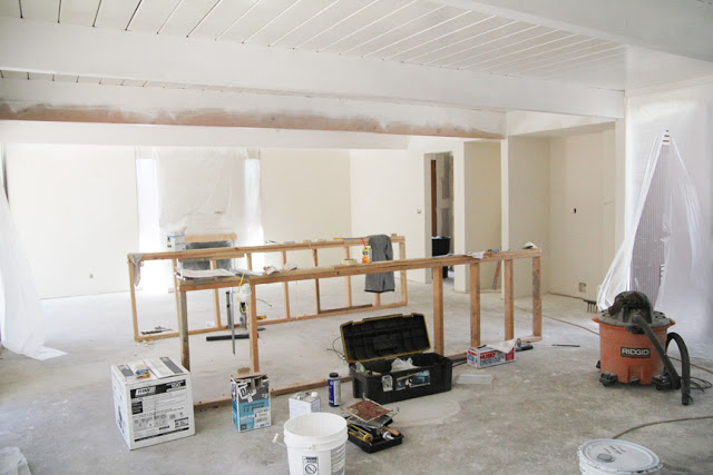
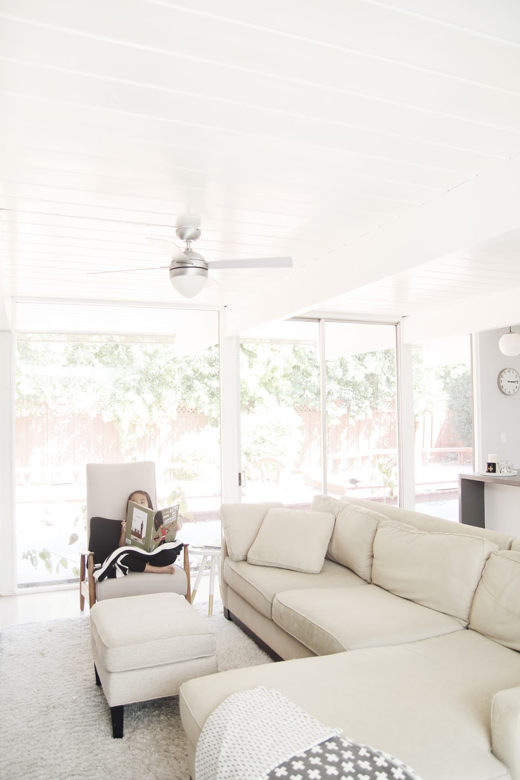
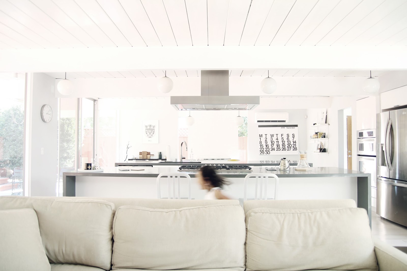
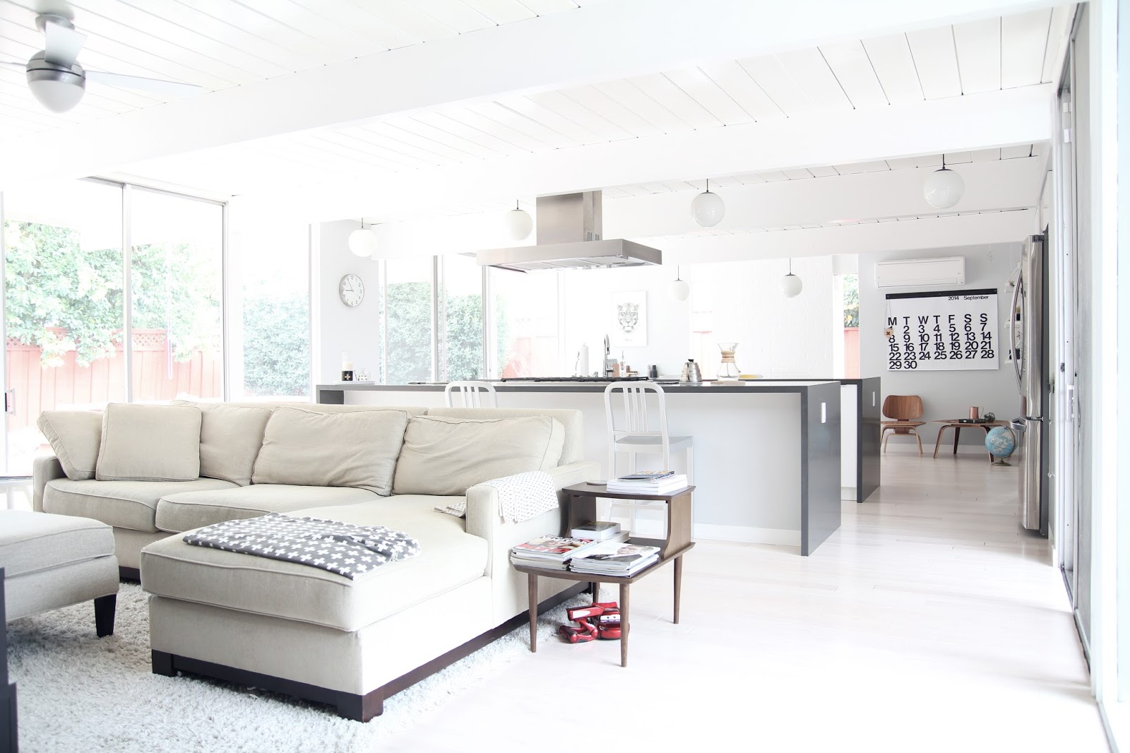
the most dramatic change came when they knocked out the wall between the kitchen and the former living room (now a dining room), creating an expansive open space in the main living area.
before:

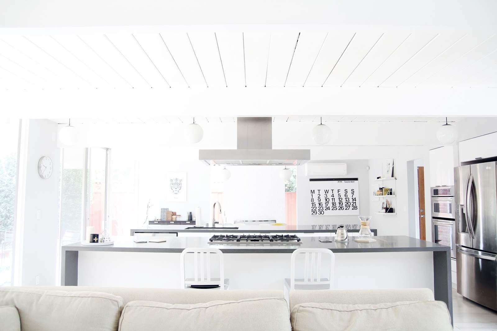
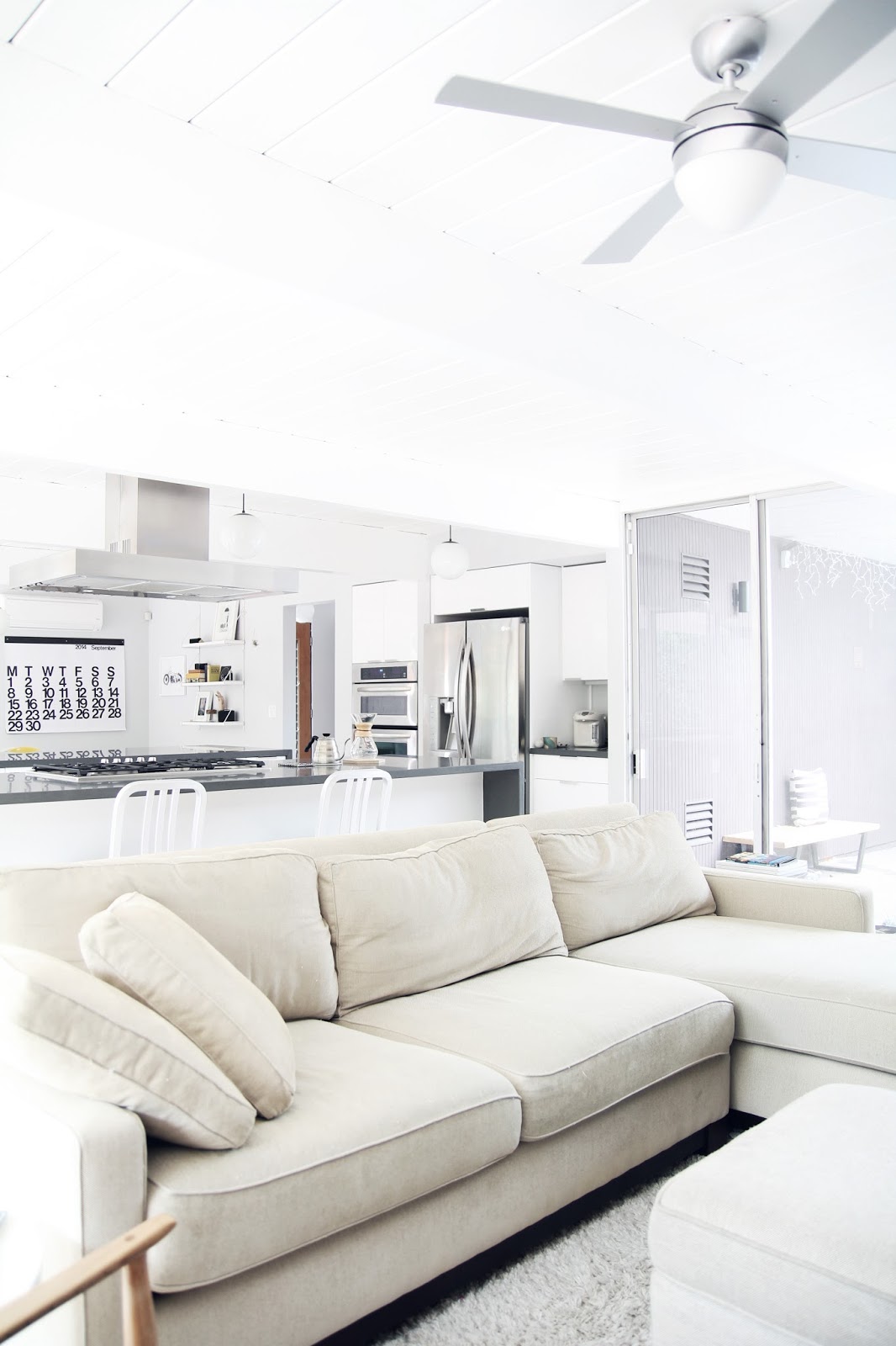
two islands with waterfall counters flank the kitchen, which now sits in the center of the family room and dining area. the contractors were able to avoid visual obstructions by running gas lines and the sink venting through the floor. there are also very few upper cabinets, contributing to the open feeling of the house.
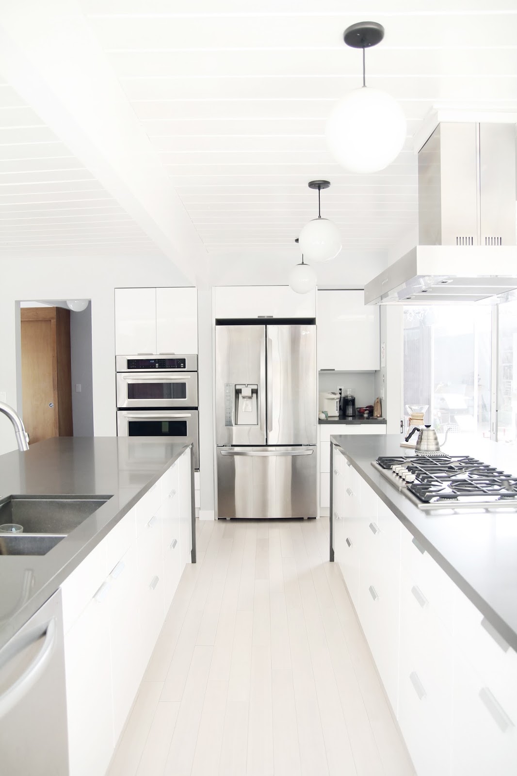
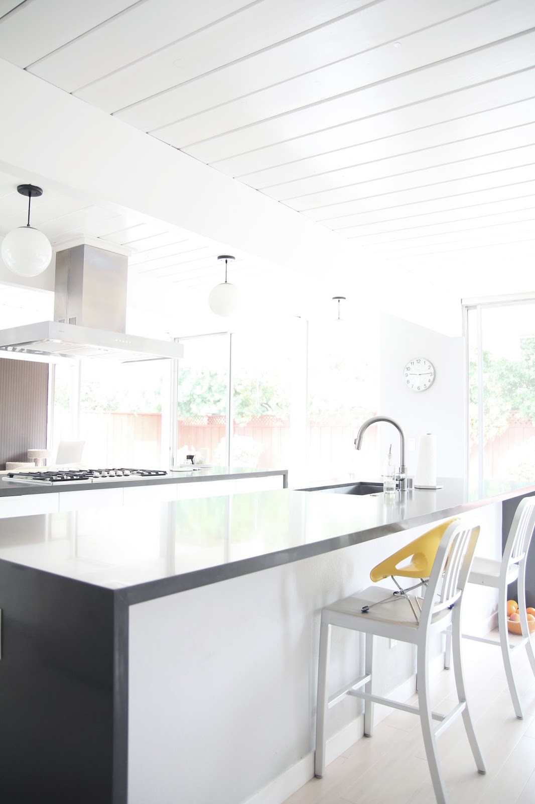

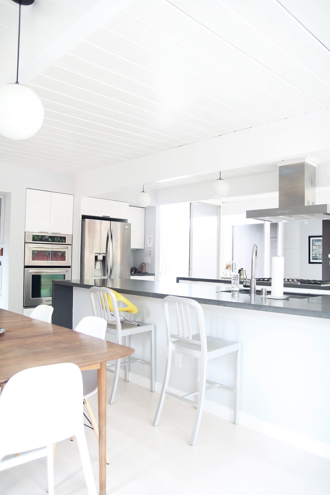

all of the walls, ceilings and exposed bricks were painted pale shades of grey and white, enhancing the light that floods in from the floor-to-ceiling windows.
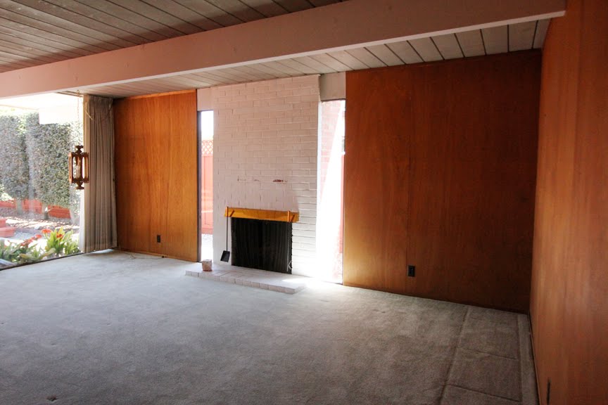
dining area before:
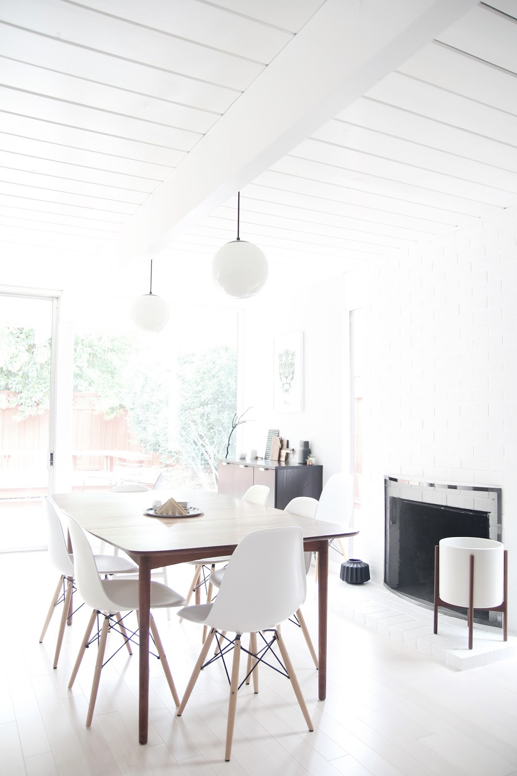
the natural wood tones of some architectural elements (certain interior doors, for instance), were preserved, and more wood tones were brought in through mid-century furniture finds. this creates a good contrast to the white walls and floors, and adds warmth to the space.

dining area after:

the natural wood tones of some architectural elements (certain interior doors, for instance), were preserved, and more wood tones were brought in through mid-century furniture finds. this creates a good contrast to the white walls and floors, and adds warmth to the space.
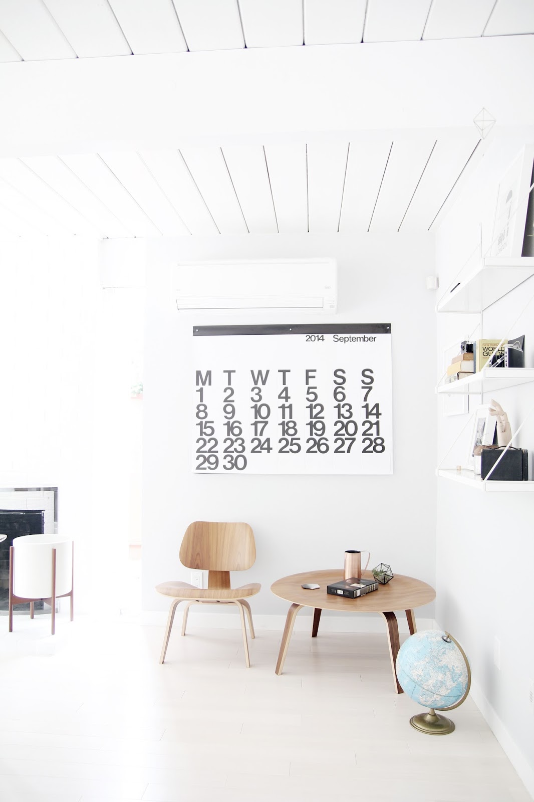
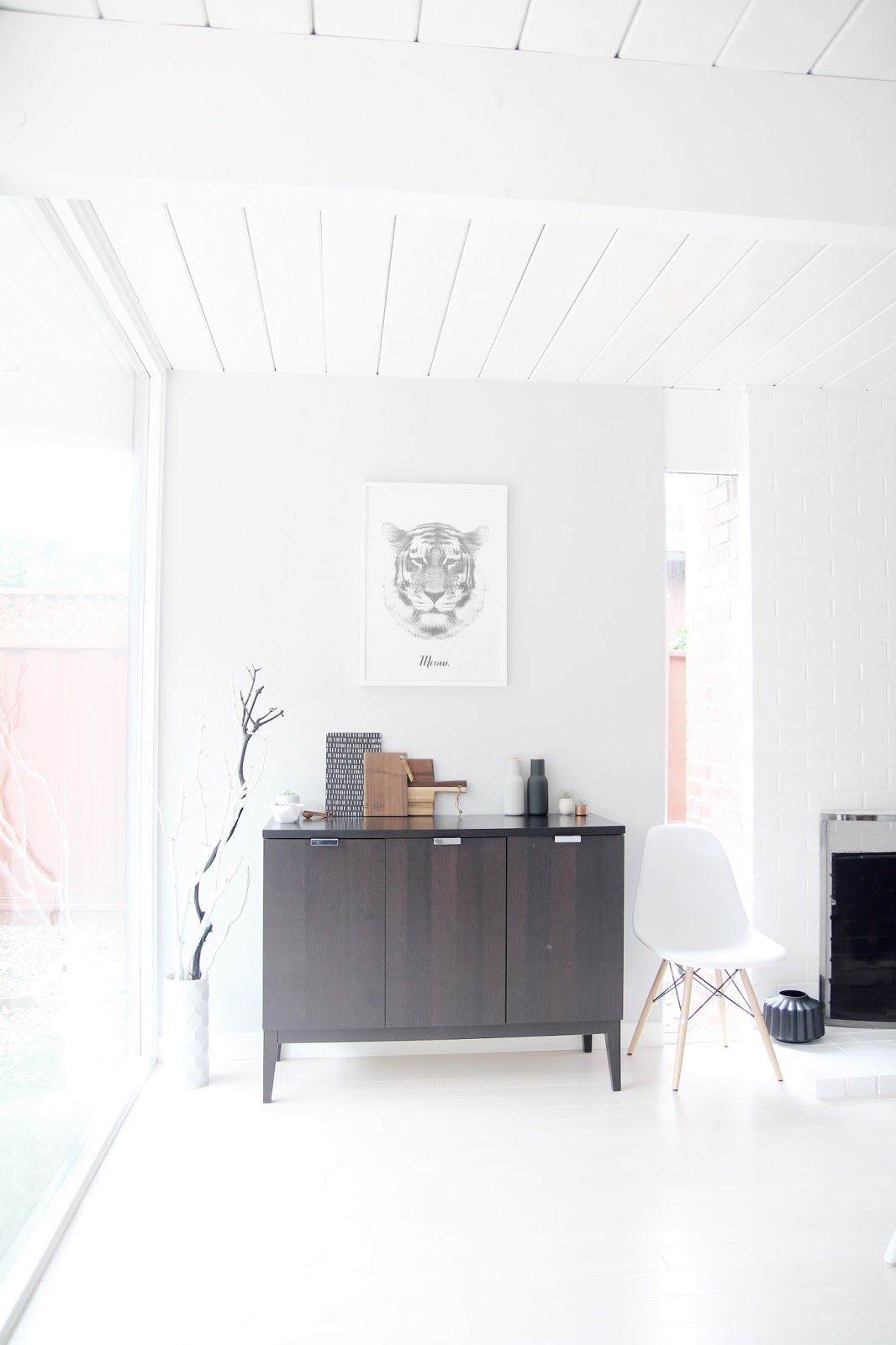
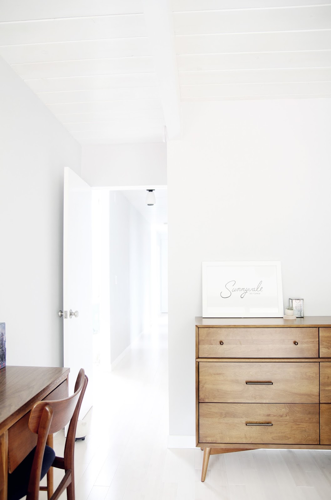
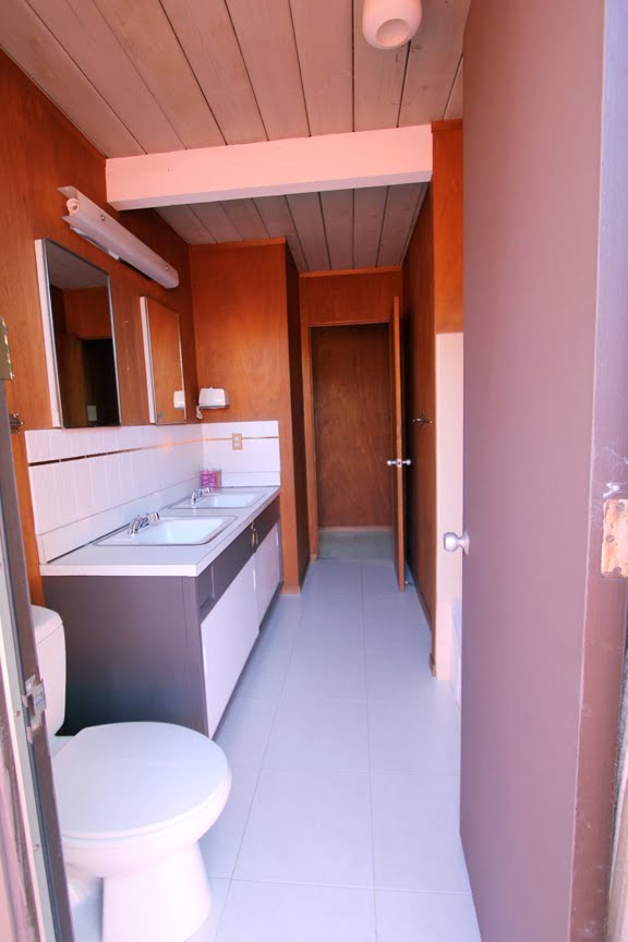
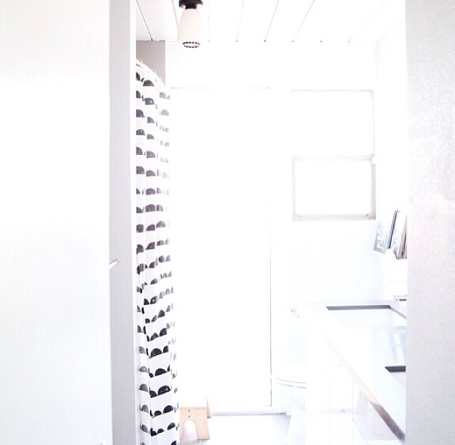
wood paneling was replaced with drywall and linoleum with whitewashed bamboo flooring throughout the house.
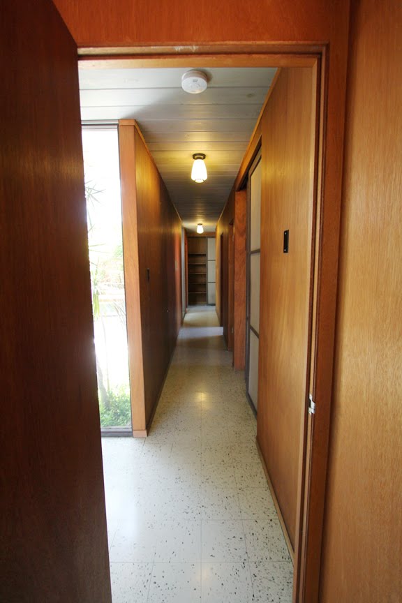
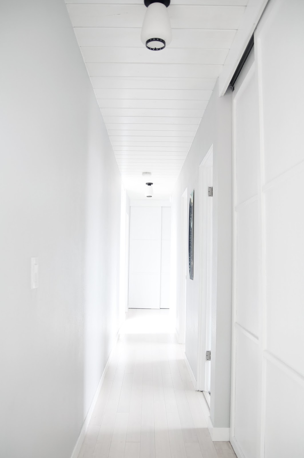
original teardrop light fixtures were preserved, and new lighting is all in keeping with the mid-century aesthetic. an entry/ mudroom area leads into the kitchen from the garage:
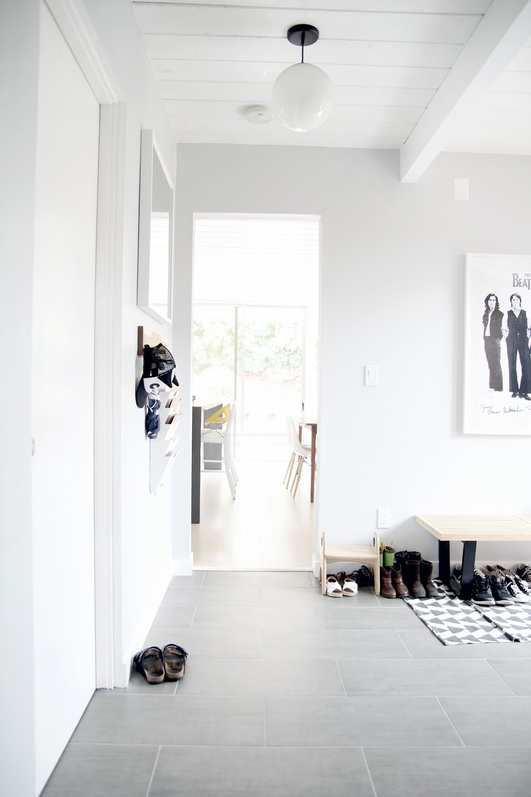

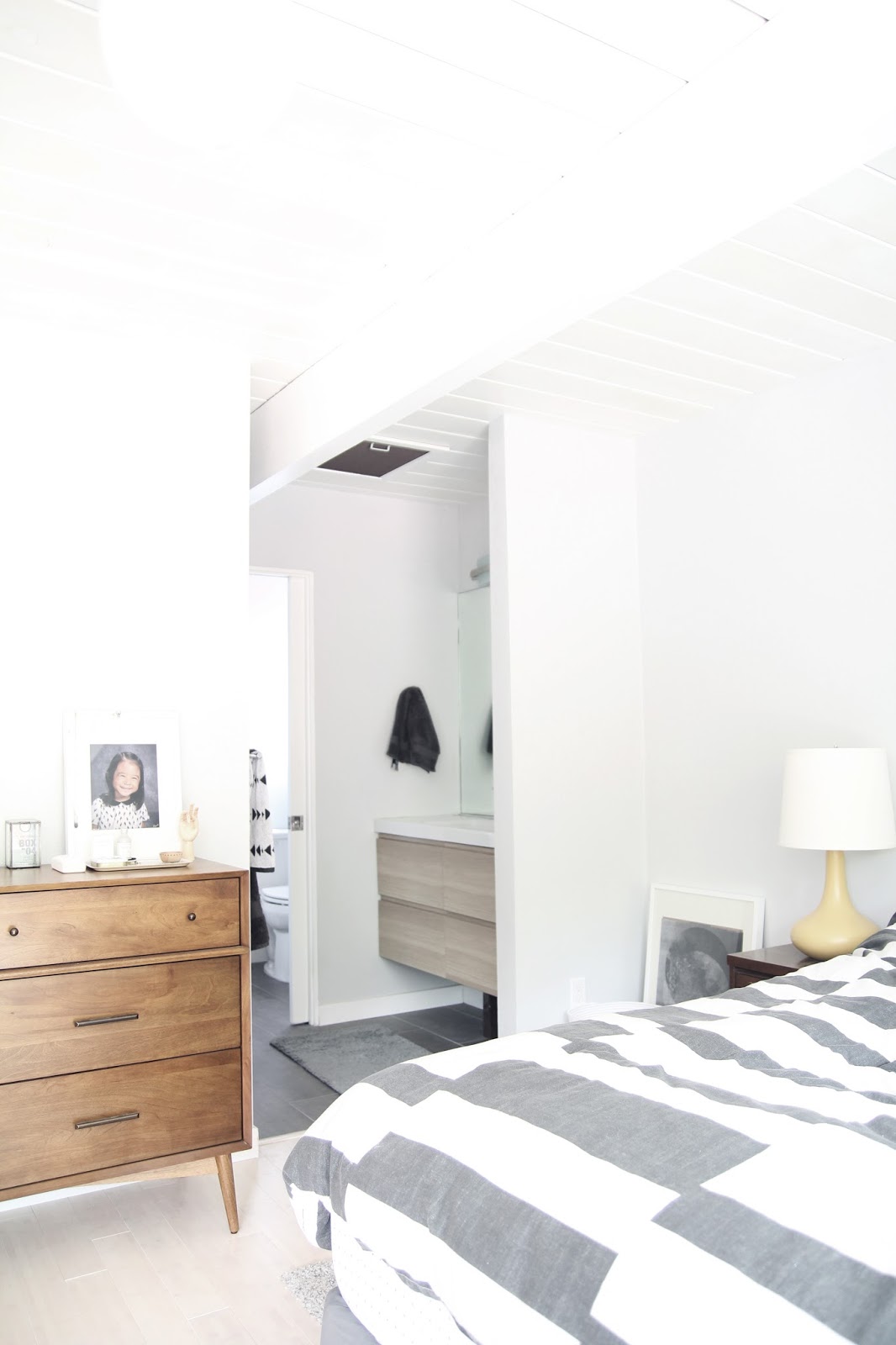
the master bedroom:
girl’s room before:
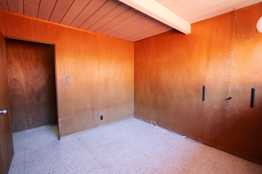
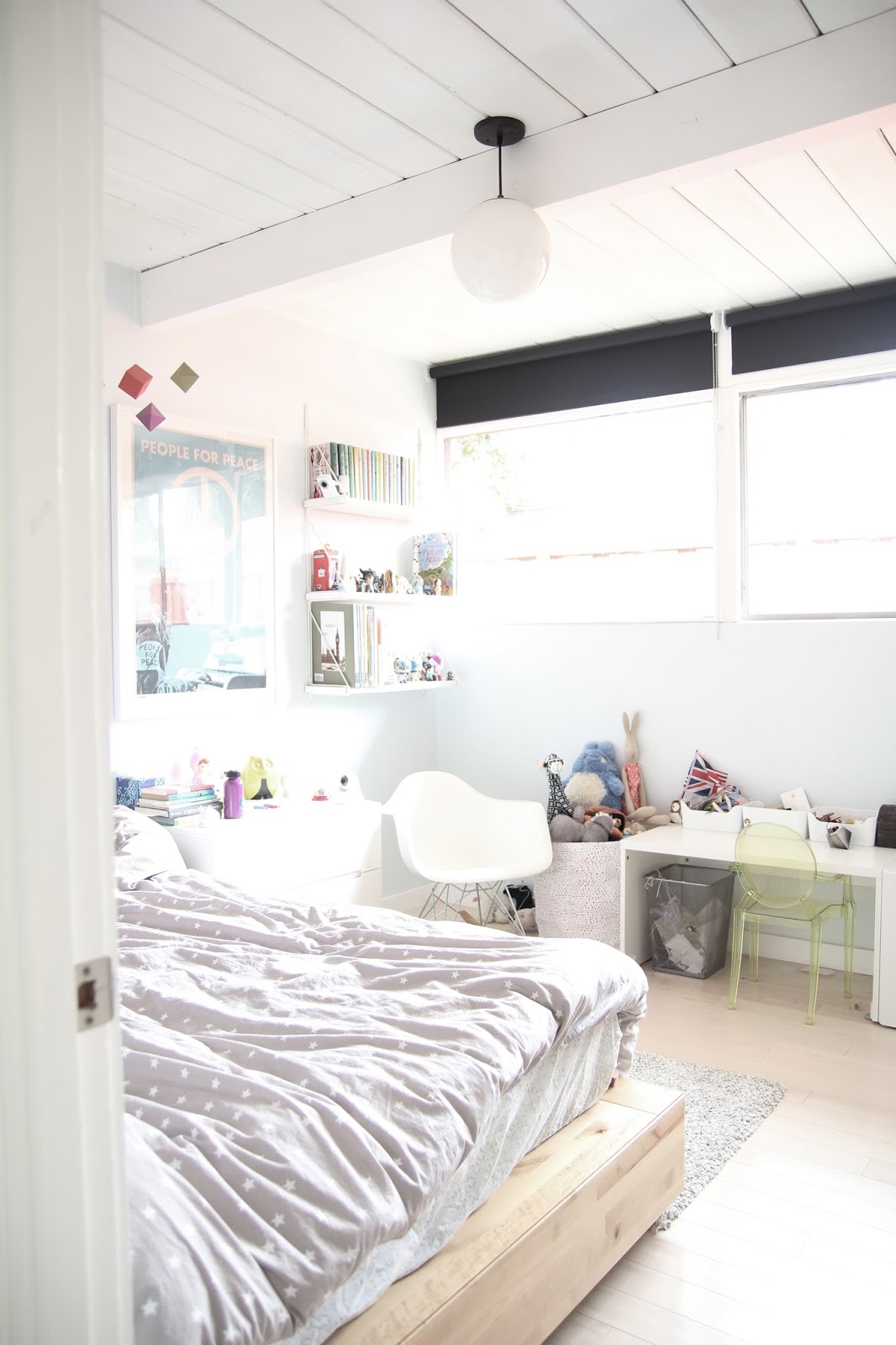
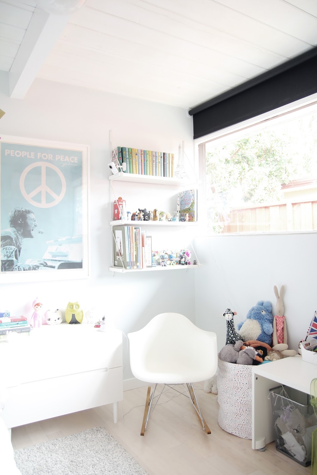
as in other rooms, white paint and modern furnishings transformed the space:
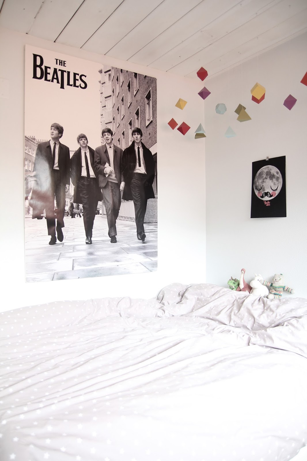
the shapes suspended from the ceiling are DIY paper party decorations from traci's daughter’s 5th birthday.
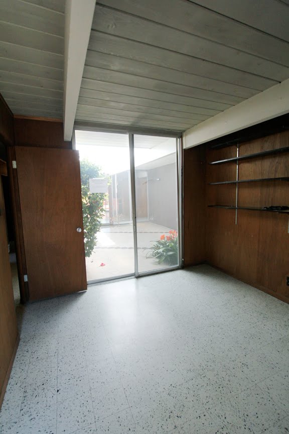
office before:
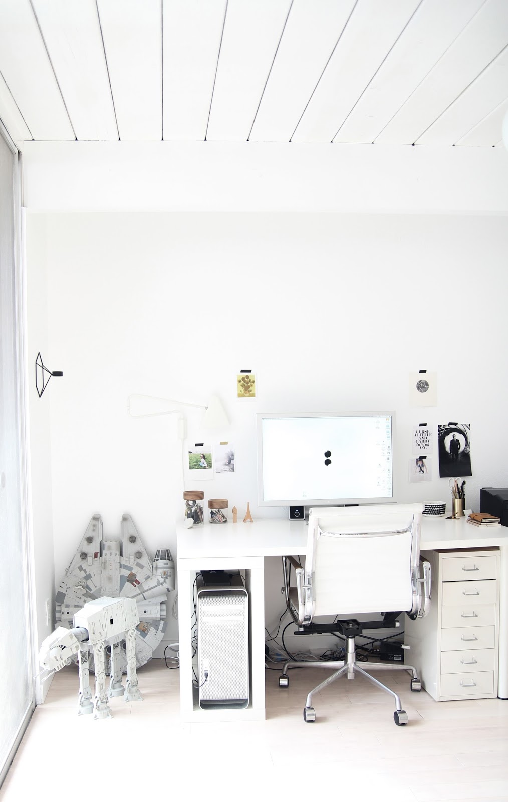
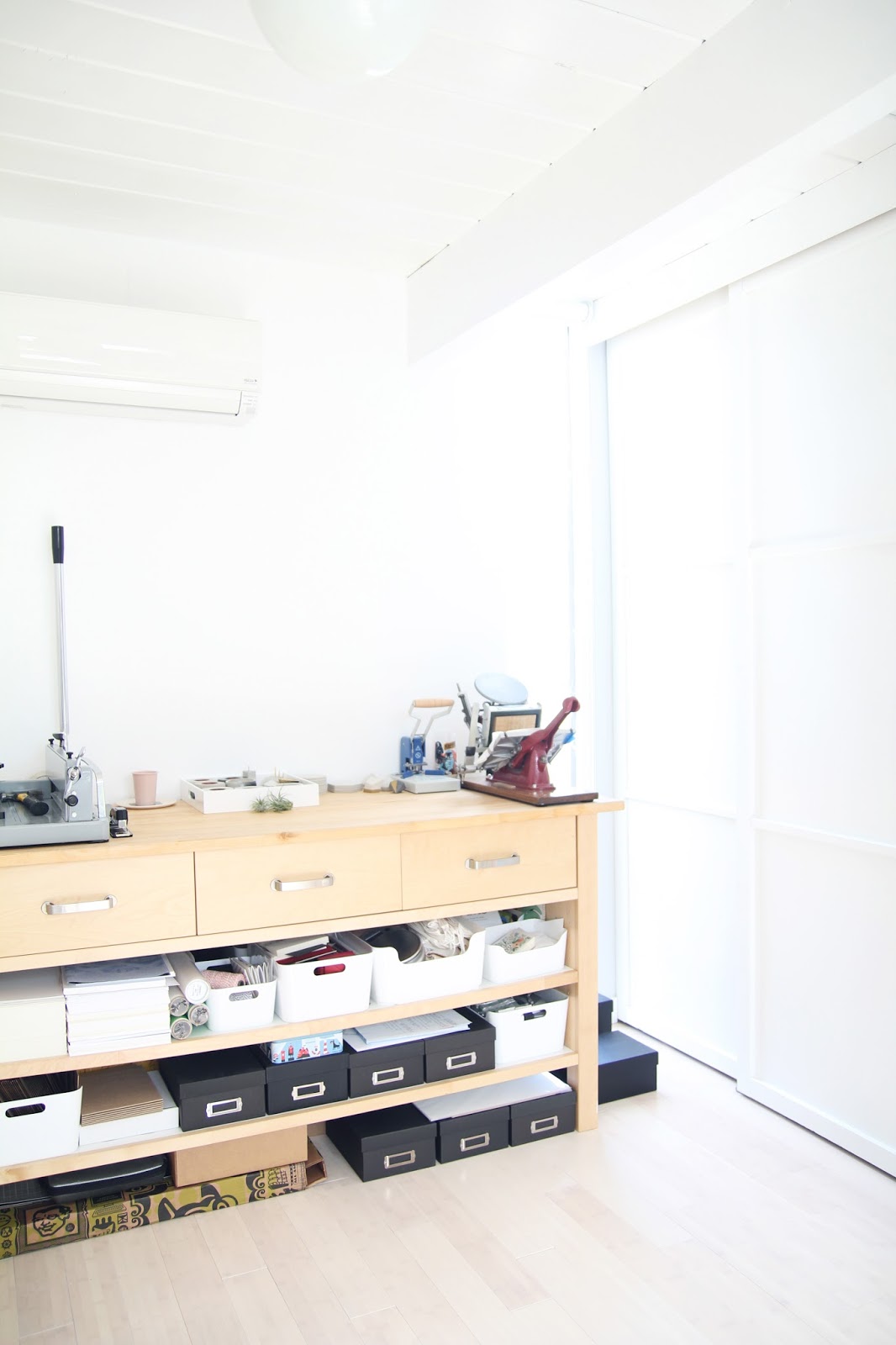

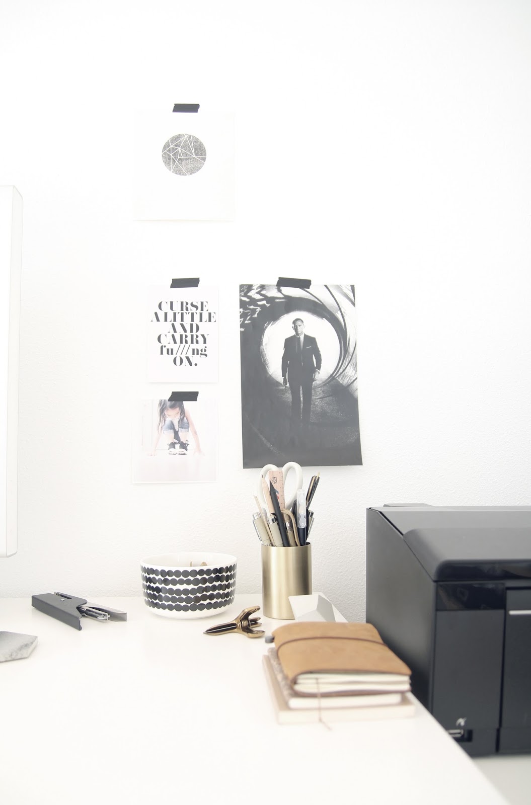
the space is perfect for creative work, with a wall of glass overlooking the atrium. the view extends into the living room all the way through to the backyard.
view of the atrium from the office:
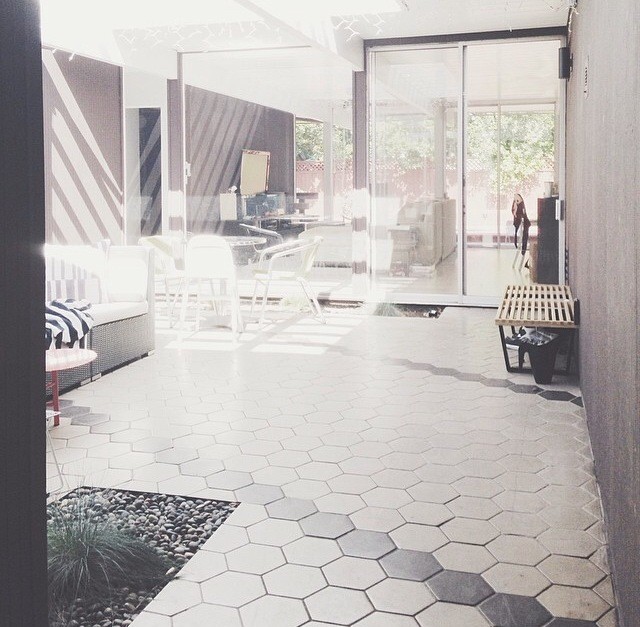
the square footage of the house is “right at 1700, which is perfect,” says traci, “although with the open air atrium in the middle, it seems bigger.” indeed, the atrium, an eichler signature, influences every room with pretty views and natural light.
finally, no tour of this house would be complete without a few shots of the world’s cutest 6-year-old photobomber:
thank you traci & family for opening up your home and sharing this tour with us. visiting you and drinking coffee in that atrium is officially on my life bucket list!
in case you missed it, i chatted with traci on monday about her beautiful instagram feed, her home goods and print shop, and the secret to keeping her beds made (most of the time). you can read the full interview right here.
{all photos copyright traci yau, used with permission}






oh wow! .. an absolutely beyond gorgeous home!! I love every. single. room ... the lightness and brightness and clean lines are everything I am craving in my home, thanks to insta and pinterest :) .... such a beautiful home and I loved the interview, too! happy 100th post my insta friend :) linda finley
ReplyDeletethank you linda!! i so agree...major crush on this house from the moment i saw it. xo!!
DeleteWOAH. im loving your style! the transformation is incredible ^0^
ReplyDeletethank you takara! i know, i always love seeing the before & afters of people's spaces. traci did such a good job!
DeleteI WANT THAT COUCH!
ReplyDeletemeeeee tooooo. :)
DeleteNice, but too much white in the pictures :) It's hard to see some of the features in the "after" photos.
ReplyDeletei'm sorry! i know, it's frustrating, especially when you want to see details as juicy as these. :) thanks for coming by!
DeleteI've always wanted to nail the all white look, but can never seem to quite get it. They truly nailed it. I heart everything. so. much.
ReplyDeletei know... it's so much trickier than people make it look....you know i'm still working on figuring it out too (mostly unsucessfully, hahha!) - glad you liked it! xo!
DeleteWonderful job on the kitchen. The house is too white for me but it's their house and I'm glad it works for them. I would like to see pics that aren't overexposed, though. I'm sure the house is plenty bright and it seems like manipulating the photos to make it look more bright is unnecessary.
ReplyDeletehi andy! thanks so much for reading and commenting! :) it could be a trend/ phase, but i absolutely love photographs that are just slightly overexposed, especially of interiors like this. that particular edit adds such an ethereal, dreamlike quality, and conveys a feeling as much as a view. i look at these and can perfectly imagine sitting in the atrium, lifting up my face, and drinking in the sunshine. we can certainly agree to disagree though! ;-) i'm so glad you stopped by! xo!
DeleteThat's a fair point! :-)
ReplyDelete;-) ;-) ;-) ;-)
DeleteHa, I love the progression shots! Your home is beautiful and shows so much love!
ReplyDeleteI’m thinking there is no way my house can look that beautiful all the time. Glad to see how some bloggers actually live. Your home is stunning!!! I adore the simplicity and calming colors - it brings more attention to each fun detail and makes them look so thoughtful and intentional. So beautiful!Thanks for the tour.
ReplyDelete