Showing posts with label tutorials. Show all posts

Thursday, August 6, 2015

DIY Summer School // Updating Doorway Trim


Hi Team! Welcome back to DIY Summer School, created and hosted by my dear Beth of designPost Interiors.

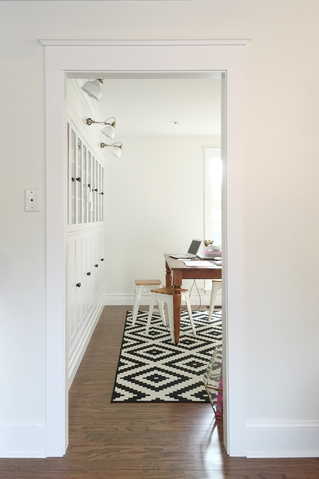
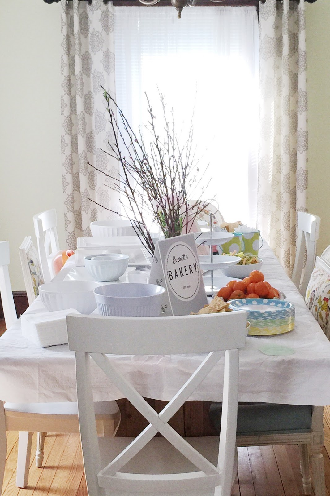
Today's theme is "Hardware Store," and Ryan and I certainly see plenty of the ol' Depot. We have been focusing on updating the architecture of our builder's basic 1991 house (slowly but surely). Beefing up the baseboards and door & window trim, along with replacing the interior doors, is making it feel like a new house entirely.

Today I'm going to share with you how to trim an interior doorway, using a classic trim design. We settled on this style because it has a nod to history but also works well with the more minimal interiors of today. And I love it!!
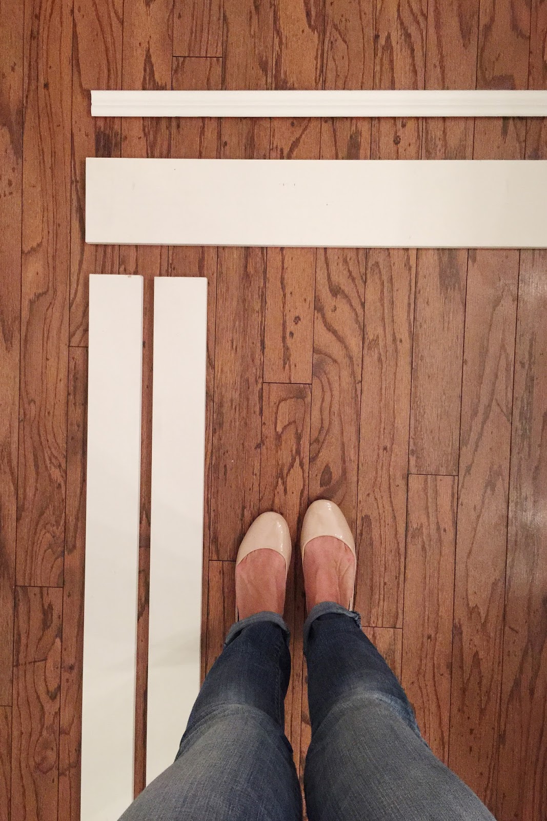

** Note, this is for a pass-through interior doorway without a door. There's a little different procedure for the inside frame if you're putting on a door, but the outside trim would be the same.


TRIM PIECES:

Across the top: EverTrue 5.5" x 8' Interior Flat Trim (Qty. 1)
Along the sides: 3.5" x 8' Composite Trim (Qty. 2)
Crown: 1-5/8" x 8' PVC Composite White Crown Moulding (Qty. 1)
Inside Door: Door Frame Kit (Qty. 1)


SUPPLIES NEEDED:

Caulk (we use DAP Dynaflex in white)
Semi-Gloss Paint (we use Sherwin Williams Pro-Classic color matched to Martha Stewart Pure White)
Finishing Nails
Lightweight Spackle
Lightweight Sandpaper
Shims (optional)

SUGGESTED TOOLS:

Compound Miter Saw
Caulking Gun
Air Compressor
Nail Gun
Crowbar (if removing existing trim)
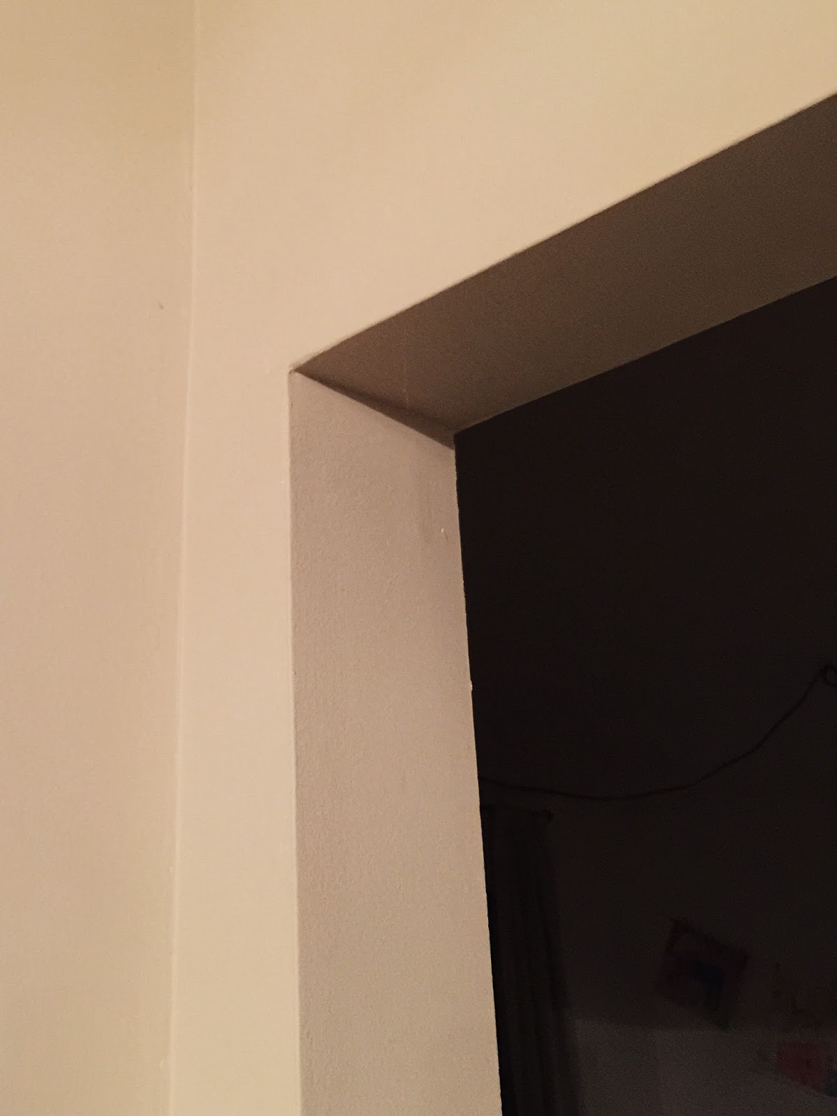

1. STEP ONE

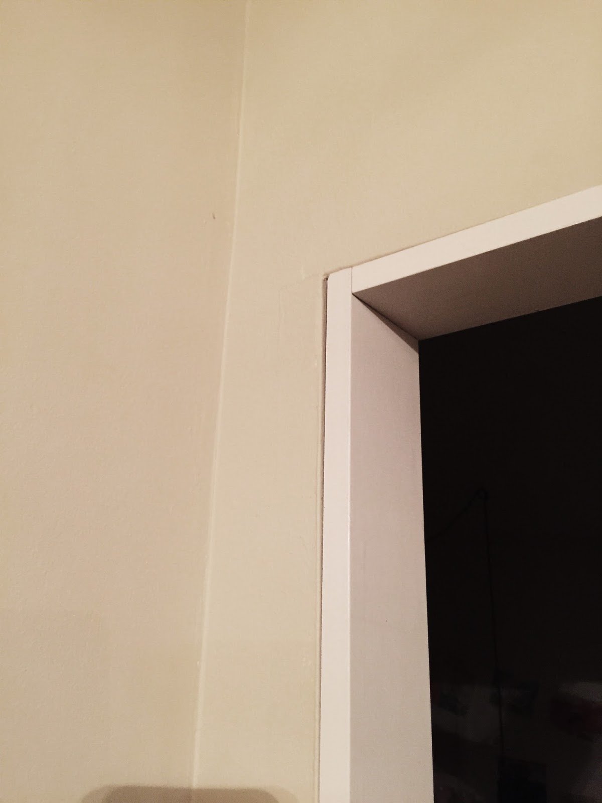
Remove any existing trim with a crowbar. Our doorway started like this, with plain ugly drywall:


2. INSTALL DOOR JAMB KIT

The kit comes with instructions for you to follow. You will cut the pieces to size. Use shims if needed to make it even and plumb. Use the nail gun to nail it in place.


3. INSTALL SIDE CASING

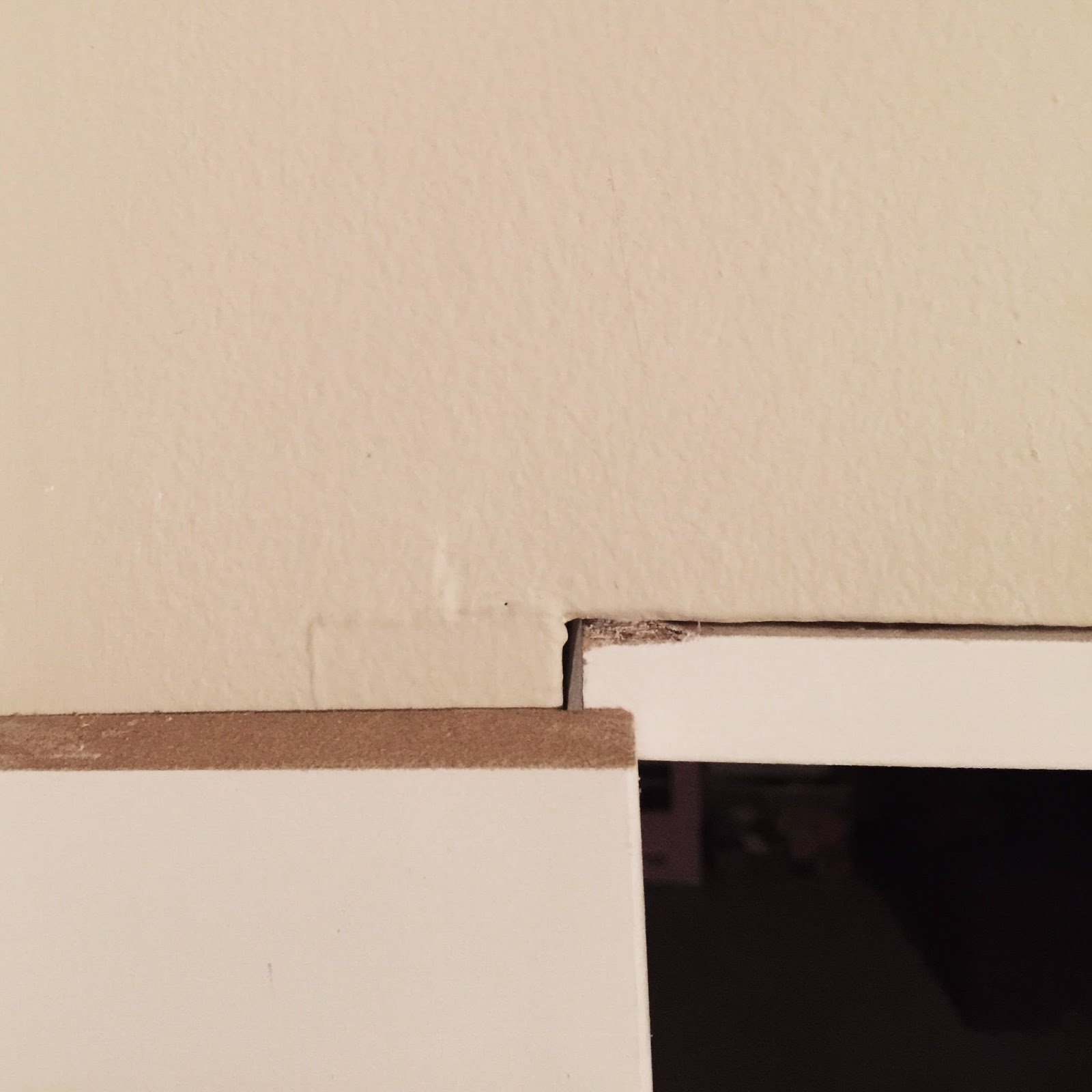
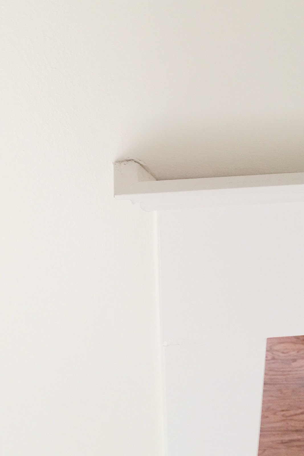
Cut each piece of side trim (3.5" wide) so that it is 1/4" higher than the bottom of the jamb. This shows the height of the side piece compared to the top of the doorway:


The side piece should overlap the door jamb so that about 1/4" of the jamb remains uncovered, like this:


Nail the sides in place. Lay a level across the top of both sides so that you make sure they are installed at the exact same height.

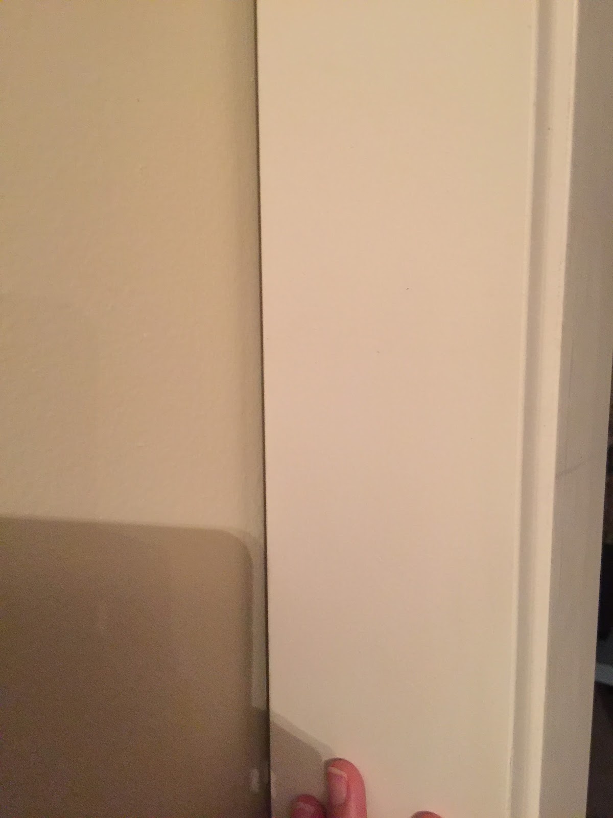
You can see from this picture how these sit on the floor- we didn't do anything fancy around the bottom:


4. INSTALL TOP CASING

Cut the piece of 5.5" trim for across the top so that the ends match up with the outside edges of your side pieces. Again, leave 1/4" of the door jamb showing. Use a level to make sure it's straight and then nail into place.
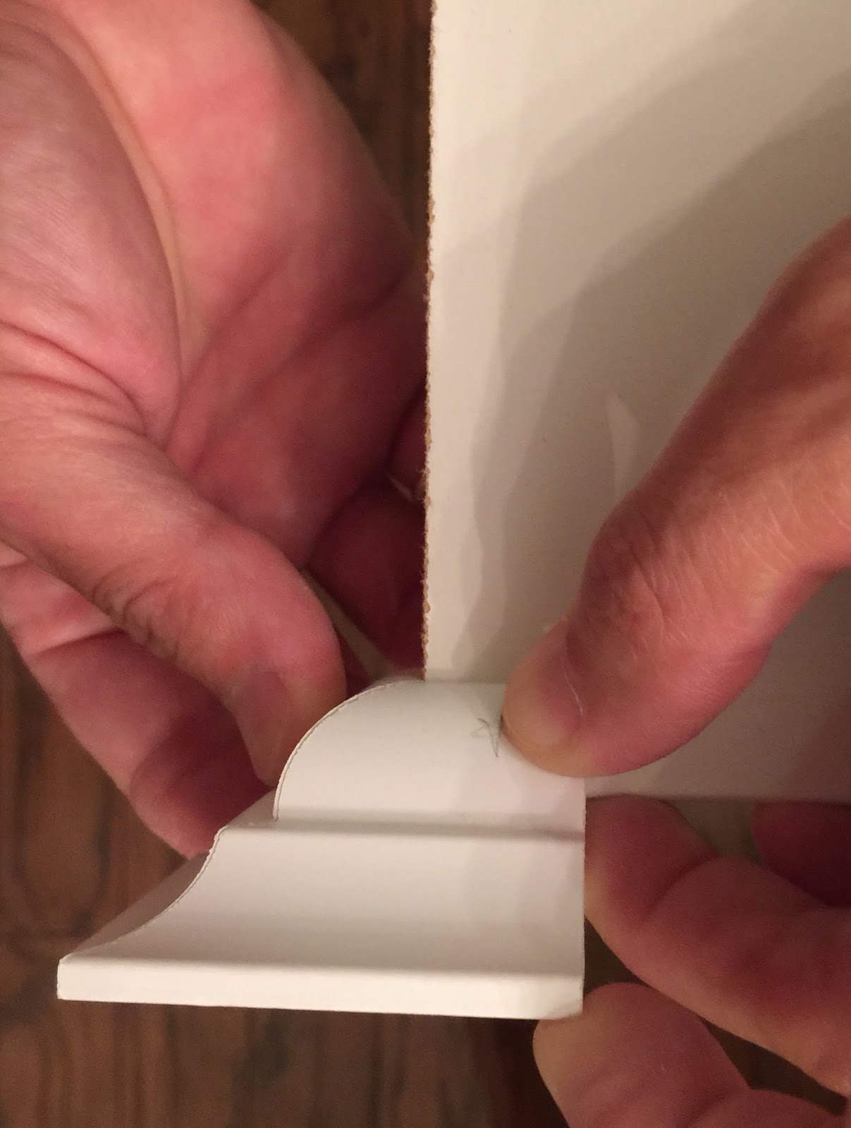
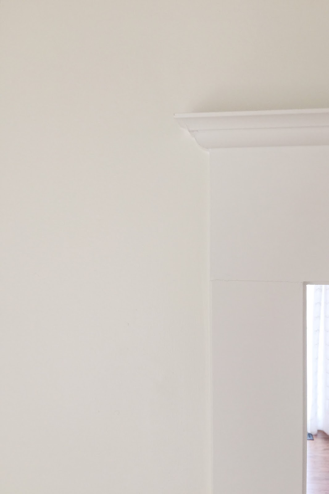
5. INSTALL CROWN

This is the only real tricky part of this project. You need to know how to use a compound miter saw. If you're like me, with absolutely no spacial reasoning skills and no hope of ever knowing how to use a compound miter saw, maybe you would like the look of this door trim without the crown moulding? Or maybe you have a handy neighbor. Thankfully I have Ryan. For the rest of you who are like him and capable of figuring this out (you lucky dogs), here is what you need to know:

Your piece is 45 x 45. You're doing an outside corner and you need to put on a 90-degree angle. The miter adjustment is 35.26 and bevel adjustment is 30.


Here is an excellent tutorial with graphics and explanations for how to use a miter saw and how to cut crown:

How to Use a Miter Saw & Cut Crown Moulding by Dewalt

Ryan's tips are: Use a scrap piece to practice, and if it goes wrong your piece is probably upside down. :)

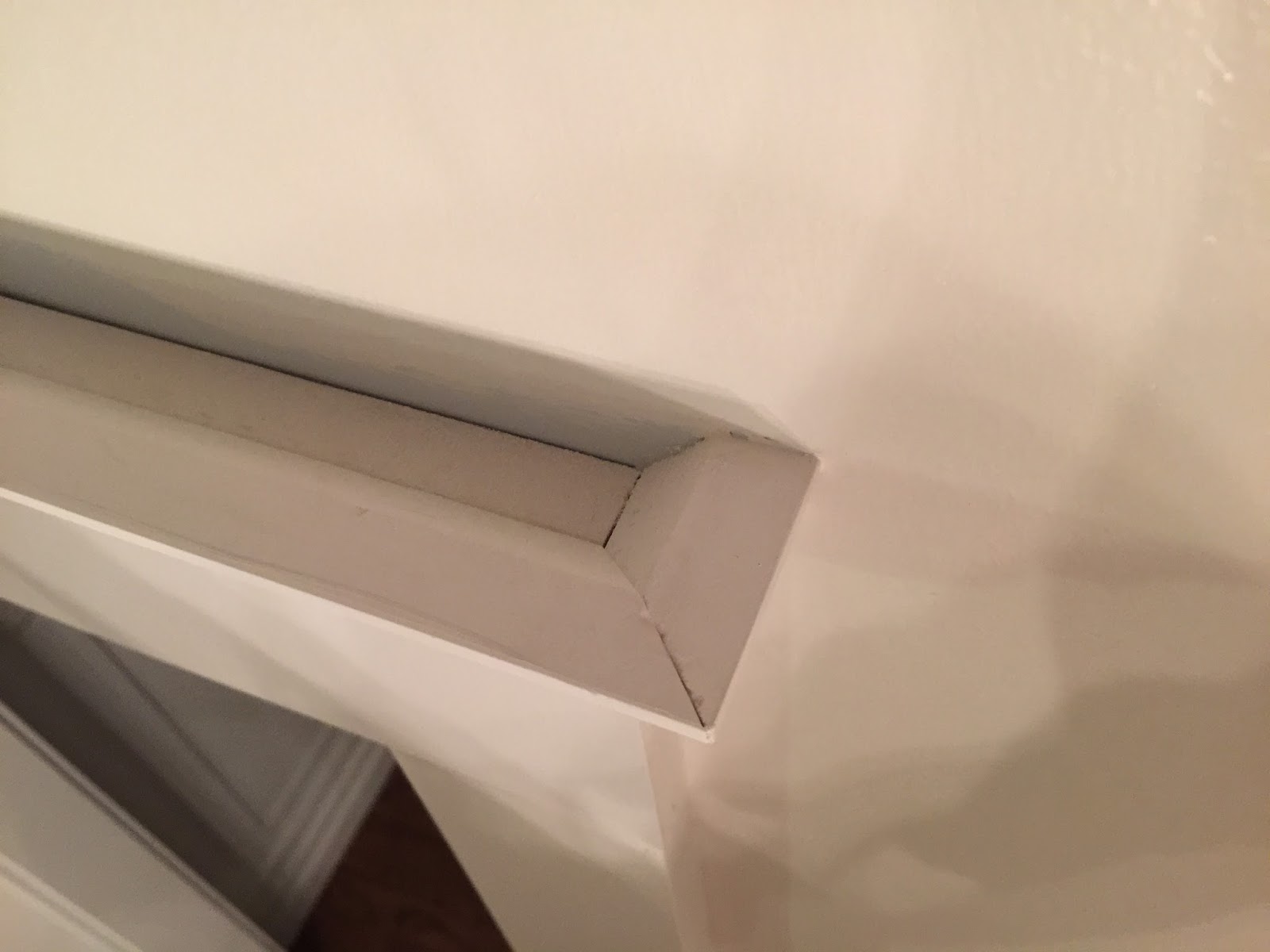
Once the front and sides of your crown are cut, place the front along the top of your top casing, with the bottom of the crown about 1/2" below the top of the casing. Nail it into place by driving your nails straight through the bottom, so they attach it to the casing. Start with the center nail and then do 2-3 nails on either side, evenly spaced. The nails go in straight, not at an angle.

Then fit your sides in, and nail them into place with one nail each. You can glue these instead of nailing them if you feel more comfortable. Just use wood glue.

In this example, the star by Ryan's thumb represents the part of the crown where the nails go.


Here is how it will look from the top:


6. CAULK THE SEAMS

Use caulk and a caulk gun to fill the seams- aaaaaalll the seams. You need to hit the inside and outside edges of the top and sides, all the seams where the trim pieces meet, and underneath the crown where it sits against the casing. The best thing about caulk is that if your crown corners didn't meet up perfectly (or if there is a gap) the caulk covers a multitude of sins. Caulk will make your door look so much better. It is a critical step in all trim work, and though mind-numbingly time consuming, it will be your best friend.

7. FILL THE NAIL HOLES

Use spackle to fill the nail holes. Ryan uses the kind that goes on pink and turns white when it's dry. Once it's dry, lightly sand it so that it doesn't leave visible patches that will show through your paint.

8. PAINT 

Paint your new trim with a semi-gloss finish paint.


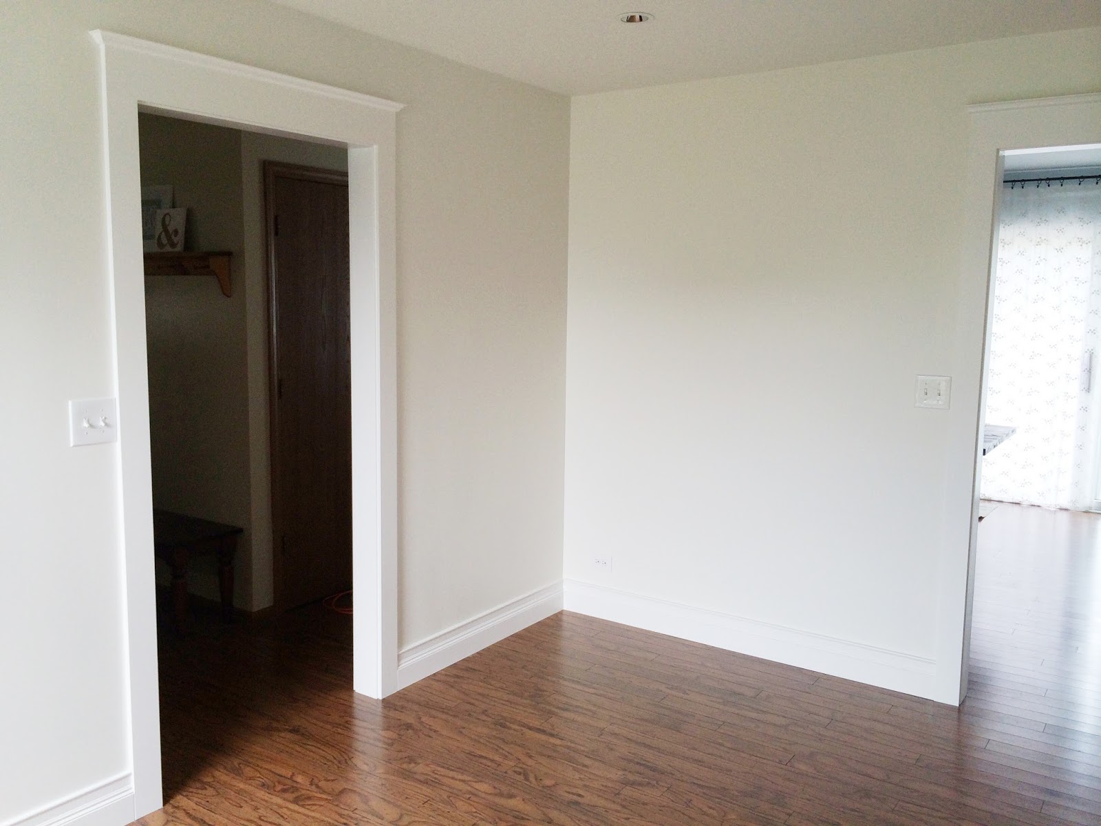
And you're done! It's definitely tricky with the crown if you're unfamiliar with doing it. But the end result is sooo incredible, especially compared to how our doors in this house started out. Just to give you an idea, here's a shot of a current door (in real time!) that's waiting in line patiently for new trim:


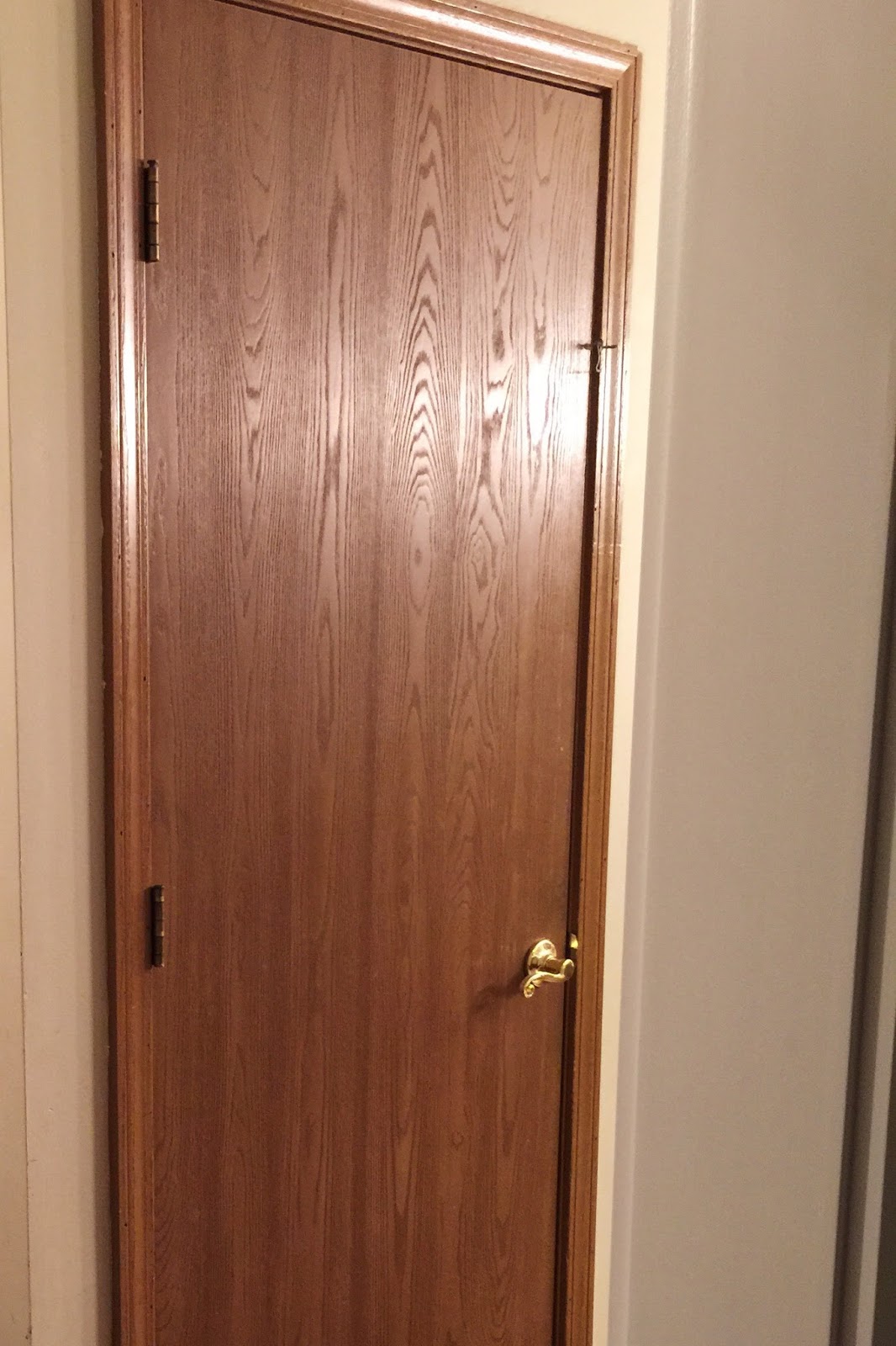
Shudder! One at a time....one at a time. Soon (or I should say eventually, someday), they will all be bright, white and pretty:


Let's see what the other DIY Summer-Schoolers have done with hardware store wares. I'm so curious! Check them out!


DIY Summer School brought to you by:

Beth, designPOST interiors
Mallory, Charming in Charlotte
Lindsey, Lindsey Brooke Design
Kevin, Thou Swell


Featuring these DIY themes:

June 4th: IKEA Hack
June 18th: Thrifting
July 9th: Wildcard
July 23rd: Craft Store
August 6th: Hardware Store
August 20th: Found in Nature

Link up below and/or show us your hardware store DIY's with #DIYSummerSchool on Instagram. We love to see what you're up to!


Thursday, July 9, 2015

DIY Summer School // There's an App for That


Hi friends! Welcome back to DIY Summer School. Your teacher has been snoozing between classes! We just got back from a super-relaxing vacation in Minnesota where I got to see both sides of the family, linger on the lake, and visit my great-grandfather's homestead. I hope your summer has been equally lazy.

Today is Wildcard Day in our series, hosted by Beth of designPOST Interiors, and I thought it would be fun to show you the latest app (not technically an app) that I've been having fun with these days.

In the past, I've showed you the apps I've used to make typographical posters, free artwork and pet portraits, and to edit photos. (Great spot to insert those graphics, right? I thought so).


Today I'm showing you a new web-based site that does all of that and more. I'm going to show you how to make a cute personalized table sign for your next party, but trust me when I say that's just the tip of the iceberg. 

The site is called Canva, and as with absolutely all and any tech-related wins I've had, this one was recommended to me by Travis Hickox.


It's only fitting then that I made today's DIY for Travis' wife Steph, who threw an adorable bakery-themed bash for her one year old this Spring. Auntie Laura (that's me) got to make the table signage and it turned out soooo cute!

I'm going to give you a long-winded tutorial of how I did this sign using Canva, and you'll definitely want to prepare to be overwhelmed by the capability of the site. There are a bajillion options and you could spend a looooong time exploring. Once you get the hang of it and sift through the infinite choices, it can become your go-to source for any project in this genre. Think menus for your kids' playroom kitchen, blog graphics, client presentations (like all these mood boards I've made with it), invitations, twitter banners, personalized greetings, posters...it's endless.

So, let's give it a try.

1. STEP ONE: GO TO CANVA AND OPEN AN ACCOUNT

It's www.canva.com. I'll wait here.


2. STEP TWO: CHOOSE YOUR SIZE

At the top right, there will be a choice that says "Use Custom Dimensions." I almost always do this, even though I really have no idea what I'm doing or what px means. I always choose something like 900 x 1200. It works.

See the little white writing to the top right of the "Madrid" sign? That's what you click on:


This is what I type in the boxes that come up:


3. STEP THREE: IMPORT YOUR DESIGN 

Your screen will look like this:


Over on the left, start by choosing the big "T" for "Text." It's fun because you will immediately get excited about how many cool graphics you have the option of using.

Place your cursor in the box that says "Search 1,000,000 images" and a menu will pop up that looks like this:


Choose "shapes" and scroll down until you see a green circle with very tiny dots all around it. See it below? This picture shows it fourth row down on the far left, but I scrolled down a long way to get there:


You click on that and it will immediately be imported into your project, shown above. 

You can change the size by dragging the corners, and change the color of both the dots and the circle itself by clicking the green and blue circles in that little pop-up tool bar above the graphic. 

Go ahead and resize/ move the circle and change the colors to black and white:


4. STEP FOUR: IMPORT YOUR TEXT

Now you are ready to add text to the circle. For quick reference, here are the fonts and sizes I used:

"Everett's": Satisfy, 72
"Bakery": Oswald, 88
"EST. 1945": Trocchi, 24

Go back to the left side bar and choose the big "T" for "Text" again. Then, at the very top of the menu, find the large font that says "Add Text" and click on it. A text box will be imported into your design:


Change the text to whatever name you want, the font style to "Satisfy" and the size to 72. You can change the color if you wish but I just left it black. I like to change the alignment to "center" by clicking on the drop down arrow on the right of the little tool bar. It makes it easier to know you are lined up straight later. You can then move the text by dragging it to the top of the circle.


Now you follow the same steps to add the other words in the circle, using the font styles and sizes listed above.

The only thing you need to do differently is to increase the text spacing on the word in the middle. Use the arrow at the right of the toolbar to bring up your drop down menu, and choose "text spacing" - you can use the slider to adjust until it looks right and fits well. Mine was at 340.

Add all your text and move it around until you are happy.


5. STEP FIVE: CHANGE BACKGROUND COLOR

Place your cursor on your design somewhere outside the circle so that the circle is not highlighted. Go over to background on the far left side and click on it. A row of circles will be at the top, and you can choose the one with the plus sign. It will then let you add a custom color. You can play and adjust, or type in a hexidecimal code directly. My grey color is d9d9d9.


6. STEP SIX: DOWNLOAD & PRINT 

Your design is done! If I read a post like this, my eyes are glossed over at this point. I promise, it looks more complicated than it is once you get used to it. You will have to play around, but if you are interested in these kinds of things, it's worth it.

Once your design is just how you like it, click the "download" button at the top right of the screen. It will give you the choice of PDF or image and either is fine. I usually choose image.

Every once in a while, Canva still gets super glitchy and makes you want to cry. Your design looks right on the screen, but the saved download is messed up. I've found that if you make sure your design is saved, close out of it, then go back in and edit something little, and save again, it usually corrects itself. This can be super frustrating but it's getting a ton better and I have full hope that they'll fix it completely soon.

Then you can print to your printer at home or save it to a flash drive and take it somewhere that does stuff like that.

Side note, I don't know what the whole "make public" thing is about- I have it set up so my designs are private (I hope, ha!) and I haven't tried sharing anything yet.


7. STEP SEVEN: DISPLAY

I didn't have a frame to show my print in, so I actually printed two and glued them to either side of a thick piece of Canson paper. If you go to Hobby Lobby, you will find cubbies full of different kinds of Canson paper over by the custom framing section; It's like photo mat paper. There are several weights and I got a large sheet of the very thickest.

I laid both prints end to end and traced them onto the paper, then cut out the rectangle with an exacto knife. You can score the middle line so that you can fold it into a sandwich board without it breaking in two. Then glue the prints on either side with a glue stick. Make sure you don't have one upsidedown!

You can then display your sign on your tablescape or dessert buffet.


Speaking of dessert buffets, do I get to tangent and brag on Steph for a second? She hand painted each one of these buildings for her dessert table backdrop and handmade ALL of those scrumptious cupcakes. (I had the one with the peanut butter chocolate thing in the middle and it was the best cupcake I've had in my whole life)! This girl can be my substitute teacher at DIY Summer School anytime.


Well now that you've been a very patient and attentive student, and are craving cupcakes in the worst way possible, let me send you along to your next DIY class. You have a great batch of teachers ready with their wildcard projects, and I can't be sure but rumor has it your hunger pains will worsen before school is out today.


DIY Summer School, brought to you by:

Beth, designPOST interiors
Claire, Claire Brody Designs
Mallory, Charming in Charlotte
Lindsey, Lindsey Brooke Design
Kevin, Thou Swell
Laura, Avery Street Design 


Featuring these DIY themes:

June 4th: IKEA Hack
June 18th: Thrifting
July 9th: Wildcard
July 23rd: Craft Store
August 6th: Hardware Store
August 20th: Found in Nature


And hey bloggers! There's a spot below for you to share your projects with us too! Link up anything and everything DIY this week- it's Wildcard so anything goes. We love to see. And blogger or not, you can share on Instagram with the hashtag #DIYSummerSchool. I'll see you next time!

Disclosure: I am not being compensated for this post. Canva doesn't know I'm writing this post. I just really like them. As always, I only recommend products or companies to you that I would share with my best friends at our weekly playdate.


Monday, December 8, 2014

speakeasy new year's eve // vintage inspired florals


i believe that flowers set the tone of a party, and therefore i almost always start with them when planning a scheme. when i set out to create a floral centerpiece for the luxe speakeasy new year's eve party kit i'm putting together with the house of hipsters and the big reveal, i wanted it to be free-flowing, feminine, and a little bit wild, just like the guests at a fashionable 20's speakeasy would have been. it needed to feel old-fashioned with a rustic twist. it dawned on me that i need look no further than this stunning centerpiece by jocelyne y., who tagged it in our #foundforaged instagram challenge. here is how i set out to recreate something similar. 

materials:

family size soup can
small handful of rocks (not pictured)
garden shears
blush roses
silver dollar eucalyptus
seeded eucalyptus


instructions:

1. remove the soup can label (goo gone works wonders if it's not cooperating) and fill the bottom with a handful of small rocks. because the arrangement is asymmetrical, this will help make sure it doesn't fall over!


2. begin with long stems of the seeded eucalyptus. place them one at a time in the can leaning against the right side so that they drape and droop. all the better if you can find stems that will fall against the table surface. i actually pushed them down ever so gently to make them bend a little lower.


3. add in the silver dollar eucalyptus and do the same thing. use the stems that are the skinniest and longest for the best effect.


4. next you'll be adding a small cluster of blush roses (of course ranunculus or other lush blooms would be wonderful too- i simply wanted to use flowers that would be available to anyone and easy to find. good ol' roses are the only ones i can always count on to be at the grocery store. everything i bought for this was from trader joe's). cut one rose to the length you'd like it to be in your arrangement and test it out.


5. when the length suits, then use that rose as a guide. build a tight bouquet in your fist and once it is assembled (kind of like a mini bridal bouquet), cut all the stems to the same length as your first one.


{pause here to pay attention to the small human about to steal your garden shears and save his life.}

6. place your rose bouquet in the left side of the soup can.


7. lastly, cut some shorter stems of seeded eucalyptus and tuck them in among the roses.


and that's it! enjoy your beautiful arrangement. the greens keep for quite a long time, and i think this will be even more lovely when the roses open more, so you can certainly do it a few days ahead of your party. (oh and if i could rewind time, wouldn't that soup can have looked awesome spray-painted copper??)


with these vintage-inspired flowers to set the mood at your party, you'll be well on your way to an elegant, and a little bit wild, new year's eve. 

our party continues tomorrow with a signature cocktail from kyla. you can catch up on our complete new year's eve bash below, and check back each day to see what will be added next! 


Blogging tips