happy monday my friends! it's been a bit of a
summer break, but the magazines are back in full effect and in all their fall glory. from my time at the library with a coffee and a stack of mags, let's dive in and see what eye candy i found in this month's issues.
from
house beautiful, september 2014, "wake up your life with color" issue:
i have to admit that after thumbing through this issue of house beautiful, i almost threw in the towel on this post. the over-the-top and over-decorated interiors, all the excessive moulding, fabrics, furniture, and expensive (like $12,000 light fixture expensive) accessories were a little much. i was about to toss the issue back in its pile when this pretty little tablescape came innocently along:
aww. it's perfect. while it might not be real life, (and i'm pretty sure that flatware costs $25 a fork), something about its easy charm and bright pops of color wooed me out of my anti-opulence funk. and that tablecloth? get outta here- part polka dot, part smudged ikat...what a gorgeous fabric.
opulence to the max, but it turns out i'm a sell-out for marble herringbone tile and unlacquered brass. i don't even care. i love you bathroom!
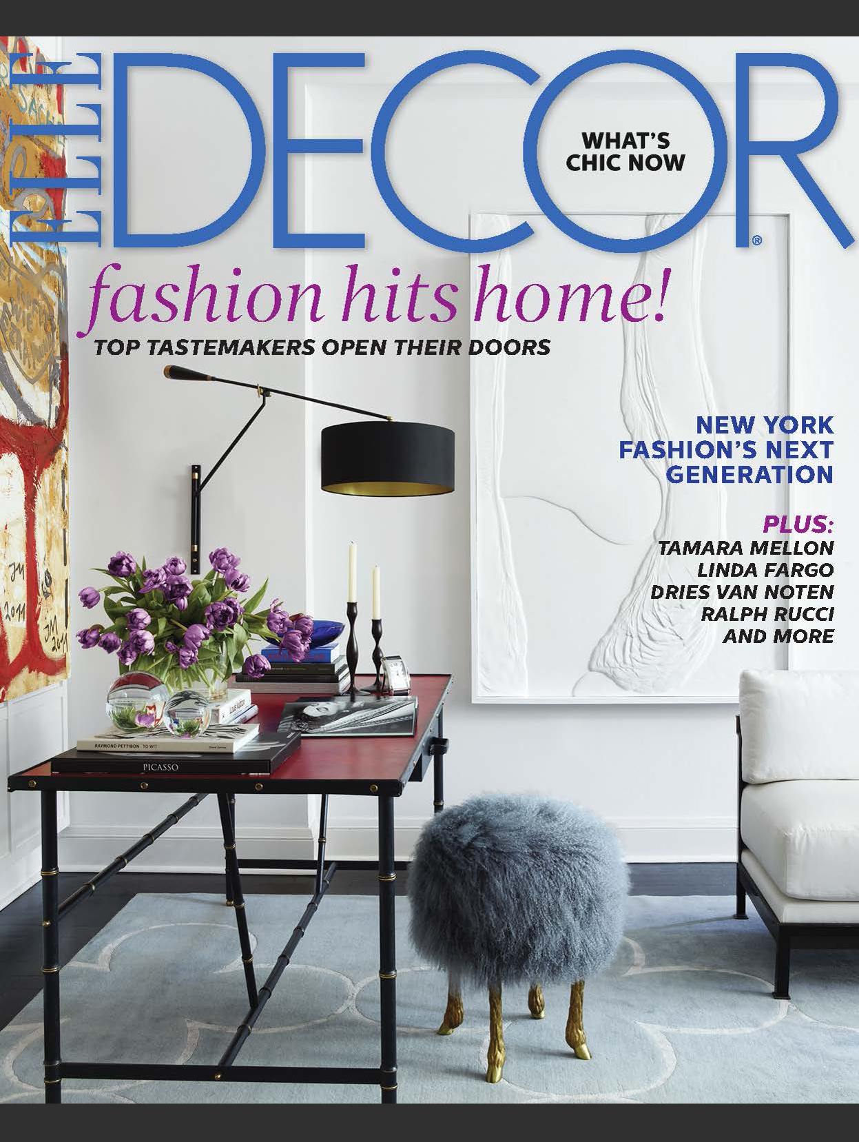
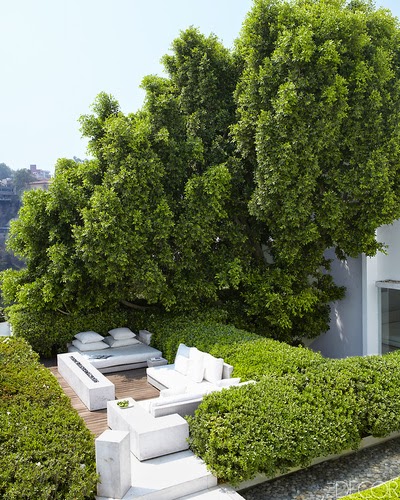
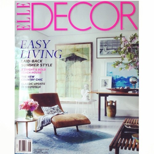
from
elle decor, september 2014, "25th anniversary" issue:
luckily, there was a backyard deck with a fire table and a bed (i've just decided that every deck needs a bed on it, right?) that i could definitely get some serious lounging done on:
moving on....
she had me at the quilt. i looooooove it.
you know i'm always swayed by a view like that.
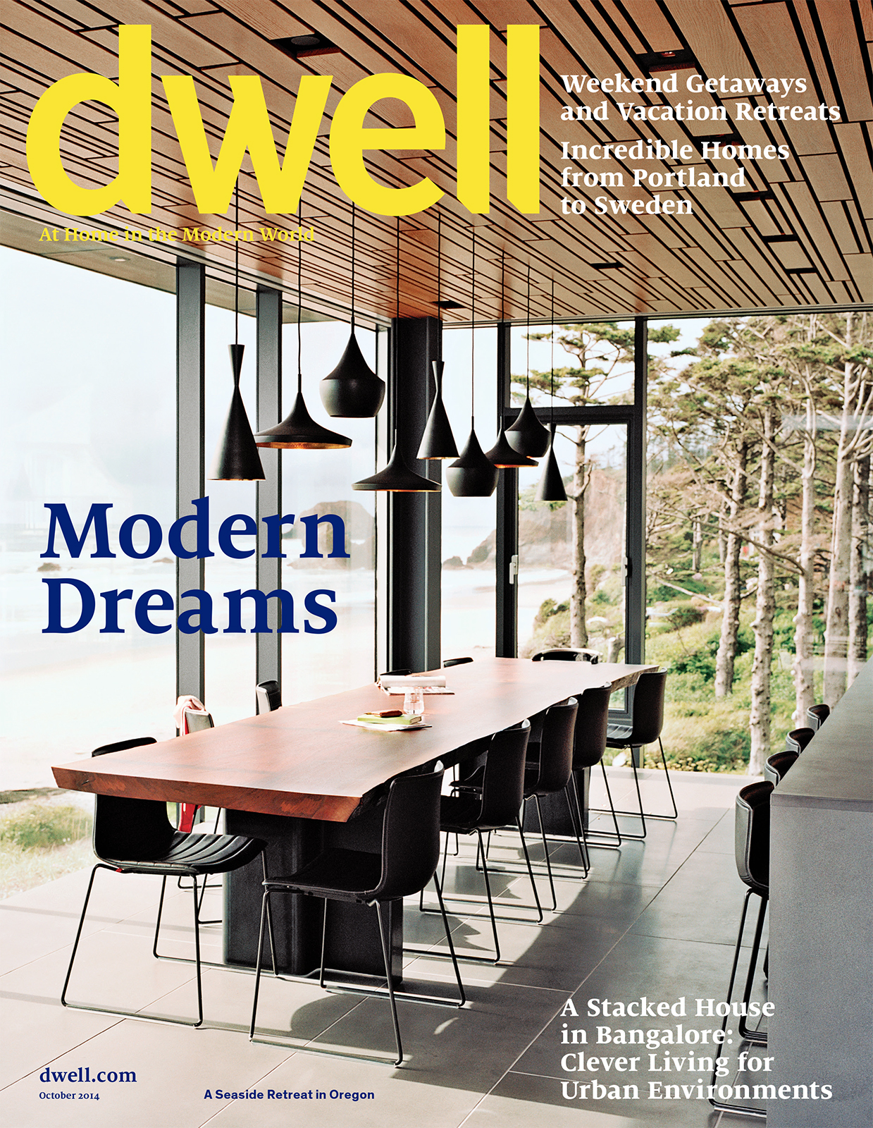
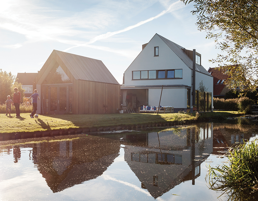
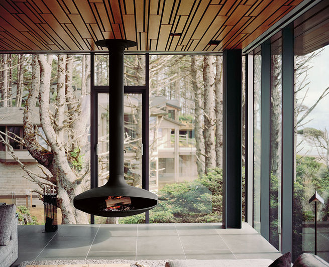
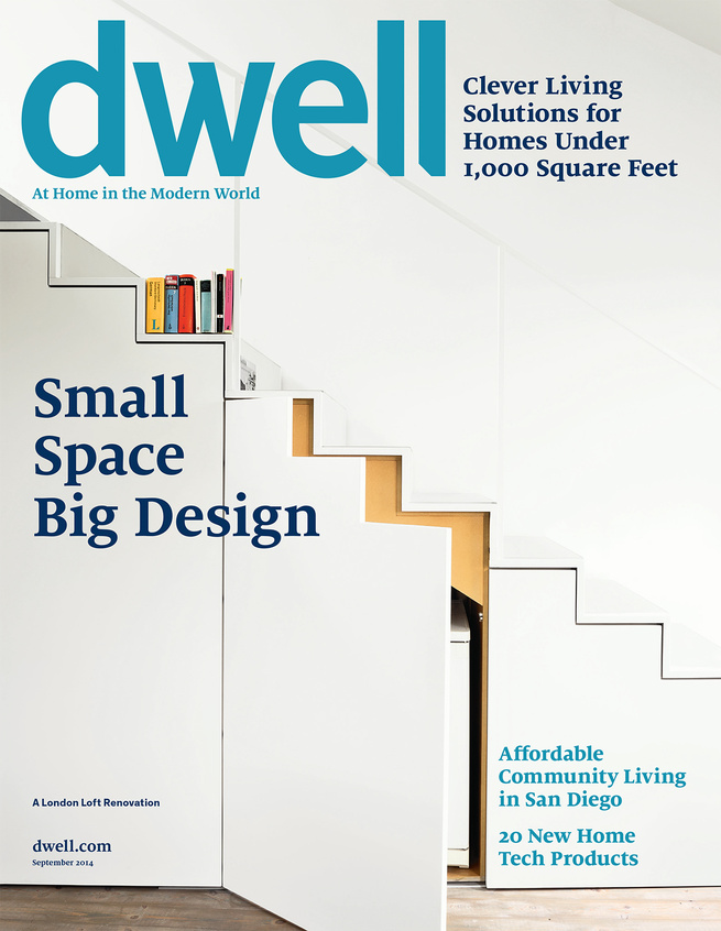
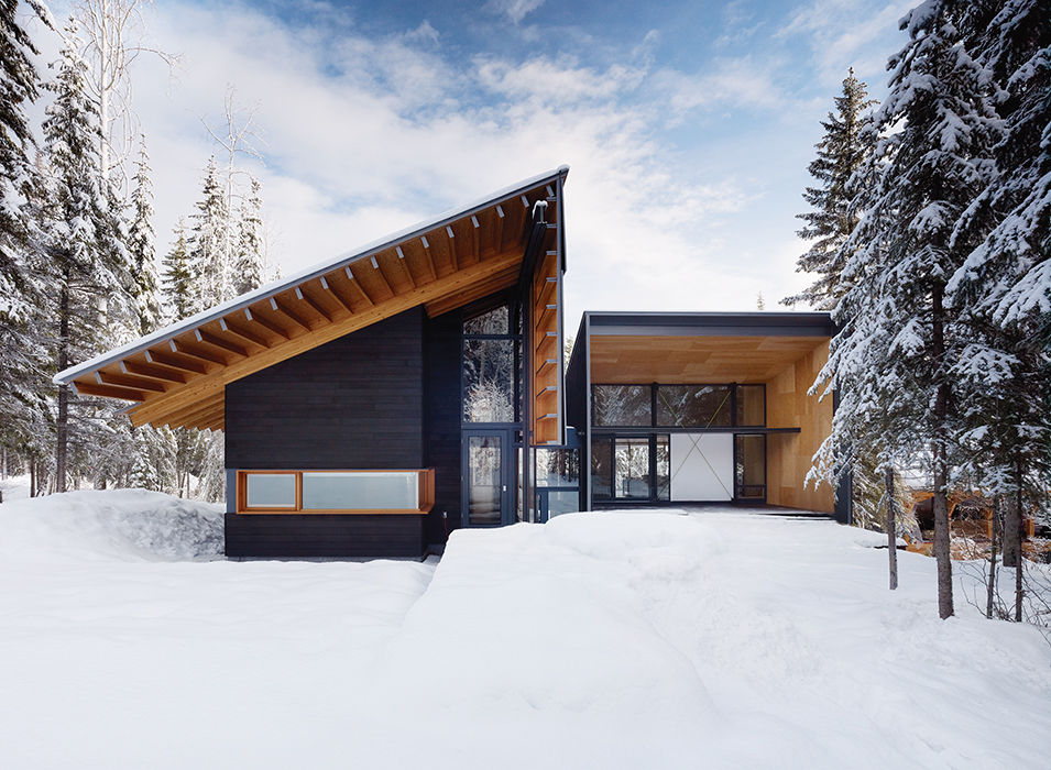
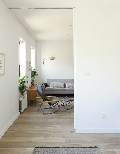
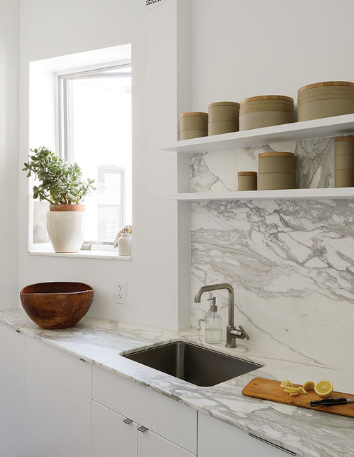
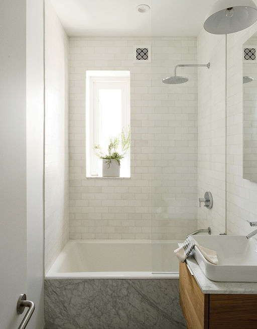
from dwell, september 2014, "small space big design" issue:
i thought this month's dwell was excellent. (finally!) maybe i'm the problem, and my tastes are getting more and more modern.
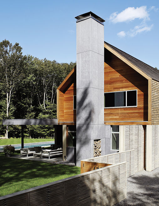
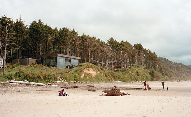
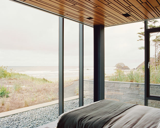
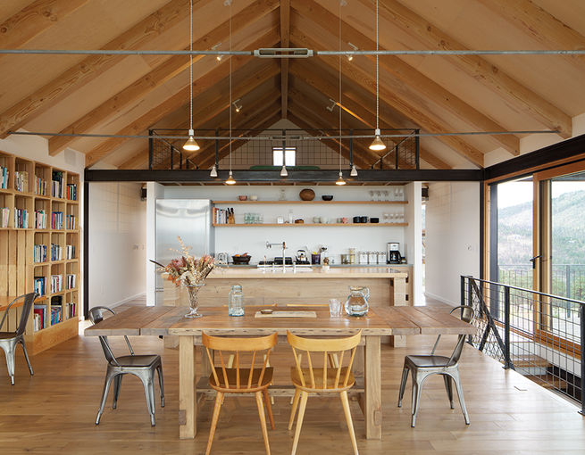
oh man, how much do you want to grab your skis tartan blanket and go to there right now? i know that in every day life that an exterior this modern isn't for me, but what a perfectly luxe getaway spot.
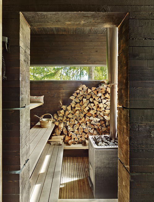
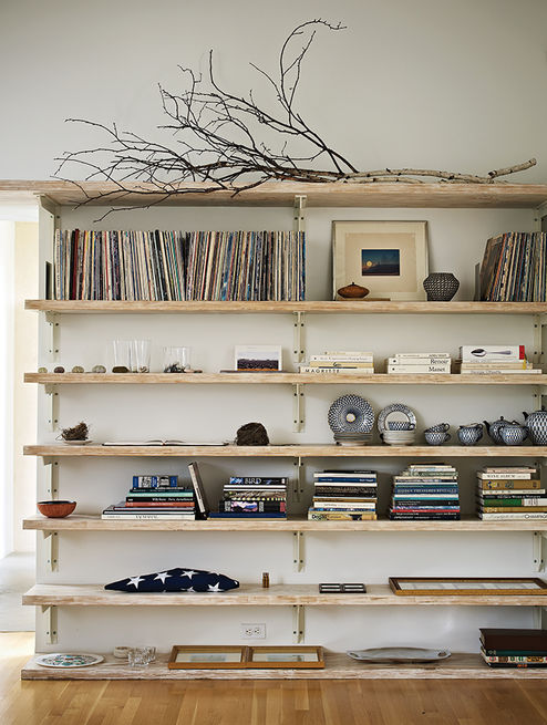
i like how calm, serene, and pared down this home is. unfortunately there is another
kids' asylum room, so i can't give the whole thing 5 stars, but almost all of the other rooms had that minimalist part of my heart beating faster.
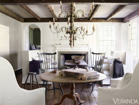
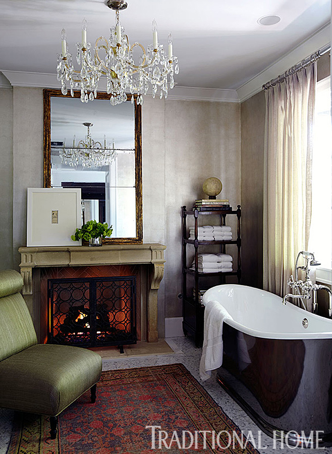
from traditional home, september 2014, "fashion comes home" issue:
from kay krill's home on long island sound:
this photo betrays the fact that there is a traditionalist deeply embedded in me somewhere. and the fact that, try as i might to fight it, i do have expensive taste.
after that, a tim clarke-designed home in las vegas was really interesting to me. the neighborhood required a frank lloyd wright style house, but the homeowner's style was anything but. i thought clarke did a good job of blending their tastes with the modern and streamlined exterior. and the part of me that loves good old fashioned hollywood glamour enjoyed the results of the whole project.
family room:
there were a lot of things i liked about it, but the master bathroom took the cake:
that chair positively needs to go, but everything else makes up for it.
and, ok, seriously...i'm definitely back on the magazine bandwagon here, but look at this closet:
no girly girl can deny, that thang is awesome. plus, this home is in las vegas, and you have to have a closet like this if you live there, right?
well, if anything, this post let you in on the fact that i couldn't nail down a design style if i tried. now you know why i have issues at my own house...i'm part modern-lover, part glamour girl, part minimalist (if only in my head), and part quilting club country girl. good thing there are a lot of different magazines at the library.


.JPG)


.JPG)